Text, Image, and Section Components
Custom pages support Text, Image, and Section components for displaying descriptive content, brand images, and section headings. These components are commonly used to supplement charts with explanatory text, display company logos or brand assets, and organize page content into clearly defined sections, making the information easier to read and understand.
Add Components
Open the Custom Page Editor
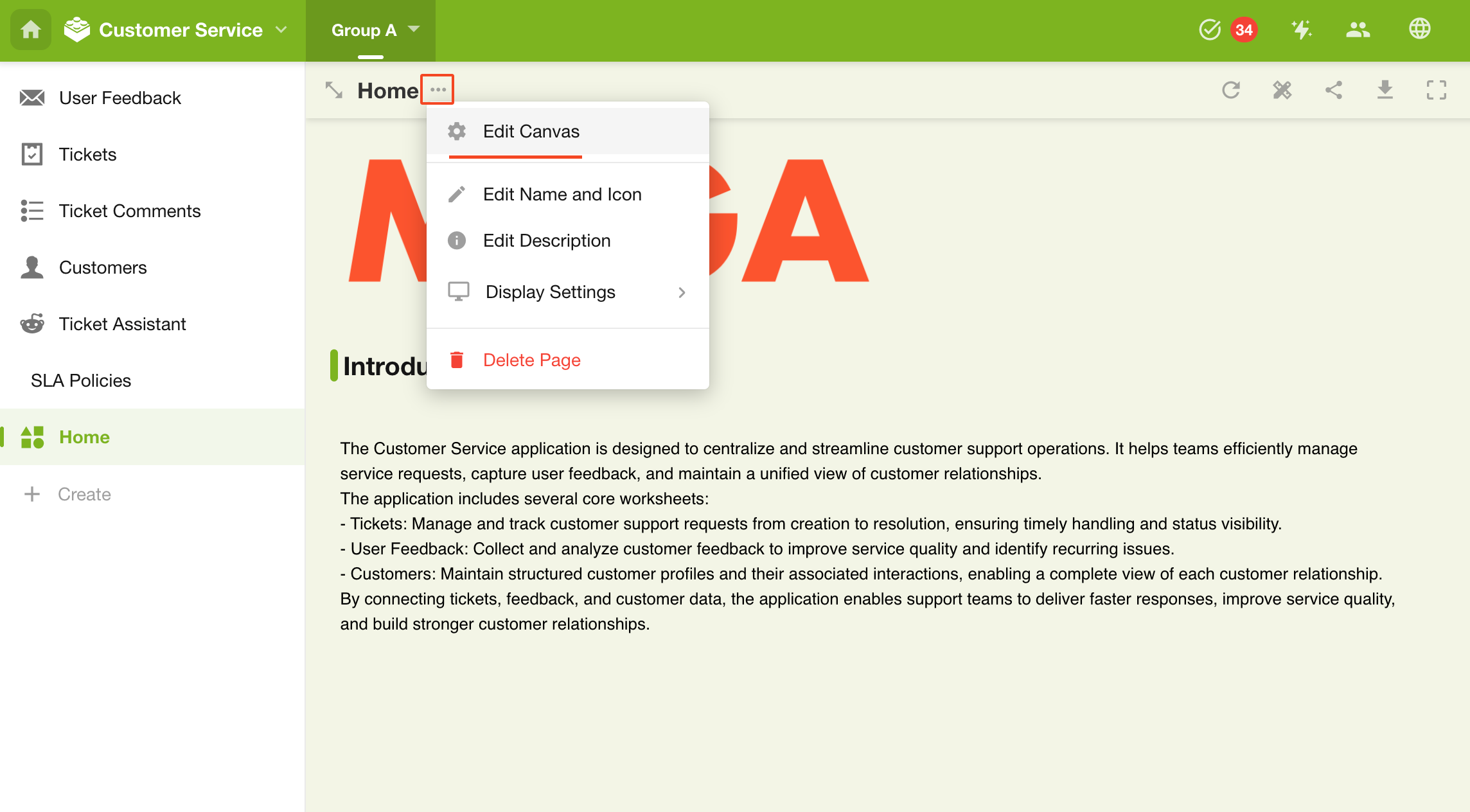
Click the More button next to the custom page name, then select Edit Canvas to open the page editor.
Add a Text, Image, or Section Component
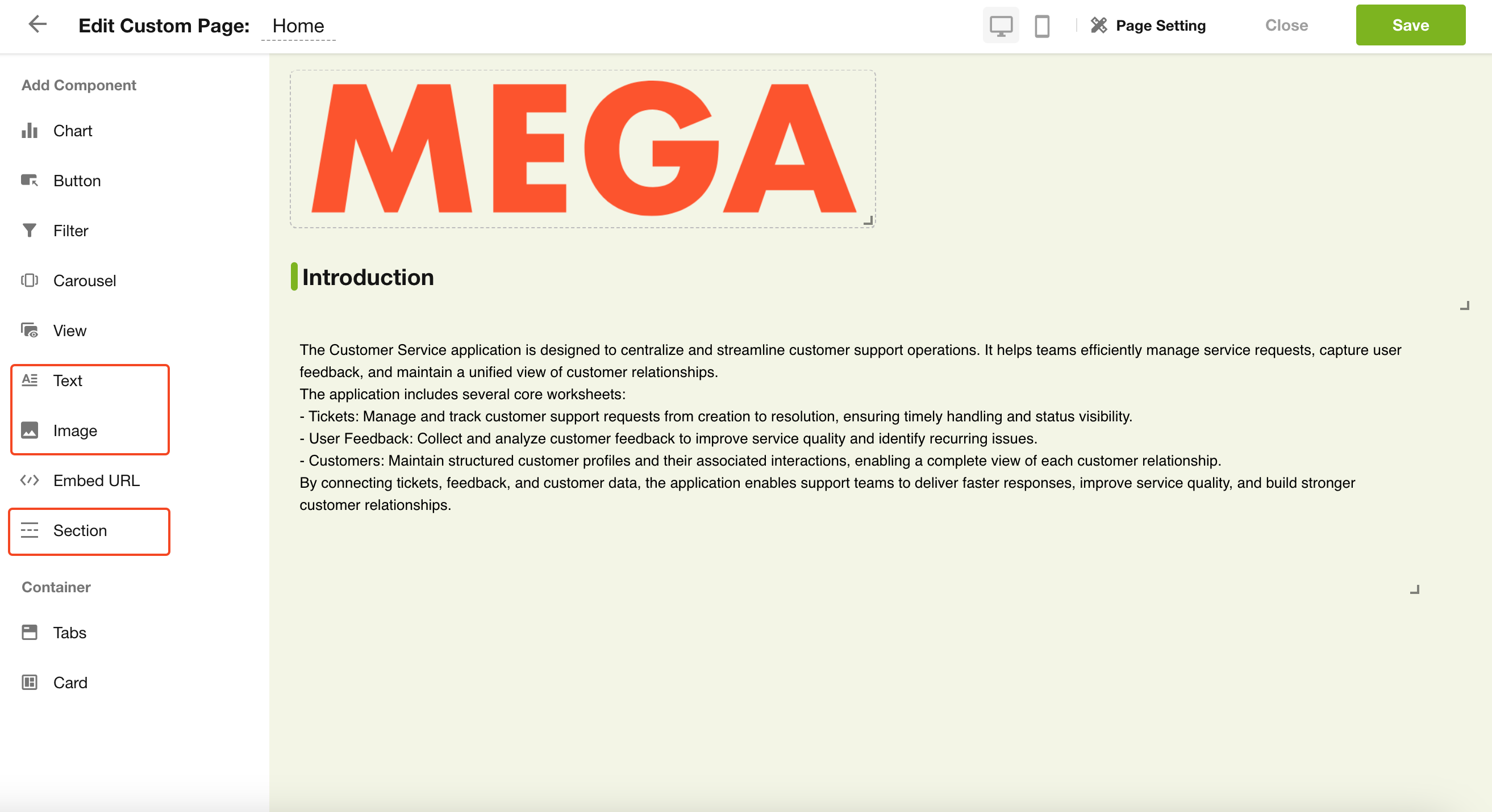
From the component panel on the left, select the Text, Image, or Section component, then drag it to the desired location on the page.
Configure the Component
-
Text Component
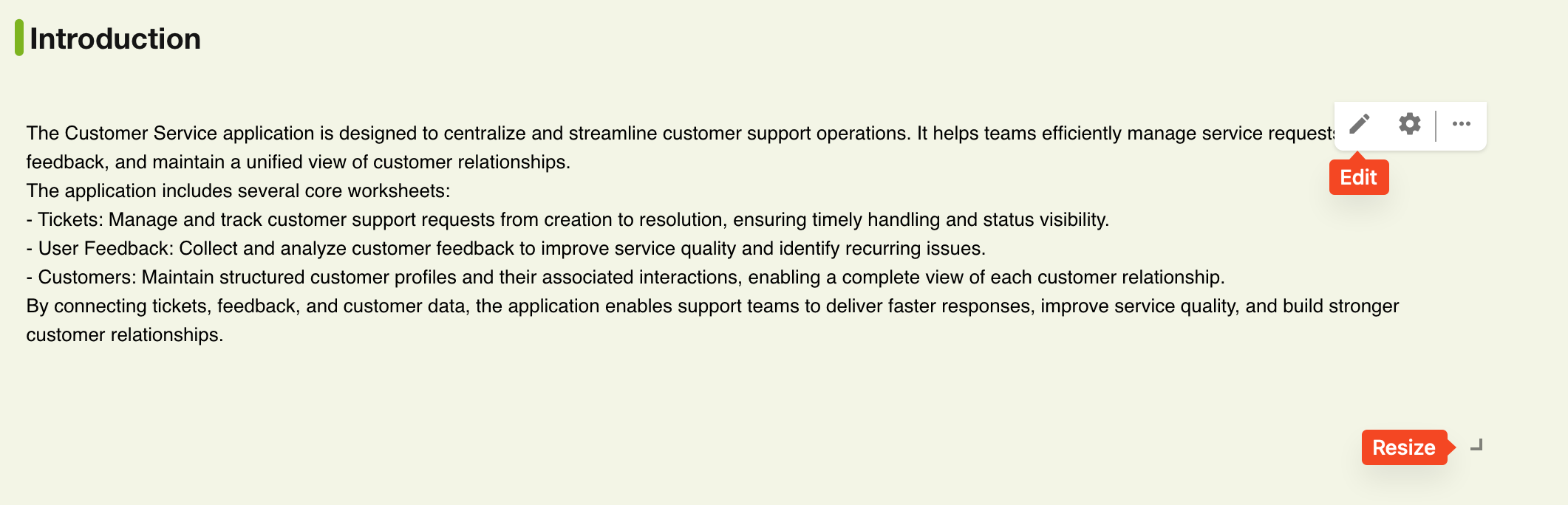
Click the Edit button in the upper-right corner of the component to edit its content and style. The Text component supports headings, body text, text formatting, and inline image uploads. You can also resize the component using the resize handle in the lower-right corner.
-
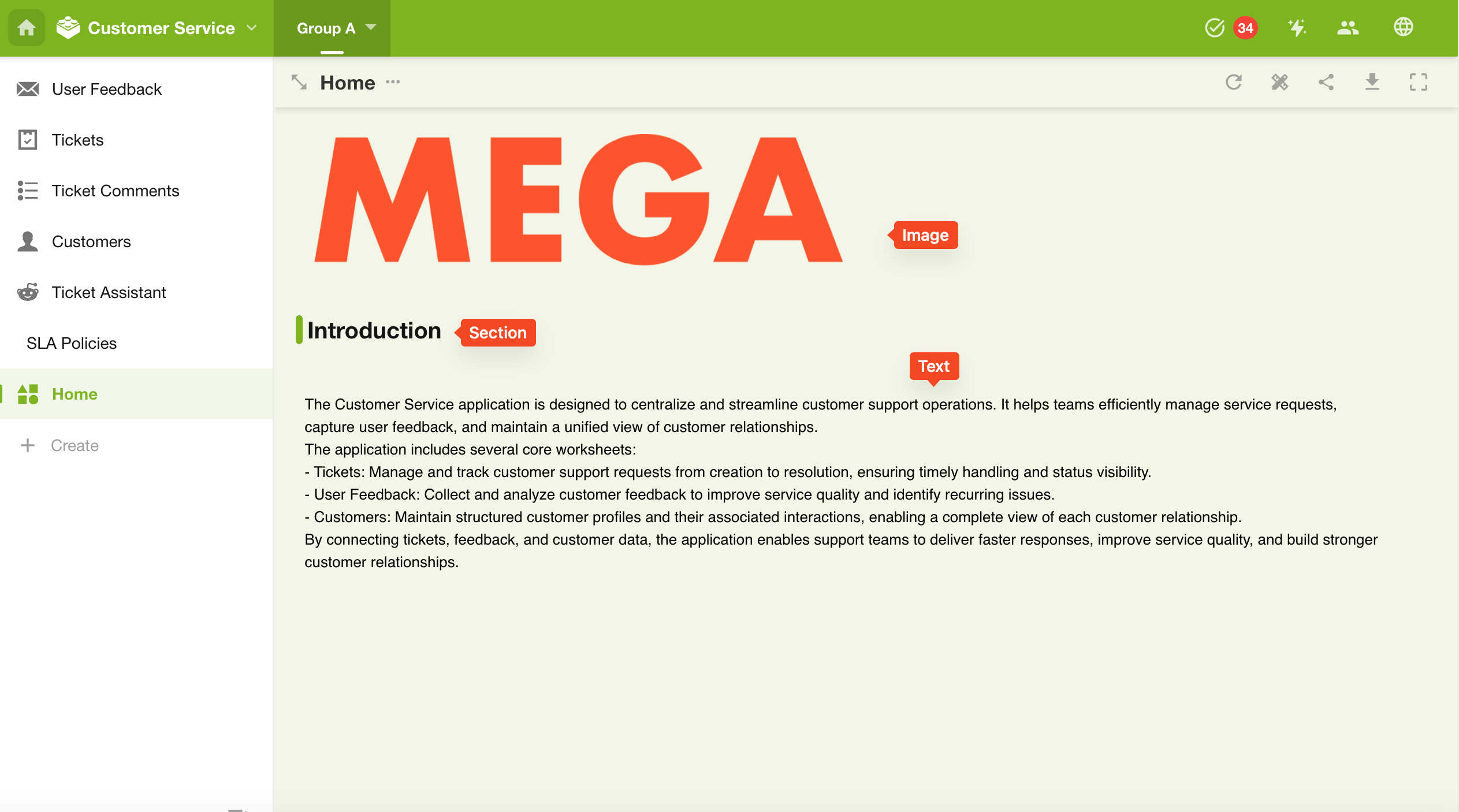
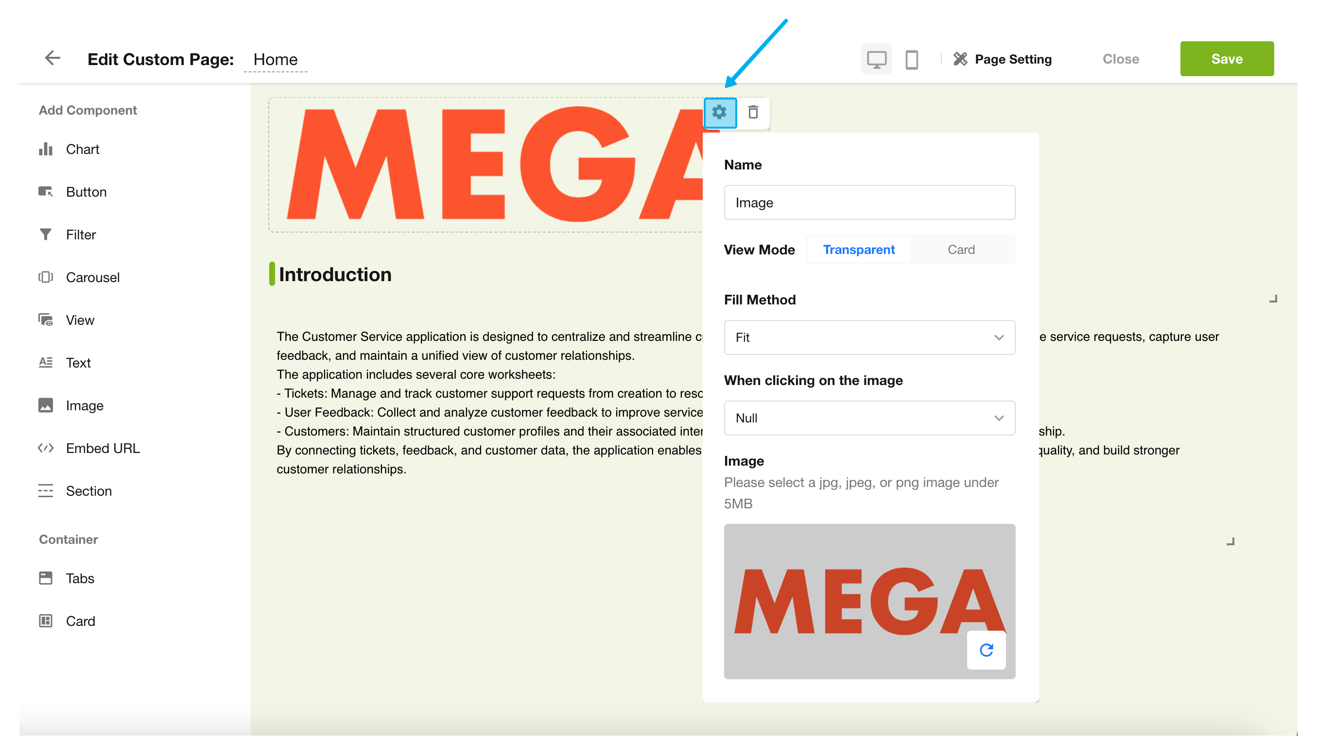
Image Component
The Image component is used to display company logos, promotional graphics, instructional images, and other visual content. Each Image component supports uploading one image. You can choose either the Transparent or Card style, and set the display mode to Fill, Fit, or Stretch.
You can also configure the image to open a link or preview the image when clicked.
-
Section Component
The Section component adds section headings to help organize different areas of the page. You can specify the section title, and the section color automatically follows the application's theme color.
Save the Page Configuration and Exit the Custom Page
Was this document helpful?