Funnel Chart
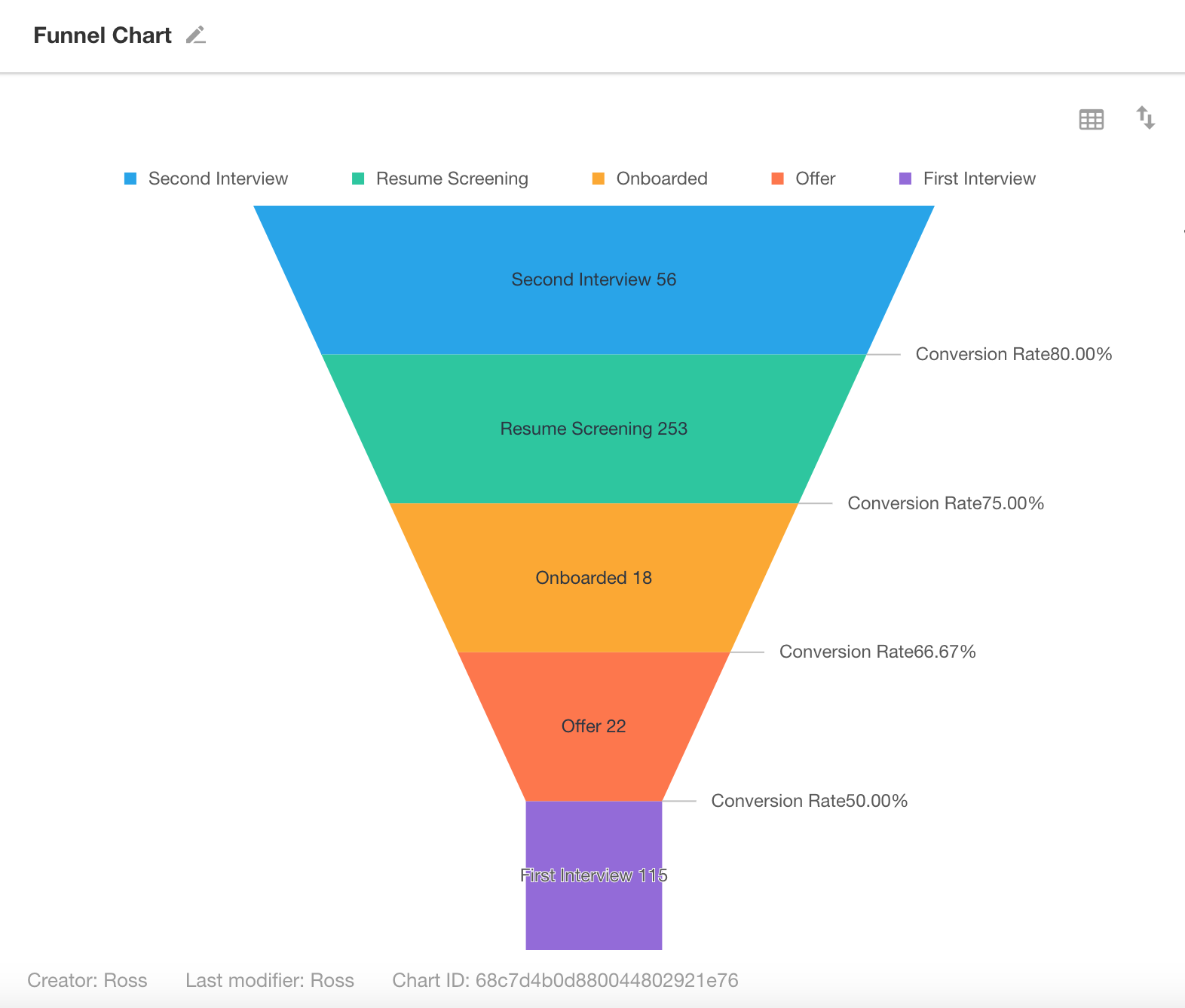
A funnel chart consists of a series of trapezoids stacked from top to bottom. Each section represents a stage in a sequential process, with the size of each section indicating the volume difference from the previous stage. Funnel charts are ideal for visualizing drop-offs in business processes such as recruitment, sales pipelines, or approval flows.
Below is an example of how to create a funnel chart.
Example: Track Monthly Recruitment Progress
Data Scope: Filter records in the “Recruitment Tracking” worksheet where the “Date” is within the current month.
Dimension: Use a non-numeric field (e.g., Stage) to group records.
Value: Select a numeric field (e.g., number of records or a custom numeric field). The value determines the size of each stage in the funnel.
Chart Configuration
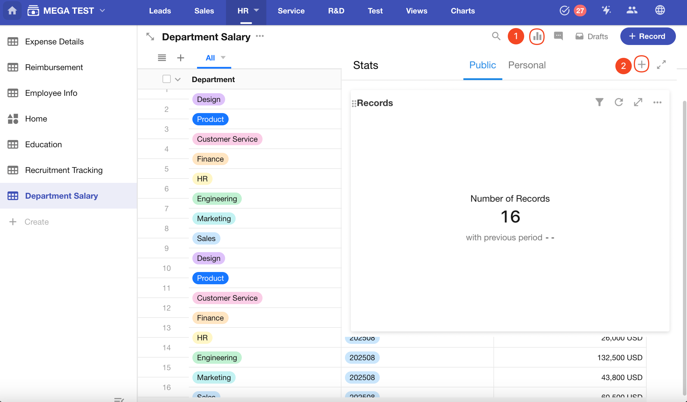
1. Create a New Chart
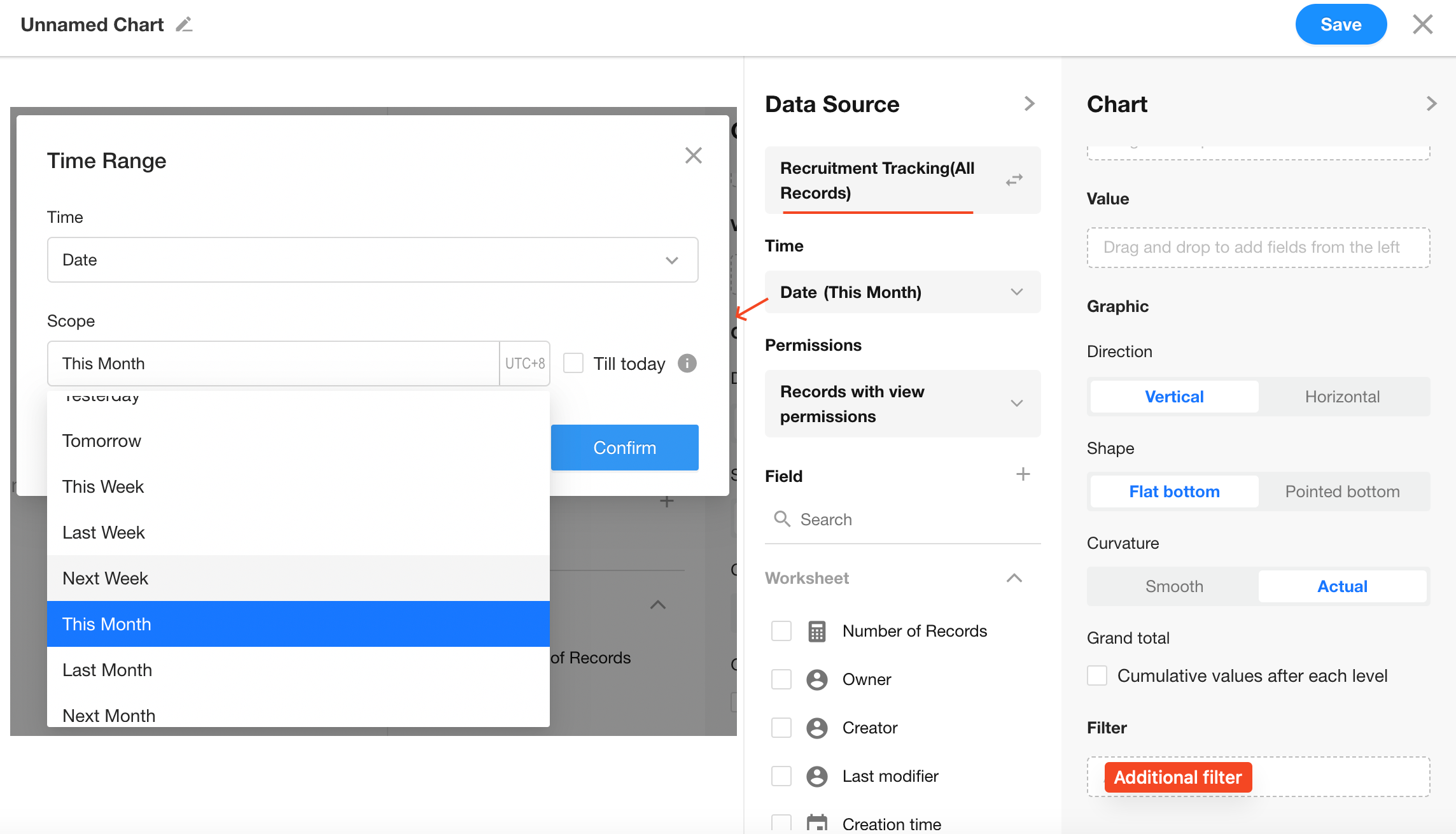
2. Set the Data Scope
Filter the Recruitment Tracking worksheet to include only records from the current month.
You can also add additional filters as needed.
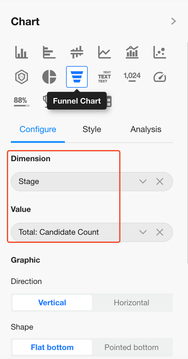
3. Select Chart Type: Funnel
Dimension: Select the "Stage" field
Value: Select the "Candidate Count" field (aggregated as Sum)
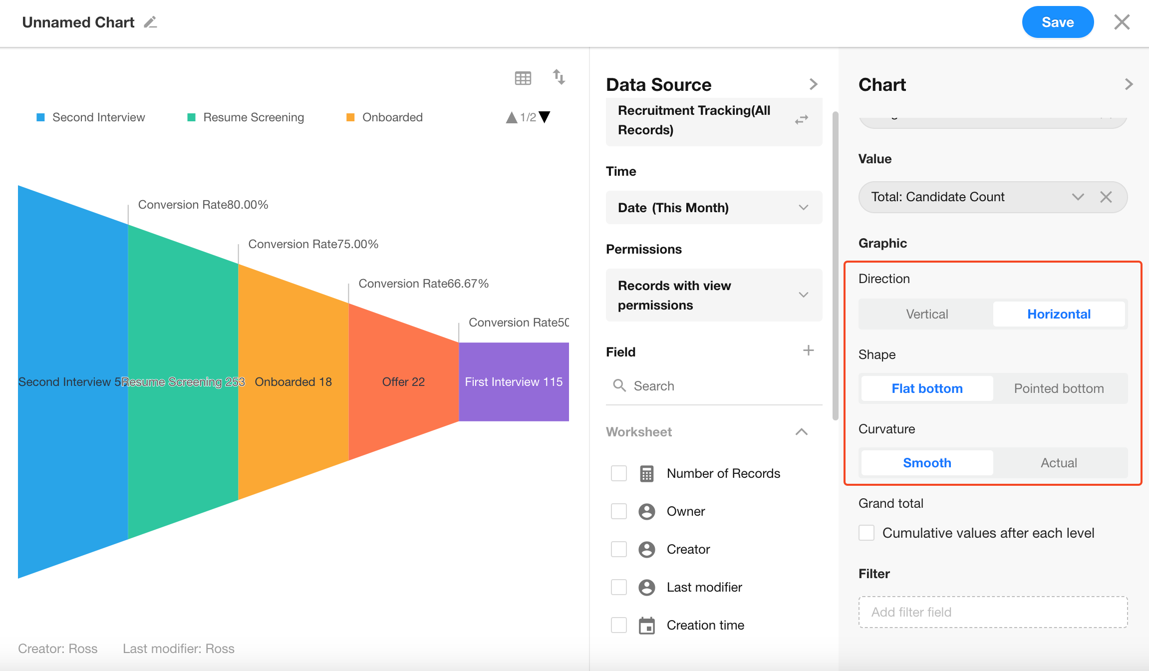
4. Funnel Orientation
You can choose between vertical and horizontal display layouts.
Additional Settings
In the Style section, you can:
- Enable or disable conversion rate display
- Enable comparison with previous month/year
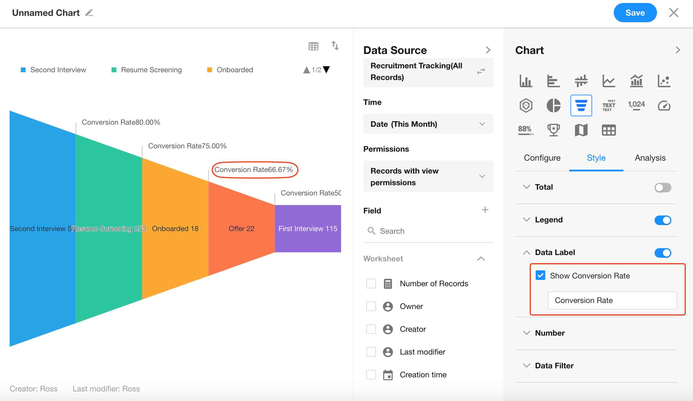
If no additional configuration is needed, simply click Save to apply your settings.
Was this document helpful?