Pie Chart
A pie chart represents proportions as slices of a whole circle, where each segment indicates the percentage of a category in relation to the total. This makes it easy to visualize the distribution and comparison across categories, with all values adding up to 100%.
Below is an example of how to create a pie chart.
Example: Analyze Payroll Distribution by Department
Data Scope: Current month's payroll records
View: Use the “All” view
Date Field: Based on “Creation Time”
Filter: "Month = 202509"
Dimension: By Department
Metric: Total salaries paid to employees in each department
1. Create a New Chart
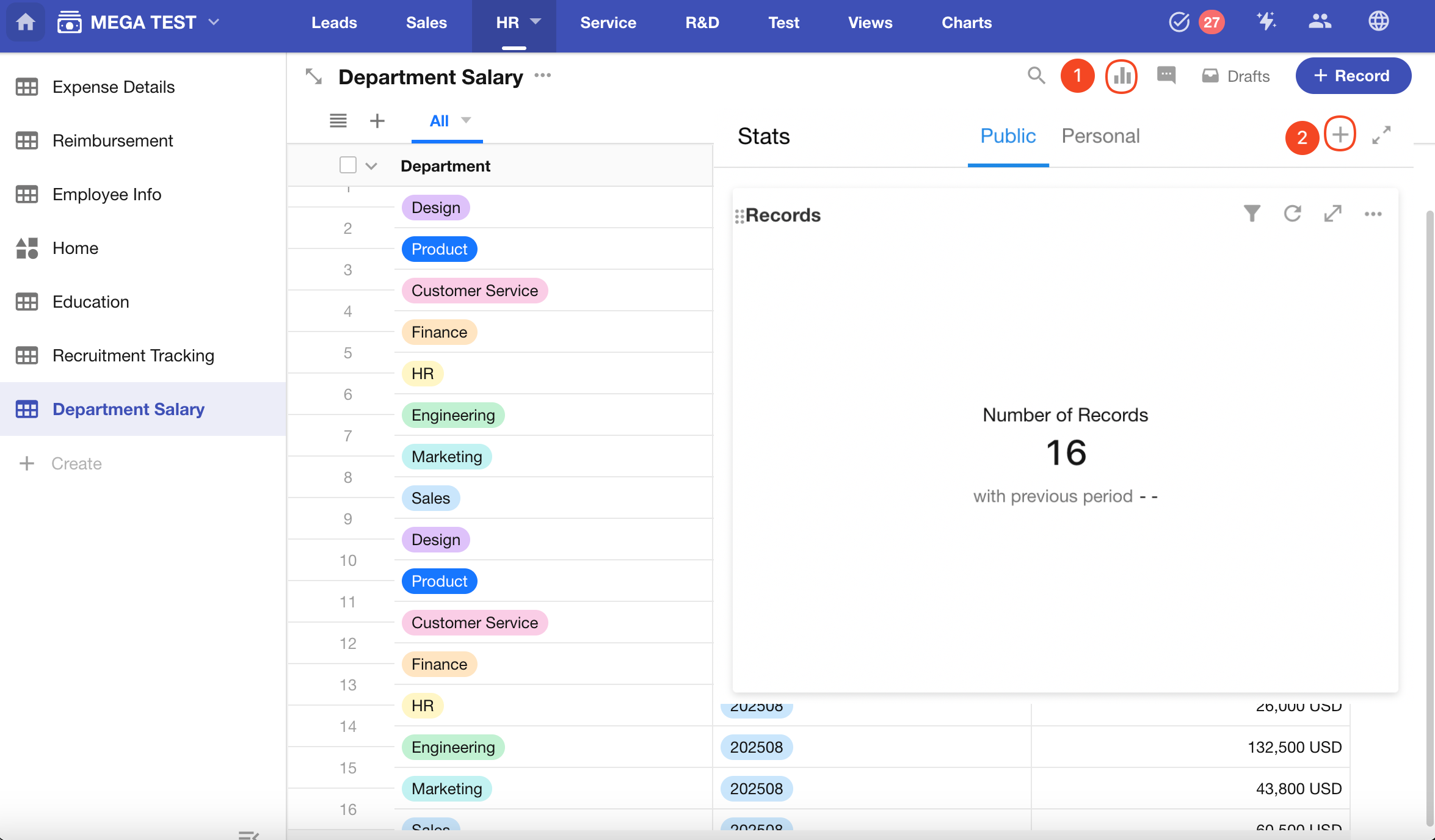
2. Set the Data Scope
Configure the View, Time, and Filter settings.
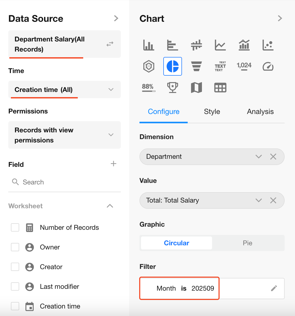
3. Select Chart Type: Pie Chart
Dimension Field: Department
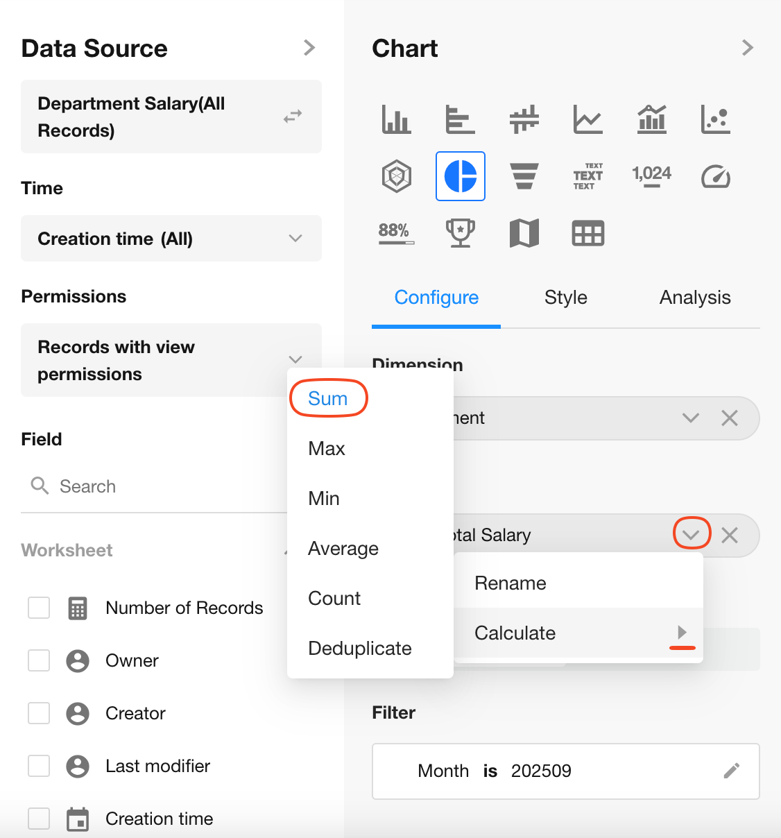
Value Field: Salary (Sum)
4. Choose the Chart Style
You can display the pie chart in circular or regular pie style.
If no option is selected, the circular style is used by default.
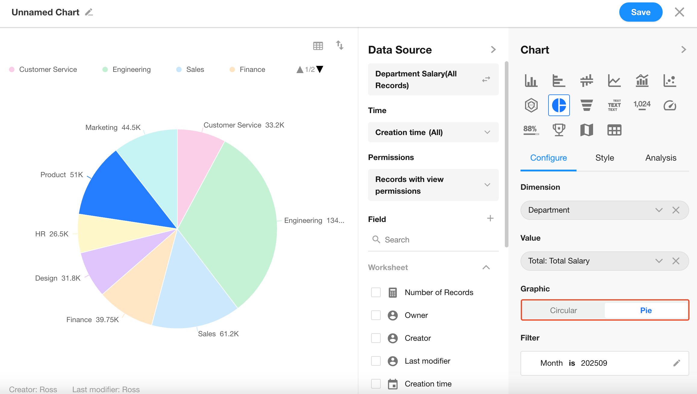
5. Save the Chart Configuration
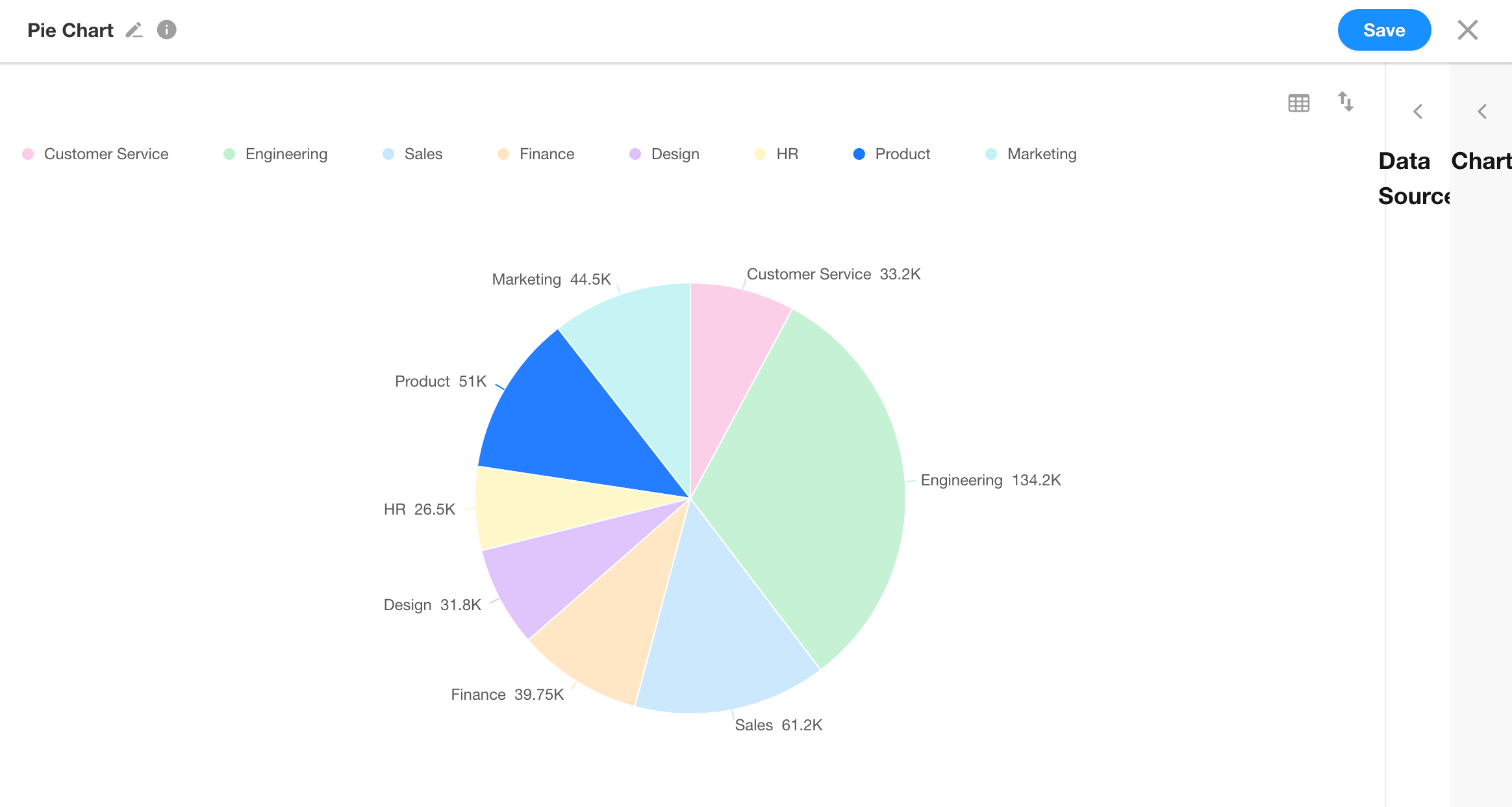
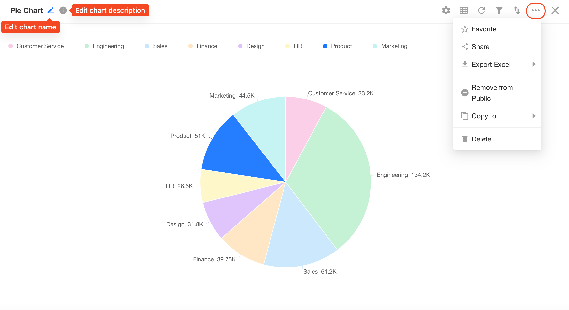
6. Edit Chart Name and Access Settings
Click the upper-left corner to edit the chart name and description.
Use the "..." menu on the upper-right to:
- Share the chart
- Export to Excel
- Remove from "Public" group
- Copy to a custom page
- Delete the chart
Was this document helpful?