Dual-Axis Chart Creation Guide
Overview
A dual-axis chart (multi-Y-axis chart) allows you to display two or more different metrics within a single chart.
By using two independent Y-axes (primary axis and secondary axis), it helps address the following challenges:
- Large differences in metric scale (e.g., sales amount vs. growth rate)
- Different units of measurement (e.g., currency vs. percentage)
Therefore, dual-axis charts are ideal for simultaneously analyzing business scale and performance quality in one view.
Common use cases:
- Monthly business reports: Use the primary axis to display absolute values such as [Sales Amount] and [Profit], and the secondary axis to track trends in [Gross Margin].
- Business performance monitoring: Use the primary axis for [New Orders per Month] and the secondary axis for [Conversion Rate].
2. Example: Annual Sales and Profit Trend Analysis
Using the Sales Order worksheet as an example, the goal is to monitor monthly Sales Amount, Profit, and corresponding Gross Margin trends within the current year.
Before configuring the chart, ensure your worksheet includes the following key fields:
-
Time dimension: A date field (e.g.,
Sales Date) for the X-axis. -
Metrics:
- Structure A: The worksheet already contains separate fields for
Sales AmountandProfit. - Structure B: The worksheet only contains sales and cost fields. In this case, it is recommended to use formula fields to calculate:
- Profit (
Sales Amount - Cost) - Gross Margin (
Profit / Sales Amount)
- Profit (
- Structure A: The worksheet already contains separate fields for
Step 1: Filter Data
Before configuring the chart, ensure the data range covers the intended comparison period.
-
Action: In the Data Source, add a filter condition: set
Sales Dateto This Year. -
Key point: Filtering ensures the chart focuses on the overall annual trend and excludes outdated historical data.
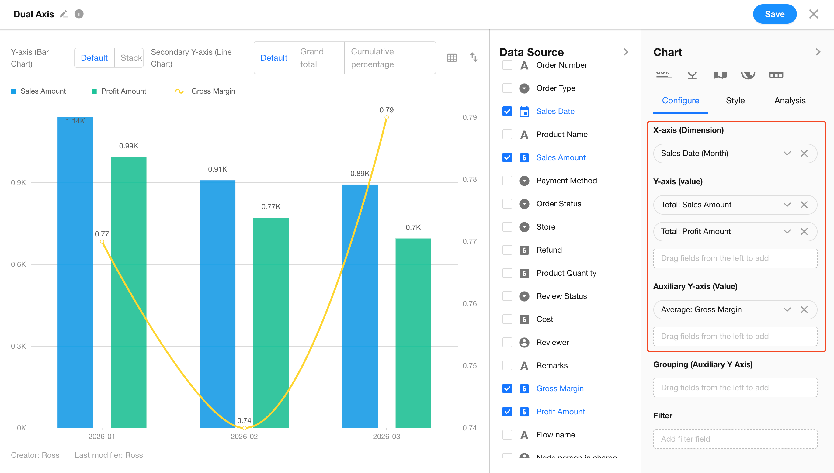
Step 2: Define Analysis Dimensions
After selecting a Dual-Axis Chart, configure the time axis and value axes.
-
Set X-axis (Dimension): Select the
Sales Datefield.- Granularity: Set to Month.
-
Set Primary Y-axis (Value): Add
Sales AmountandProfit, both aggregated using Sum. -
Set Secondary Y-axis (Value): Add
Gross Margin, aggregated using Average.
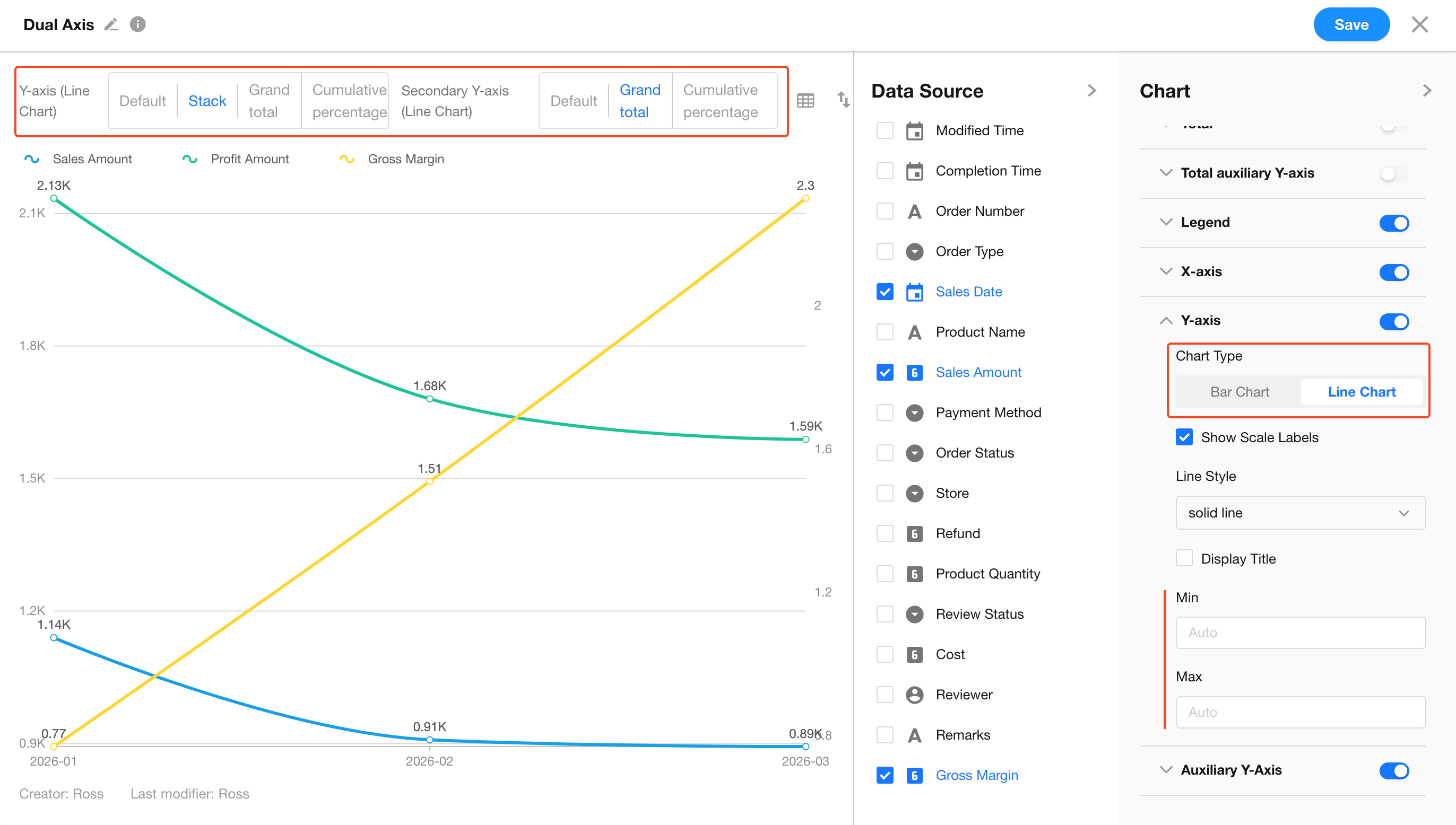
Step 3: Configure Advanced Features
-
Switch Between Column and Line Chart
You can switch Y-axis metrics between column and line representations to better observe trends across multiple metrics. -
Customize Y-axis Scale
In Style > Y-axis, you can manually set the maximum values for both the Primary Y-axis and Secondary Y-axis.- Tip: Increasing the maximum value of the secondary axis allows the gross margin line to “float” above the columns, avoiding visual overlap.
-
Stack Mode
When multiple metrics exist on the Y-axis, you can enable stacked column mode to analyze internal composition. -
Enable Cumulative Mode
In the preview toolbar, select Cumulative.- Automatically accumulates data over time to display year-to-date progress (e.g., cumulative sales).
FAQ
-
Q: Why does the gross margin line break in some months?
- A: This usually occurs when there is no sales data for those months. In the value settings, set Empty Value Display to Show as 0 or Ignore to maintain line continuity.
-
Q: Can the secondary Y-axis be displayed as a column chart?
- A: No. The secondary Y-axis is always displayed as a line to maintain clarity and avoid confusion with the primary axis columns.
-
Q: Can I view trends by quarter instead of by month?
- A: Yes. In Step 2, change the X-axis granularity from Month to Quarter, and the chart will automatically re-aggregate the data.
Was this document helpful?