Bar Chart / Horizontal Bar Chart Creation Guide
Overview
Bar charts and horizontal bar charts visually display differences in data through the height or length of bars. In addition to comparing values, they also support deeper cross-analysis through grouping and stacking.
Common use cases:
- Monthly trends: Set the dimension to "Date" to observe performance fluctuations over time.
- Team contribution: Enable grouped stacking to analyze each team’s contribution to total performance.
- Individual ranking: Use a bar chart, sorted by amount in descending order, to clearly display performance rankings.
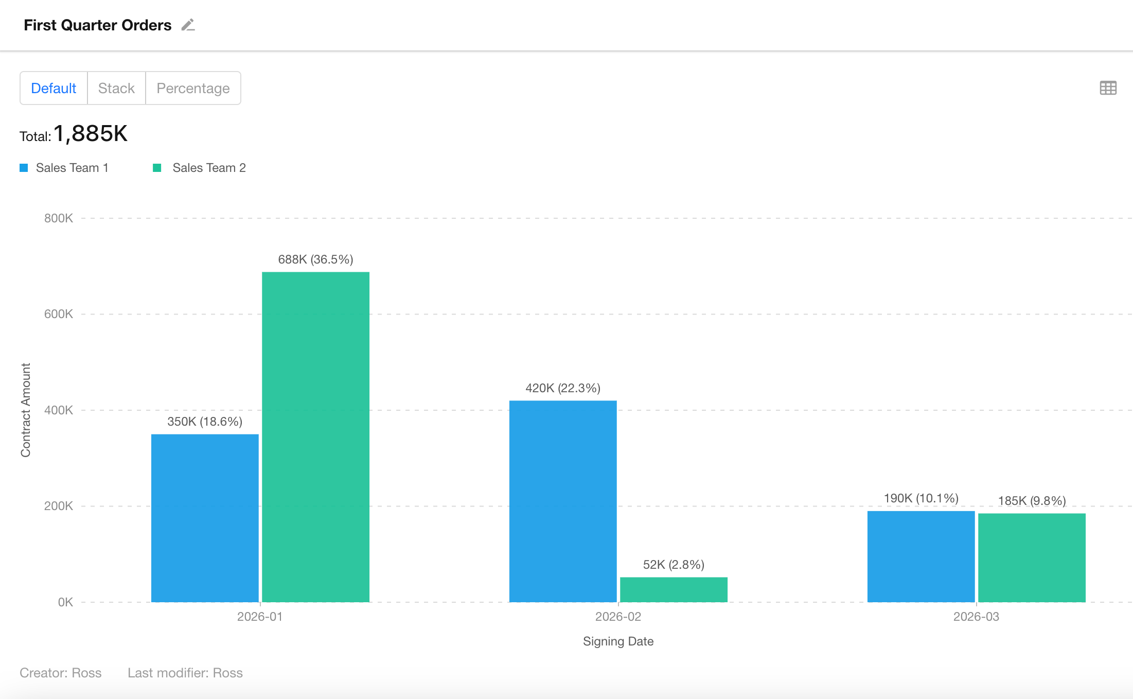
The following example shows a bar chart analyzing quarterly business performance and team contributions:
2. Example: Monthly Performance Trends and Team Contribution Analysis for the Current Quarter
Using the Contract Management app as an example, the goal is to monitor the company’s total monthly sales within the current quarter in real time and analyze the contribution of “Sales Team A” and “Sales Team B” for each month.
This article focuses on features specific to column and horizontal bar charts. For general chart configuration, refer to Chart General Configuration.
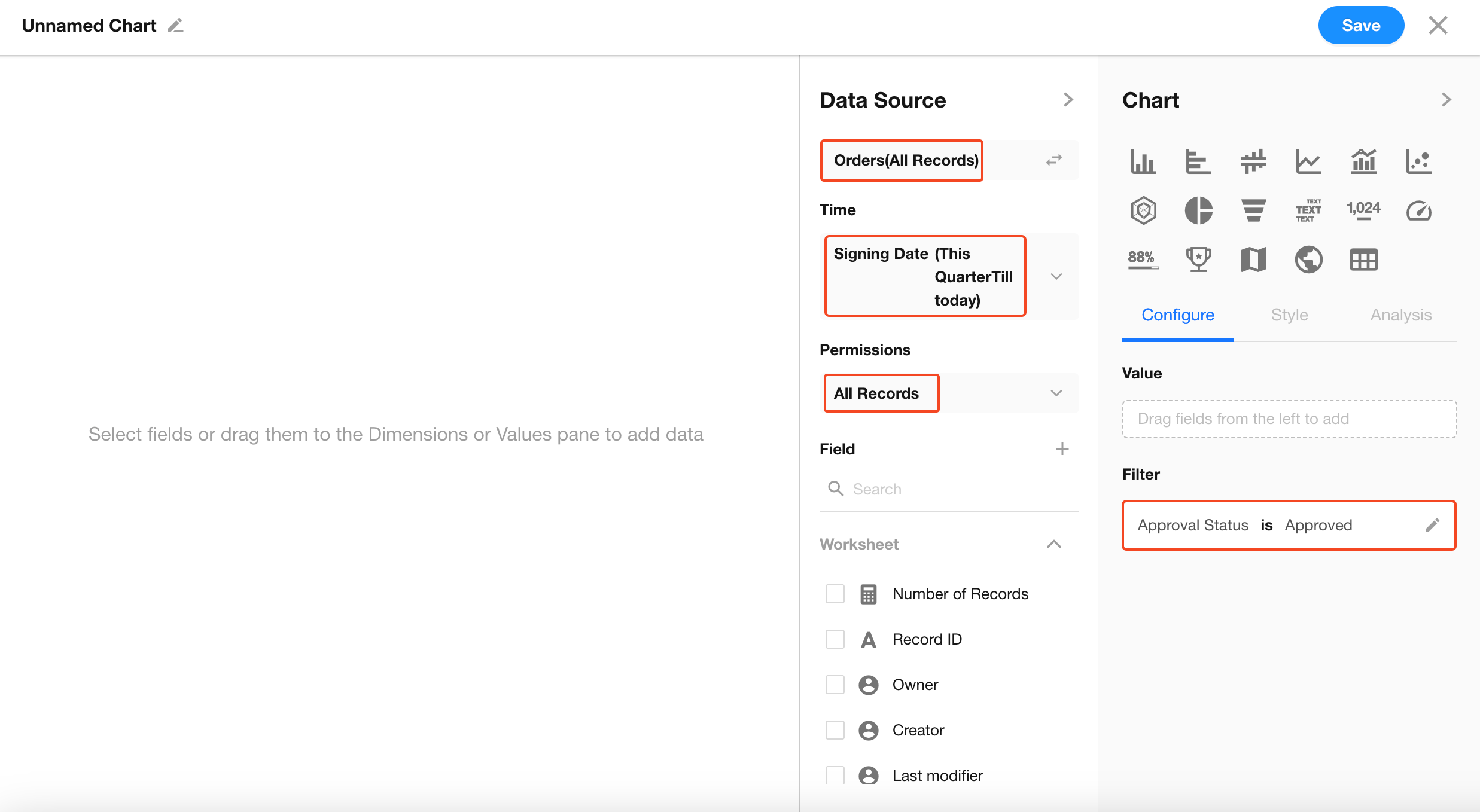
Step 1: Filter Data
Select the data to analyze in the data source and set the following filter conditions:
Signing Date= Current QuarterApproval Status= Approved
This ensures that only valid data from the current quarter is included in the analysis.
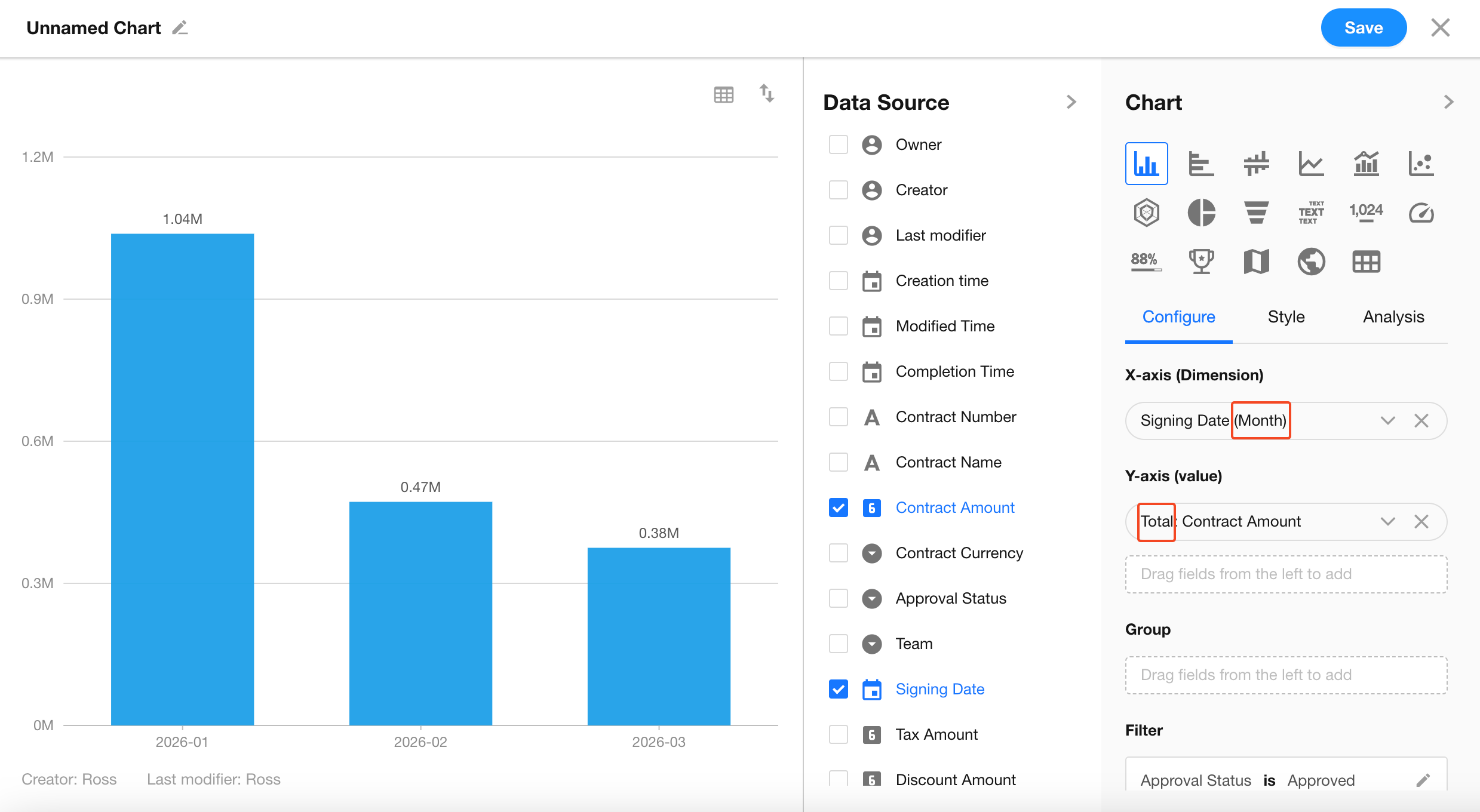
Step 2: Define Analysis Dimensions (X-axis / Y-axis)
After selecting a bar chart or bar chart, define the X-axis and Y-axis to create a basic monthly chart.
-
Set Dimension (X-axis): In Dimension, select
Signing Dateand set the granularity to Month. -
Set Metric (Y-axis): In Value, select
Contract Amountand set the aggregation method to Sum.
At this point, you will have a basic bar chart showing the company’s total monthly performance for the current quarter.
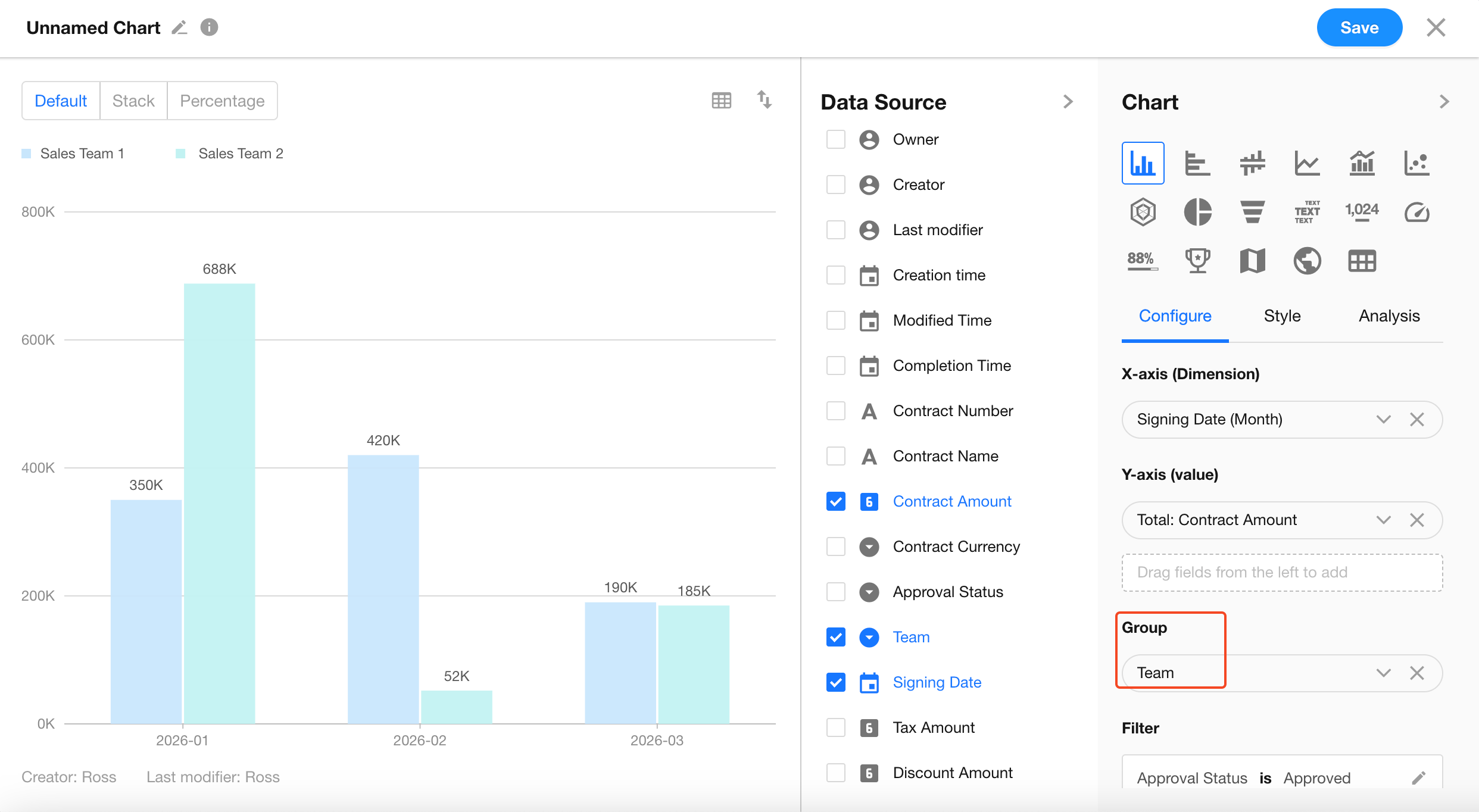
Step 3: Configure Grouping
Once the basic chart is created, you can further analyze team contributions by adding grouping.
-
Add Grouping: Under Grouping in the configuration panel, select the
Teamfield. -
Core logic: Grouping splits a single bar into segments based on different categories (such as Sales Team A and Sales Team B).
Step 4: Configure Chart Style
After setting up grouping, you can choose how to present the segmented data to gain different business insights.
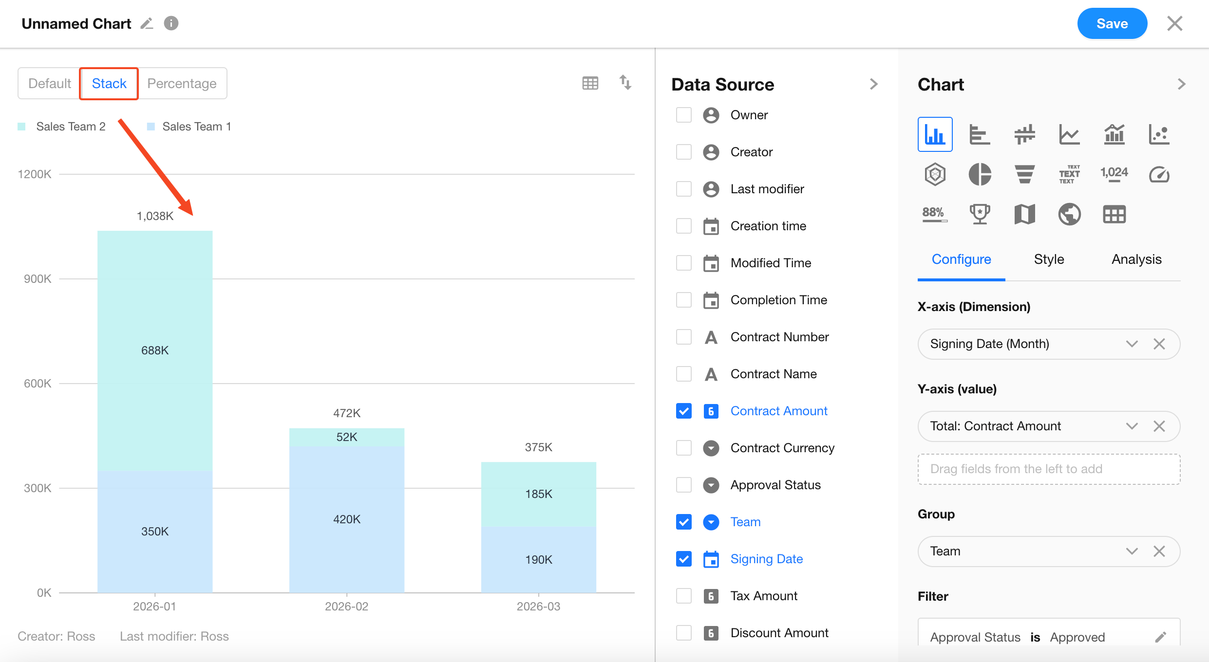
1. Stack Mode (View Total Trend)
On the configuration page, switch to Stack mode from the top-left corner.
-
Effect: Values from both teams are stacked vertically. The total height of each bar represents the total monthly performance.
-
Value: Enables managers to quickly identify whether performance is increasing or declining over the quarter.
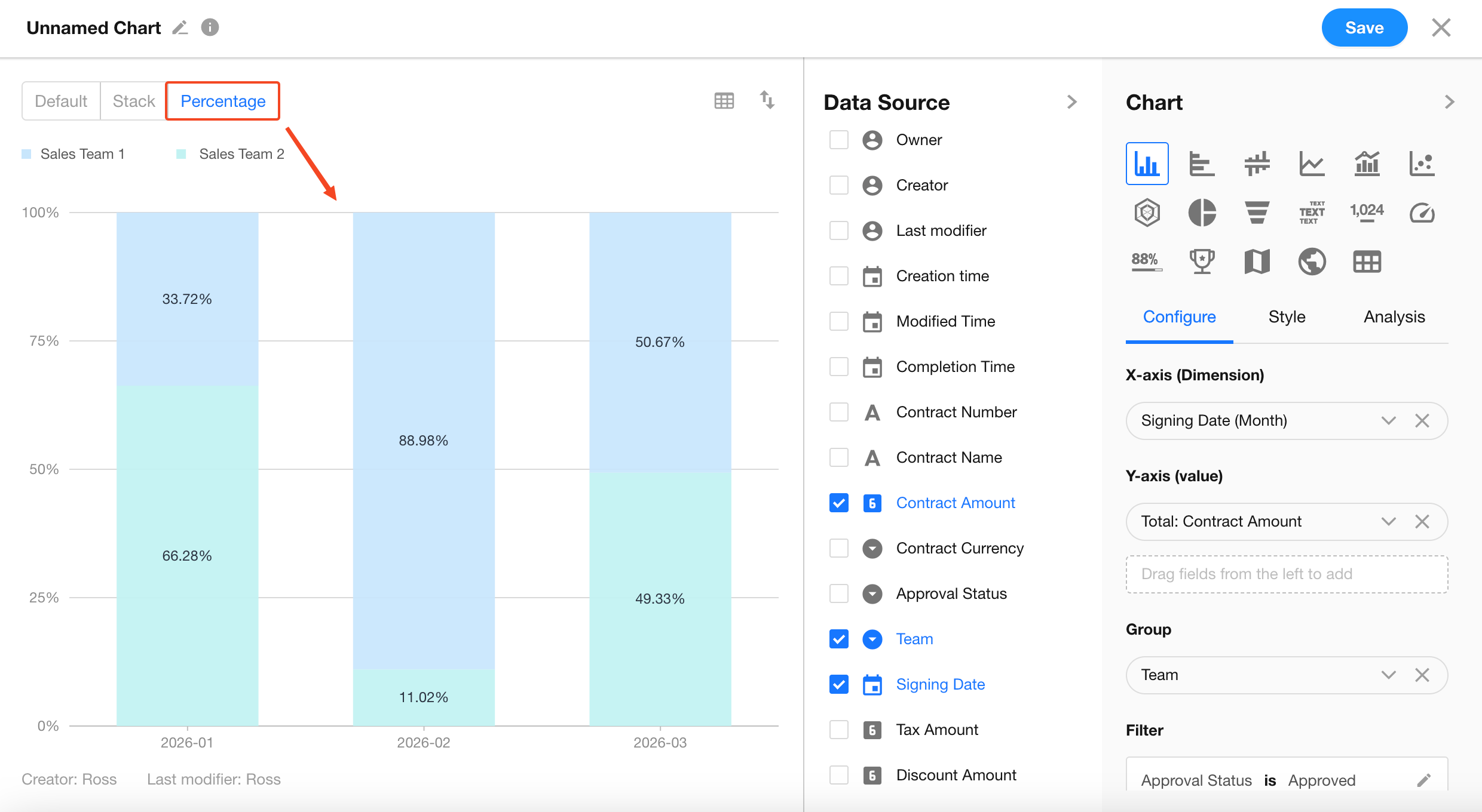
2. Percentage Mode (View Contribution Ratio)
On the configuration page, switch to Percentage mode from the top-left corner.
-
Effect: All bars are normalized to 100%.
-
Value: Eliminates the impact of value fluctuations and focuses purely on the contribution ratio of each team.
3. Legend Colors
We provide 12 preset color palettes. The default is the classic palette, which can be switched or customized.
-
When the statistical dimension (X-axis) is an option field:
Newly created charts will use the colors configured for the option field by default. After switching to custom mode, you can modify the colors.
If no color is configured for the option field in the worksheet, the default classic palette will be used.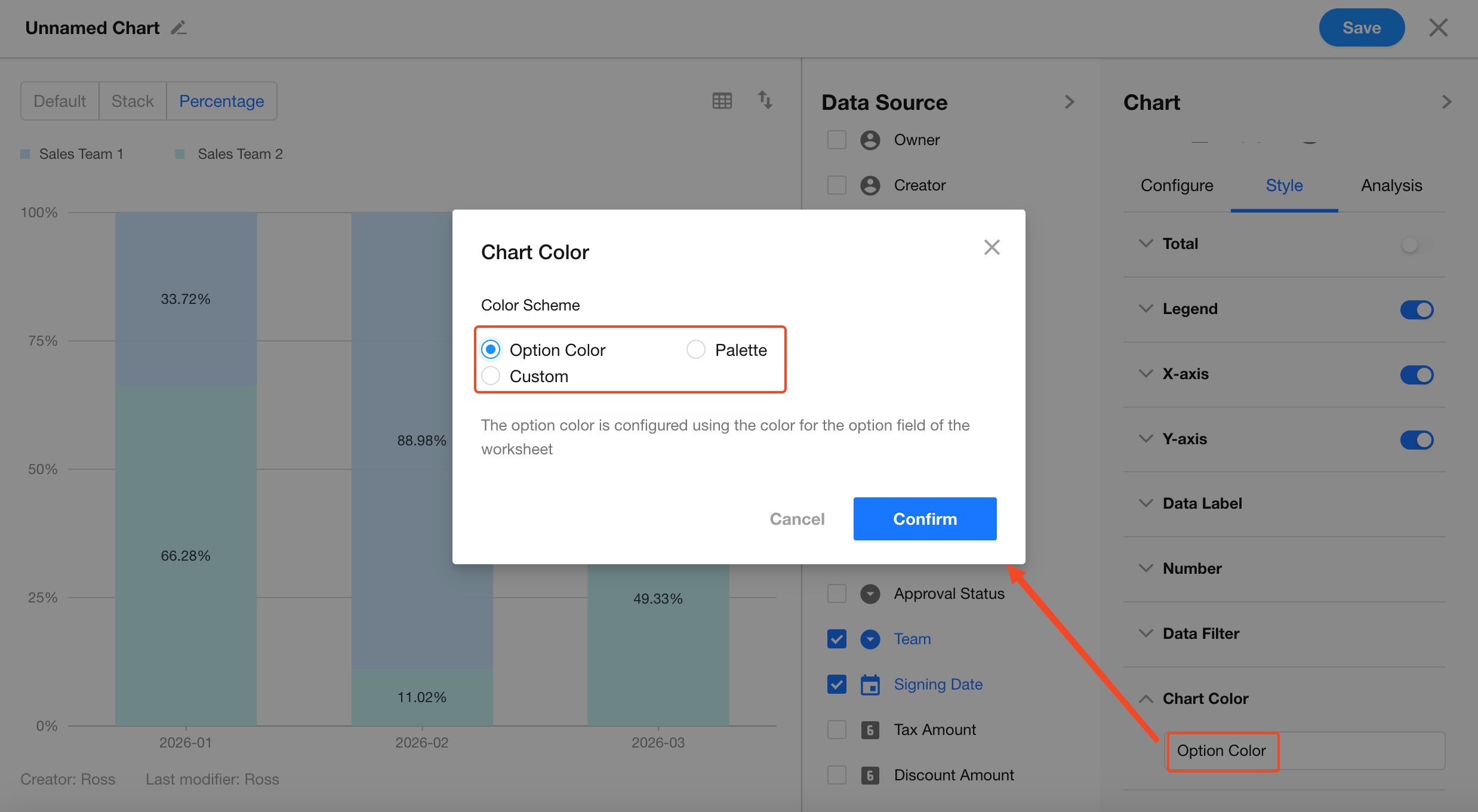
-
When the Y-axis of the bar chart contains an option field:
You can configure the color of each legend item under the dimension (default is the classic palette; click Custom to modify each legend color individually).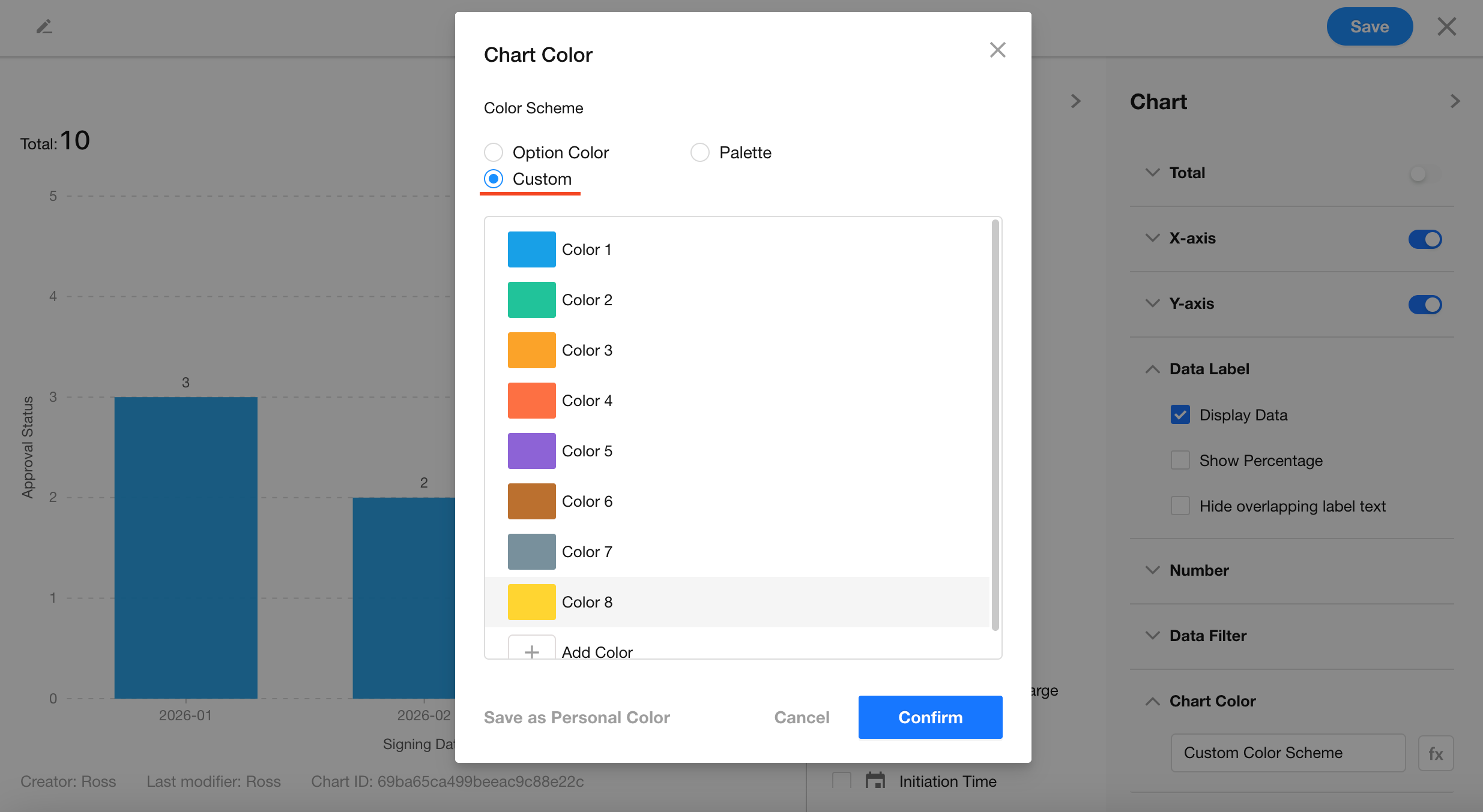
FAQ
-
Q: Why can’t I add grouping after setting values?
- A: If you add multiple fields under Value (for example, tracking both amount and profit), the system will automatically use metrics as grouping. In this case, you cannot add additional fields for grouping.
-
Q: At the beginning of a quarter, why are there no bars for months without data?
- A: In the value field settings, set Empty Value Display to Show as 0.
The chart will then display all months in the quarter, even if performance is 0.
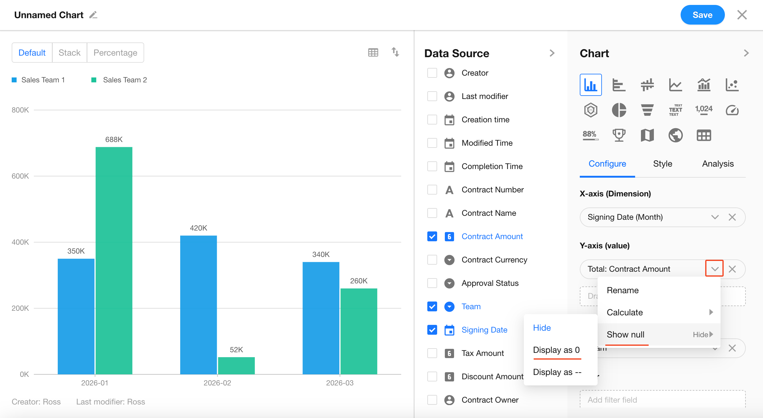
- A: In the value field settings, set Empty Value Display to Show as 0.
Was this document helpful?