Progress Bar
A progress bar provides a visual representation of a metric’s progress. It is typically used to show task completion, remaining workload, or estimated time needed. Progress bars are usually displayed as rectangular bars, conveying the ratio of completion to a target.
Below is an example of how to create a progress bar.
Example: Create a progress bar in the Orders worksheet to display the completion ratio of annual sales against the target
Data Scope: Filter records in the “Orders” worksheet where the "Signed Date" is within the current year
Value: Select the “Total Sales” field
Target Value: Set a static or dynamic value to compare against, making it easy to visualize the completion ratio
Chart Configuration
1. Create a New Chart
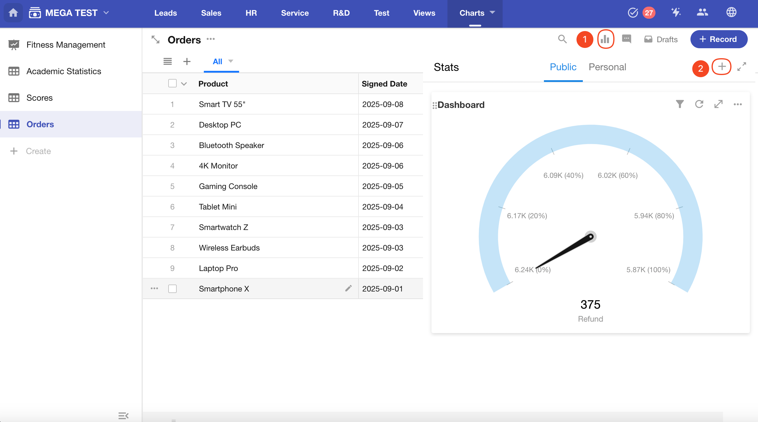
2. Define the Record Scope
Choose whether to analyze records from a specific view or from all records (default).
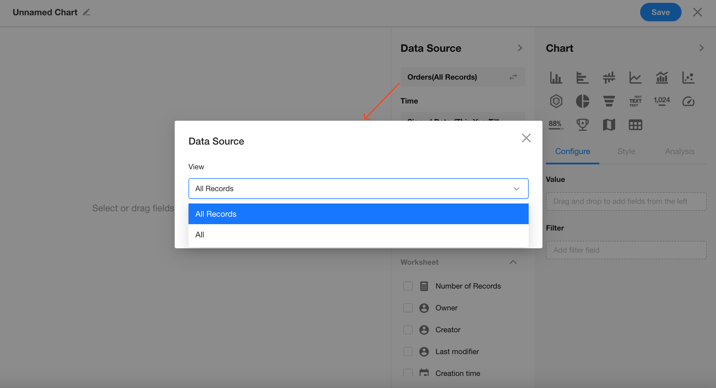
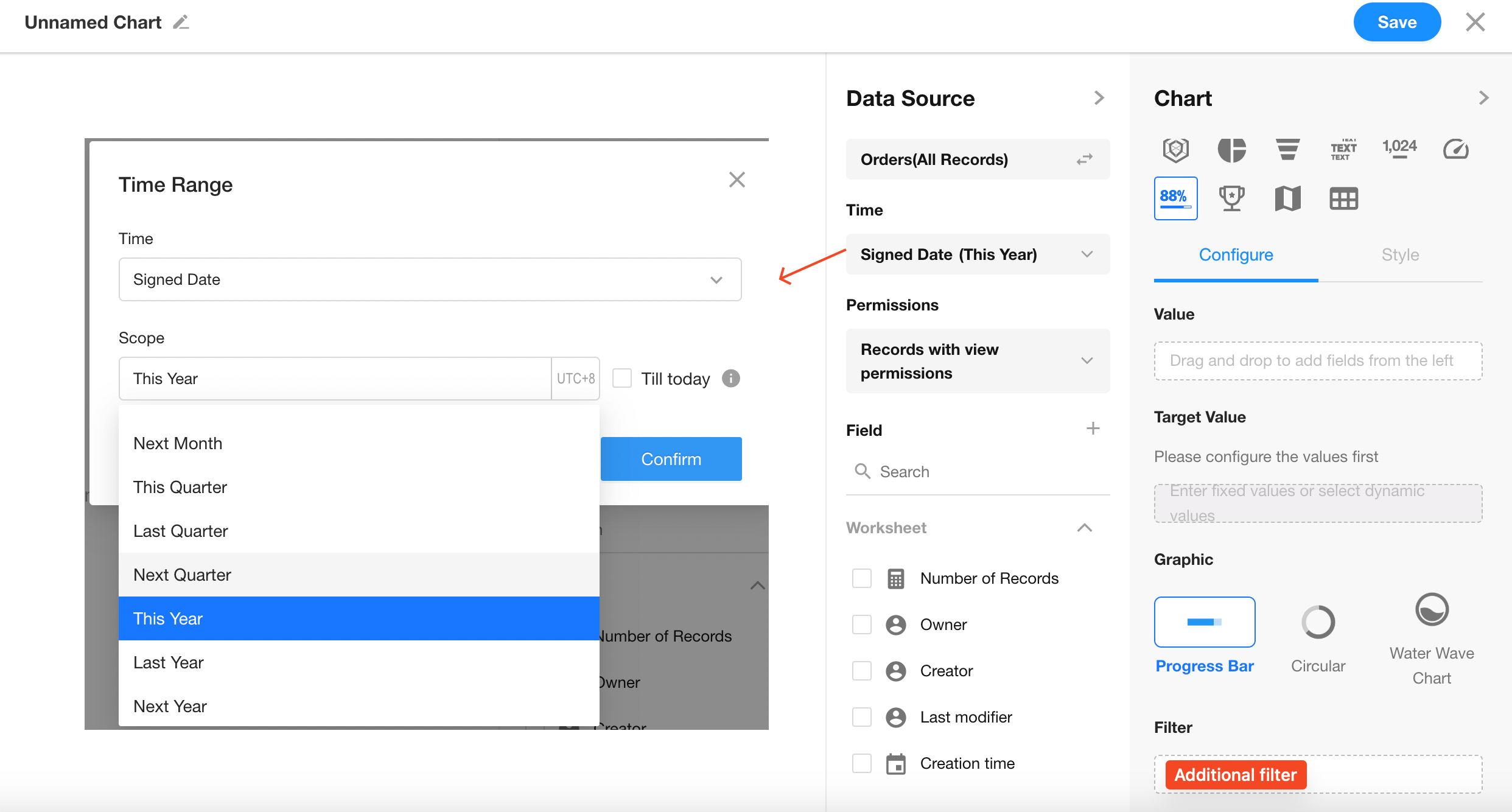
Apply a filter: “Signed Date” is within the current year.
You can add more conditions if needed.
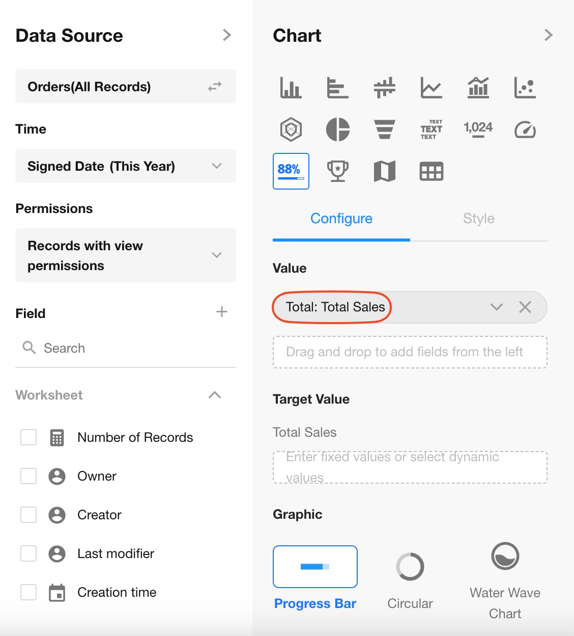
3. Set Value Field
Select the “Total Sales“ field.
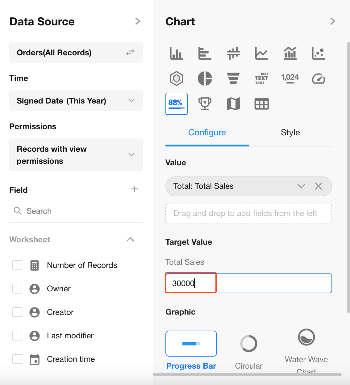
4. Set Target Value
Set the target manually or use a field from the worksheet as a dynamic reference.
Completion Ratio = Actual Value / Target Value × 100%
5. Choose Chart Style
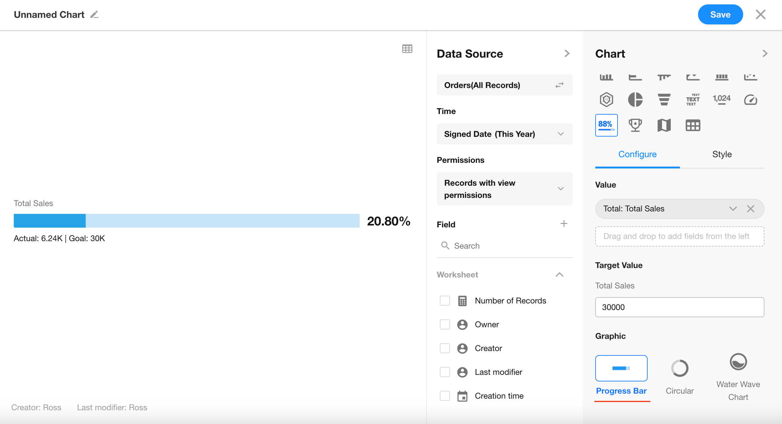
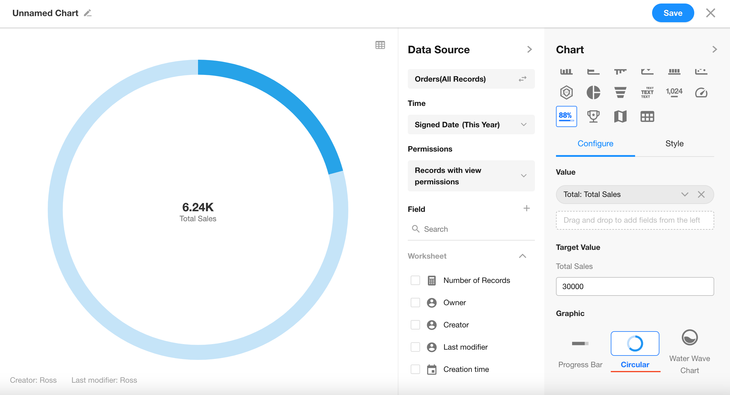
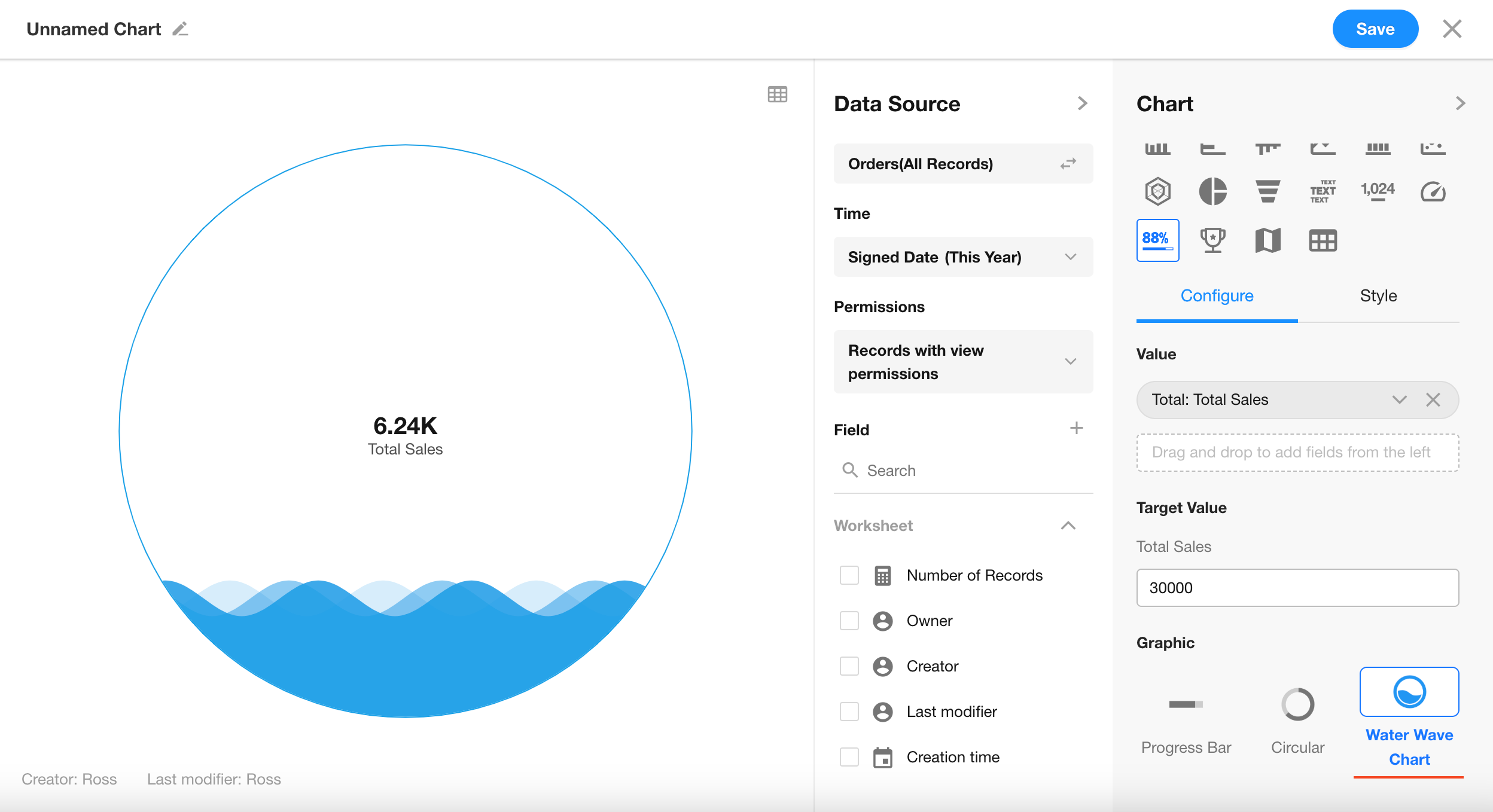
You can display the chart as a horizontal progress bar, circular ring, or liquid fill chart.
Click “Save” to finalize the chart configuration.
Additional Styling Options
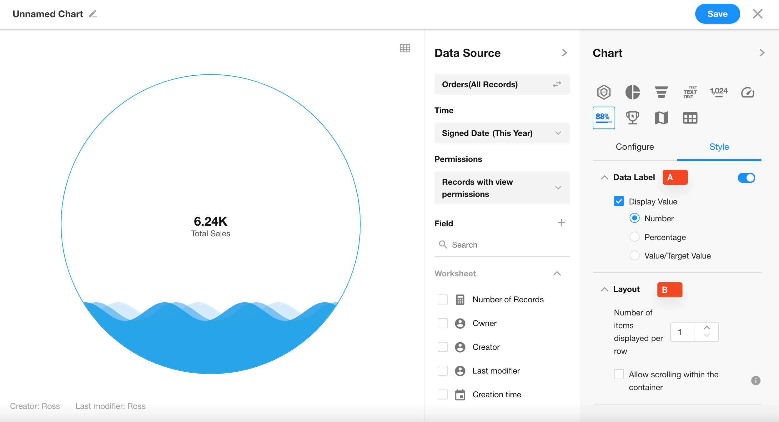
When using the progress bar style, you can only configure whether to display the value and target.
6. A: Data Label
Control whether values are displayed on the chart (enabled by default).
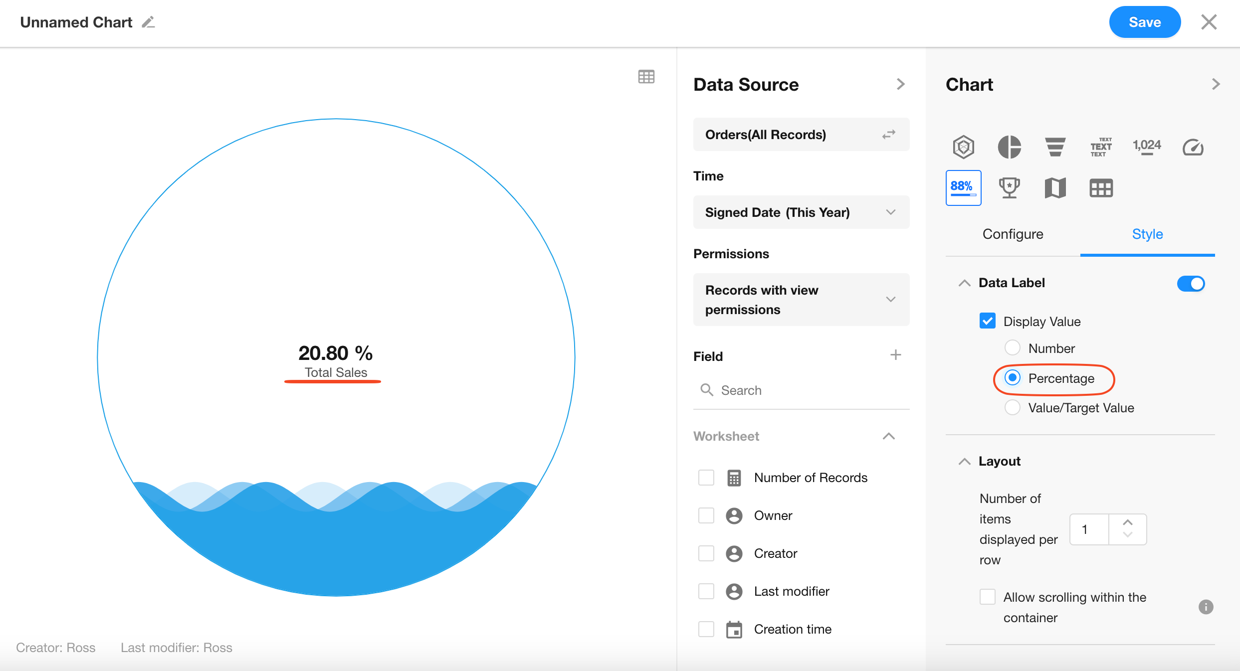
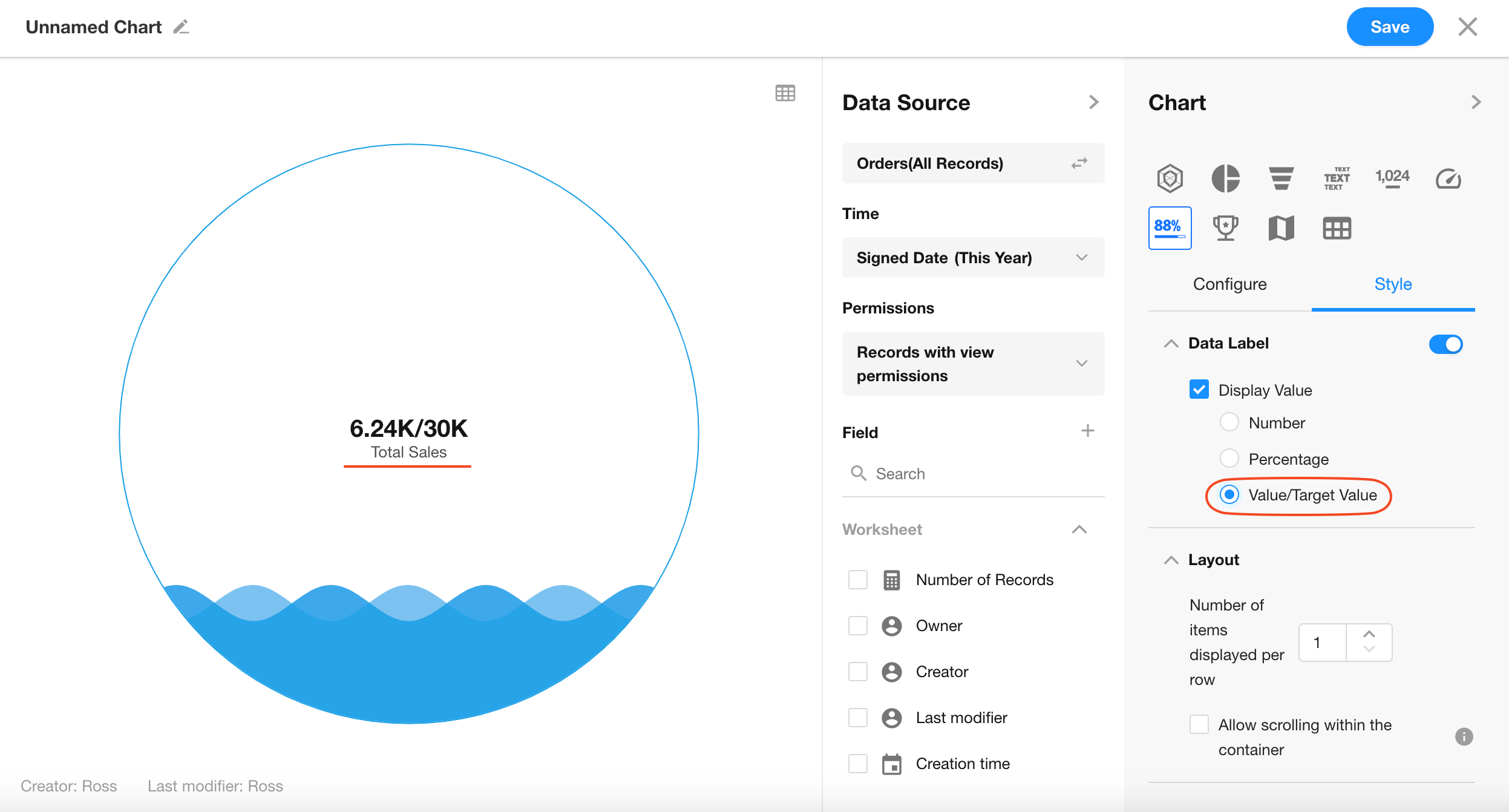
When values are shown, you can choose to display them as:
- Raw value
- Percentage
- Value/Target format
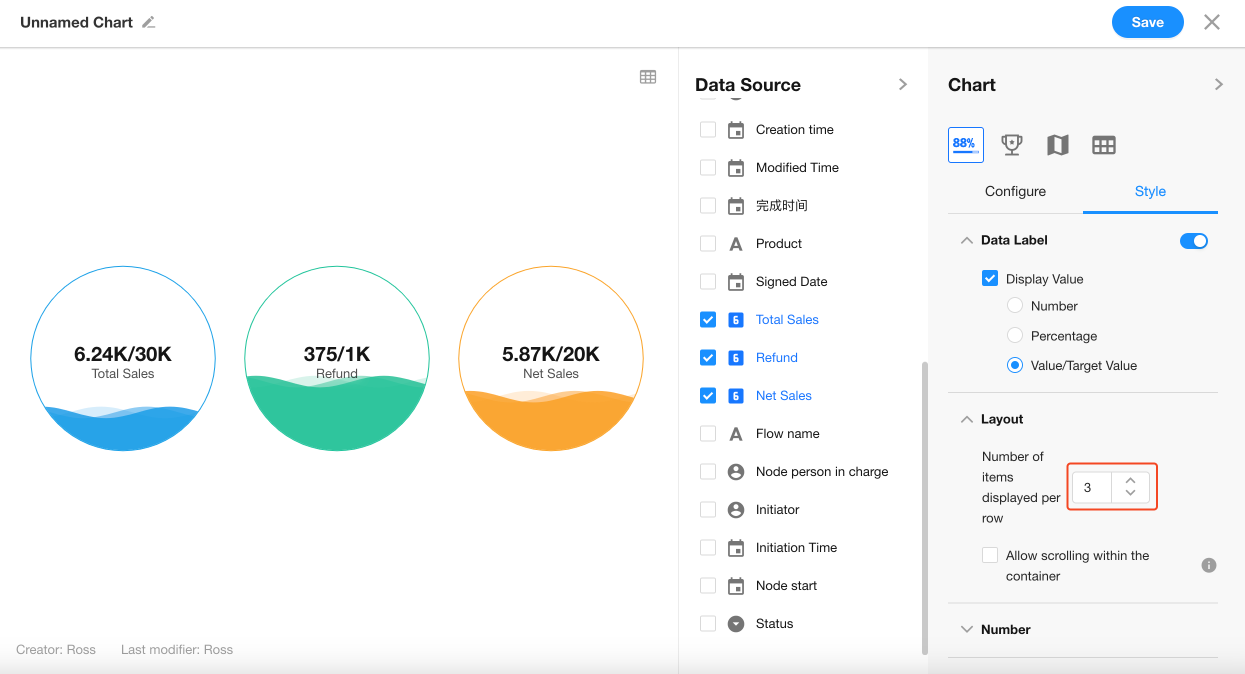
7. B: Layout
If multiple value metrics are selected, you can configure how many charts to display per row (maximum of 4 per row).
Was this document helpful?