Table View
The Table View is similar to an Excel spreadsheet, allowing records to be displayed and managed in a grid layout. When a new worksheet is created, a default table view named All is automatically generated, displaying all records and fields.
Table View Features
Common View Configurations
-
View Settings
- Data Filtering
- Link Parameter
- Sort
- Record Color
- Field Visibility
- Data Filtering
-
User Actions
- Quick Filter
- Filter List
- Custom Action
Table View-Specific Features
- Common Table Operations
- Column Display
- Mobile Display Configuration
Configuration Example
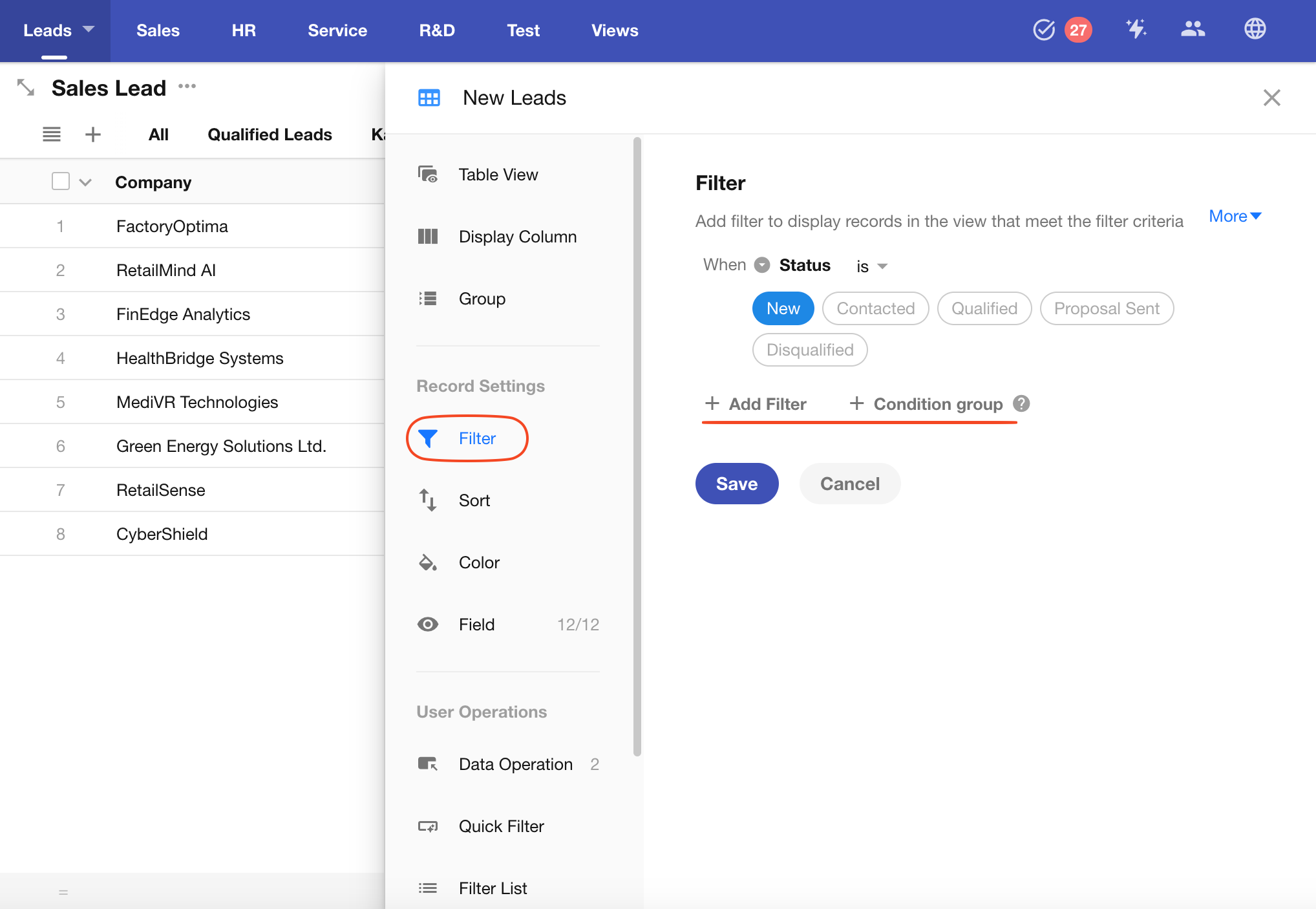
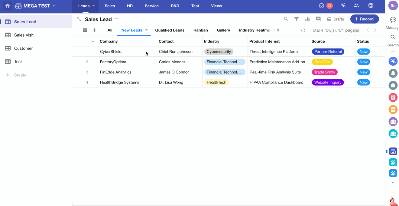
In a Sales Leads worksheet, you can create a new view called New Leads, which only displays records marked as new.
Common View Settings
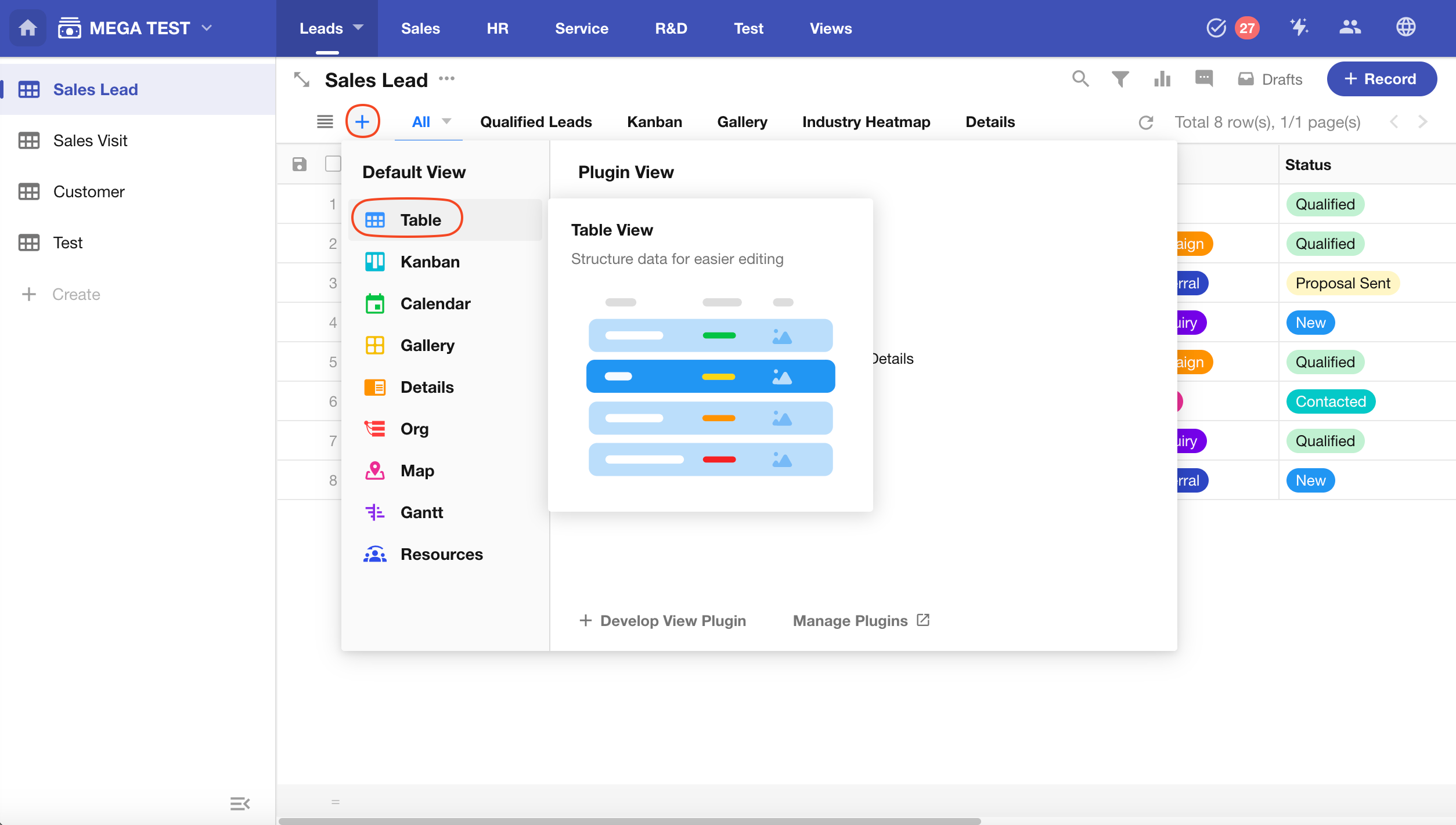
Creating a New View
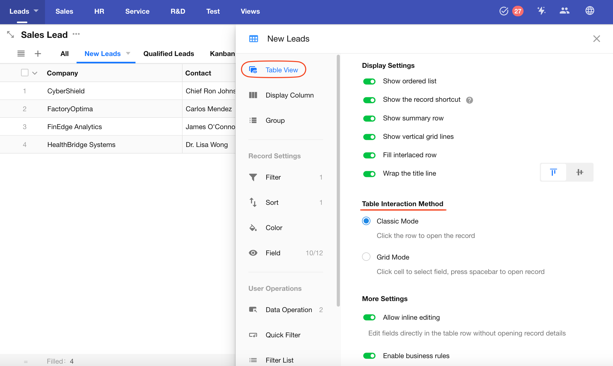
Click the + button and choose Table View as the view type. The view configuration panel will slide out on the right.
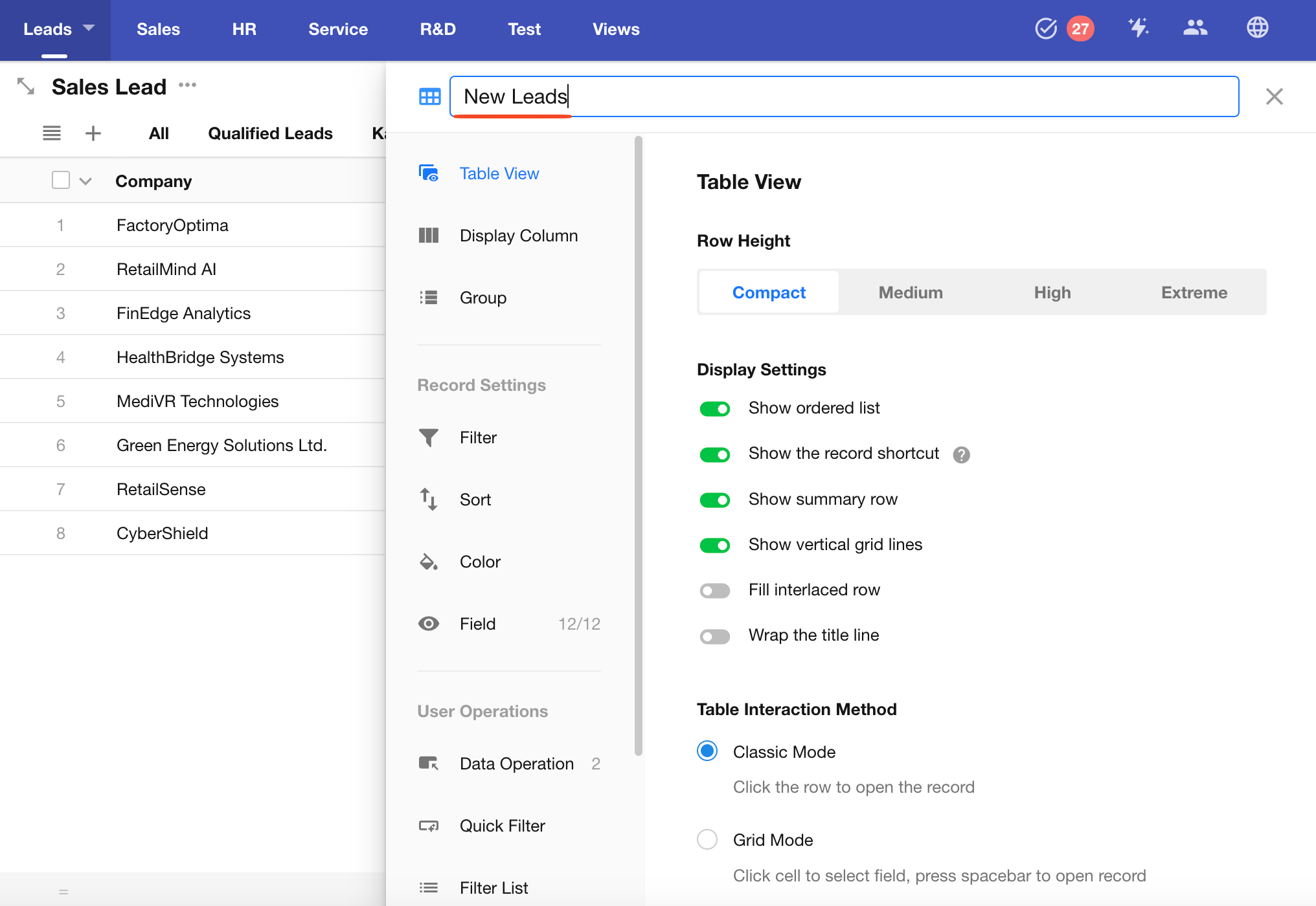
Set the View Name
Edit the view name at the top of the configuration panel.
Configure Data Filters
Use filters to show only relevant records in the view. Records not matching the criteria will be hidden. When a record is updated and meets the criteria, it will automatically appear in this view; if it no longer matches, it will disappear.
-
Add a Filter
Select a field → Choose a comparison operator → Set a target value
-
Condition Groups
Multiple filter conditions can be configured.
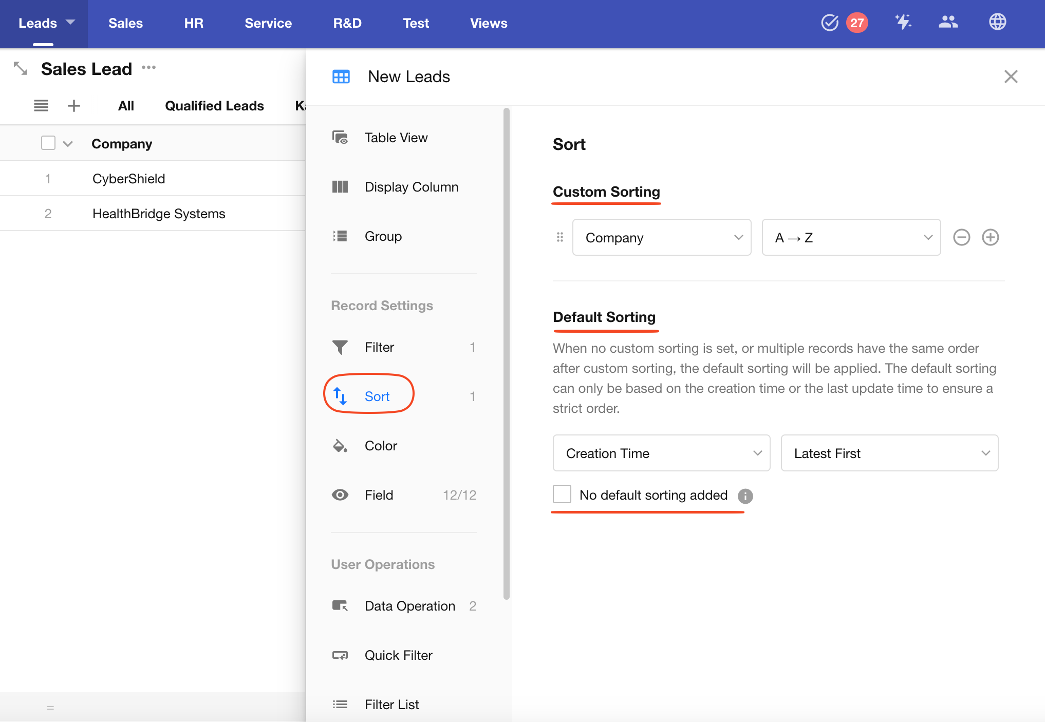
Configure Record Sorting
-
Custom Sorting
Define custom sort orders to display records based on specific business needs. You can add multiple sort fields.
-
Default Sorting
If no custom sorting is set, or multiple records have the same values in custom fields, the system will fall back to default sorting by Created Time or Last Modified Time to ensure a stable sort order.
-
No Default Sorting Added
If your custom sort configuration already ensures a strict order (e.g., via index), you can choose No default sorting added.
⚠️Warning: Disabling default sorting without a strictly ordered custom sort may result in missing or duplicated records when paginating.
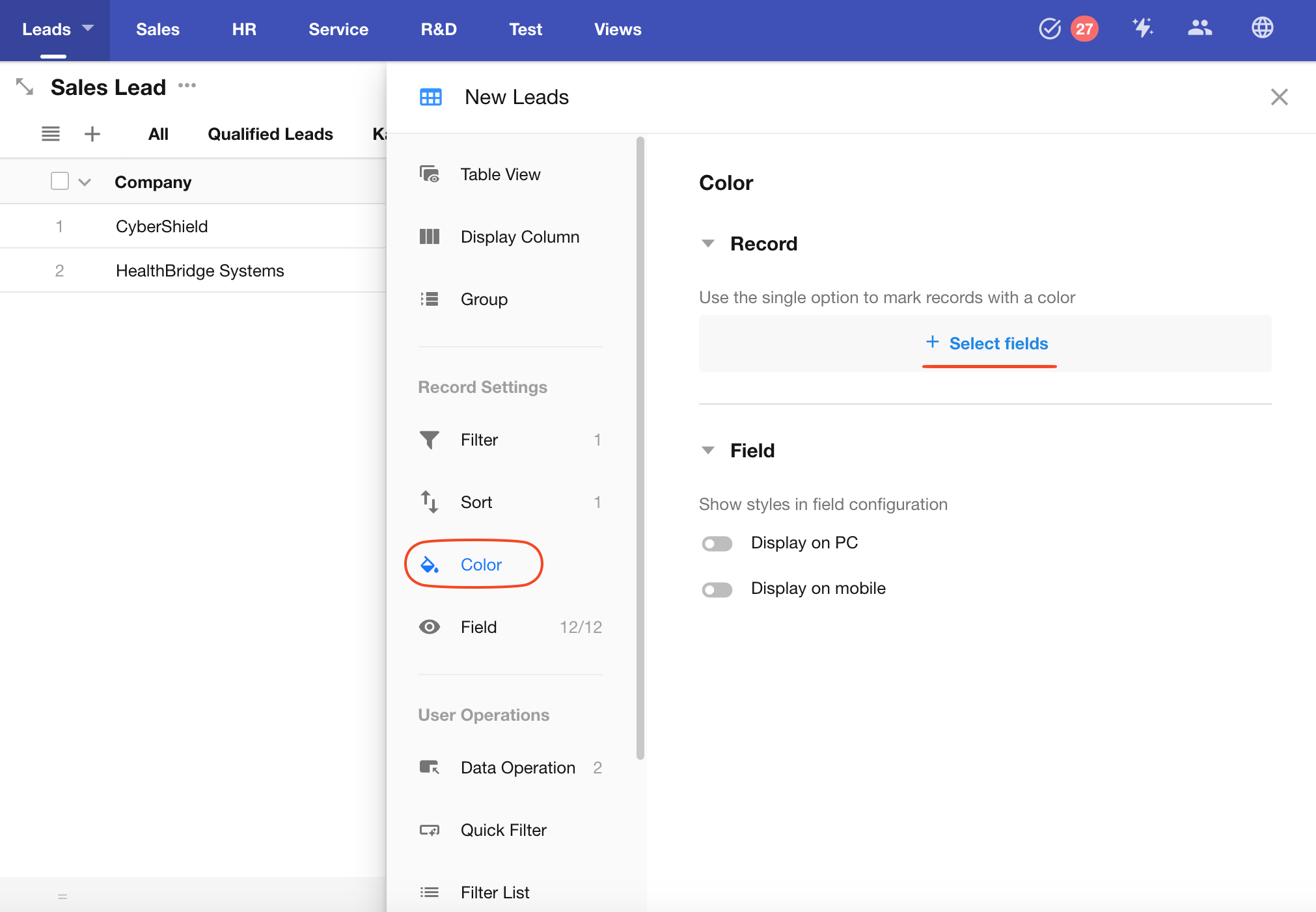
Record Color
You can use the option color from a Single Select field to highlight records, making it easier to identify different statuses.
-
Select a Single Select Field
The field must have color settings configured for its options.
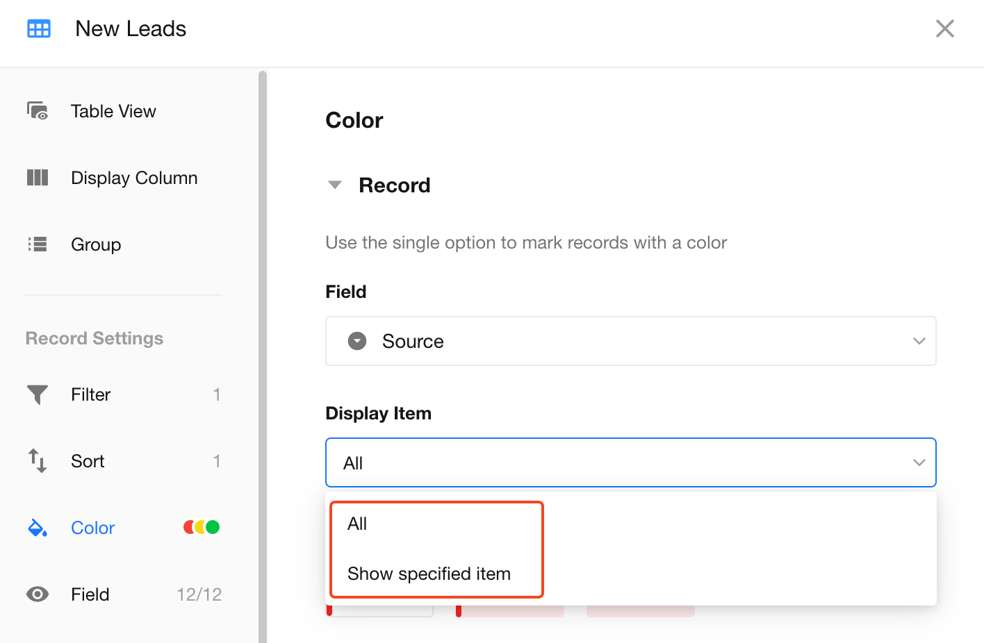
-
Specify Which Options to Display with Color
By default, all records will be colored based on their option. However, if you only want certain records to be highlighted with option color, you can configure which options to display.
For example, if you specify "Male" as the only colored option:
-
Records with the "Male" value will show the corresponding color
-
Records with "Female" or blank values will not be color-highlighted
-
-
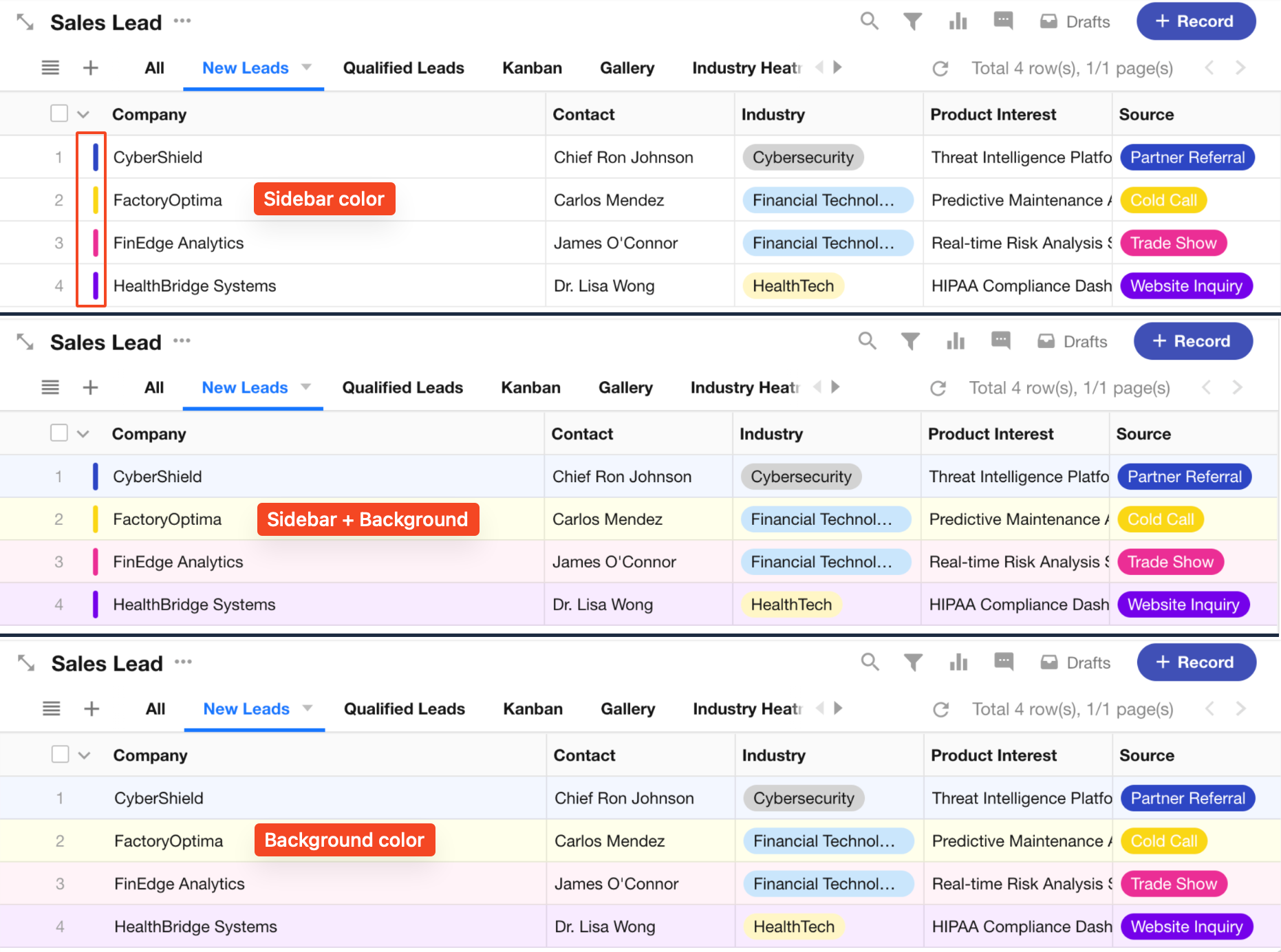
Color Display Styles
There are 3 display modes: Sidebar, Sidebar + Background, and Background Only.
Sidebar mode uses the full color; background mode uses a lighter tone.
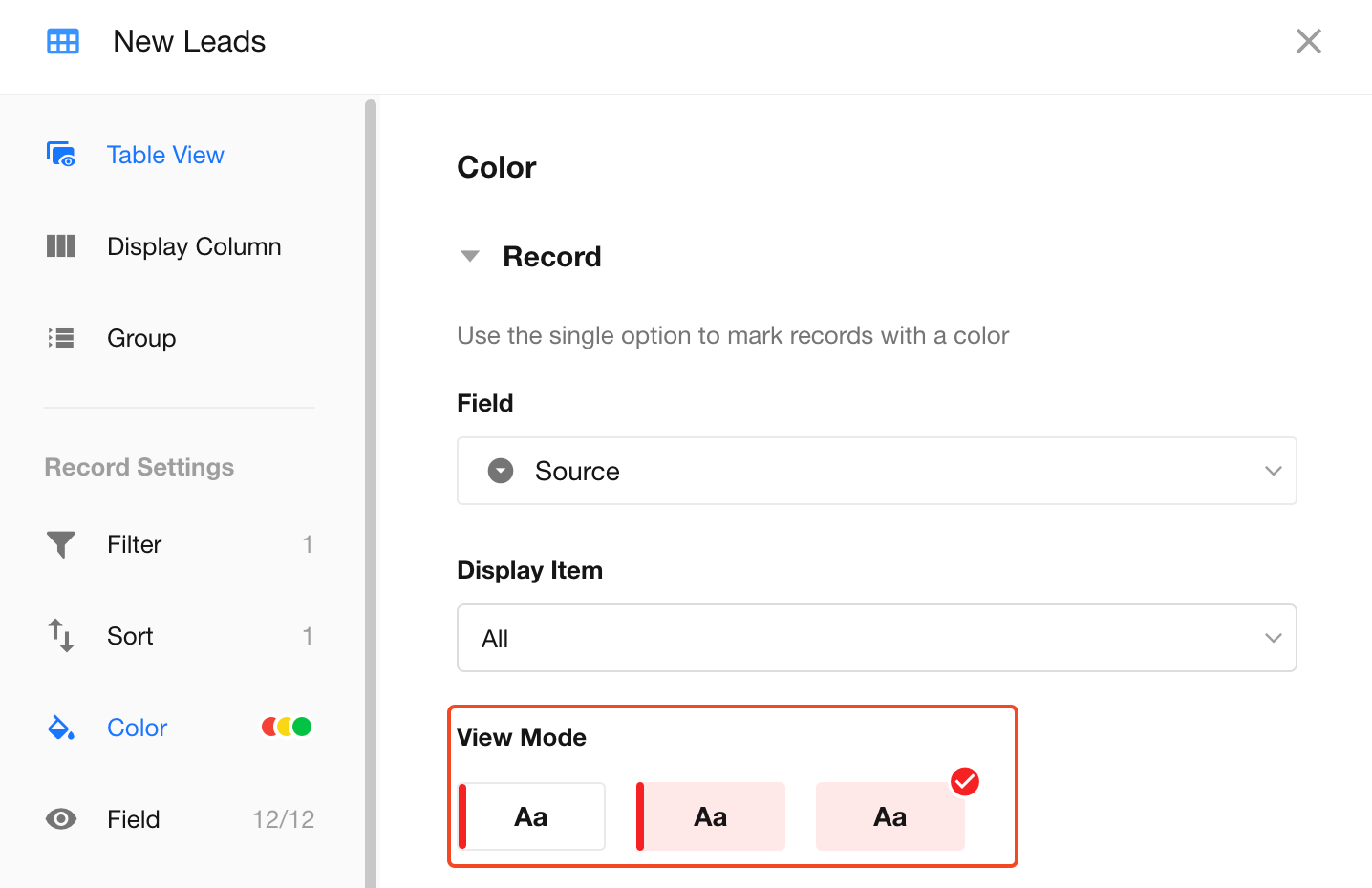
Display Example:
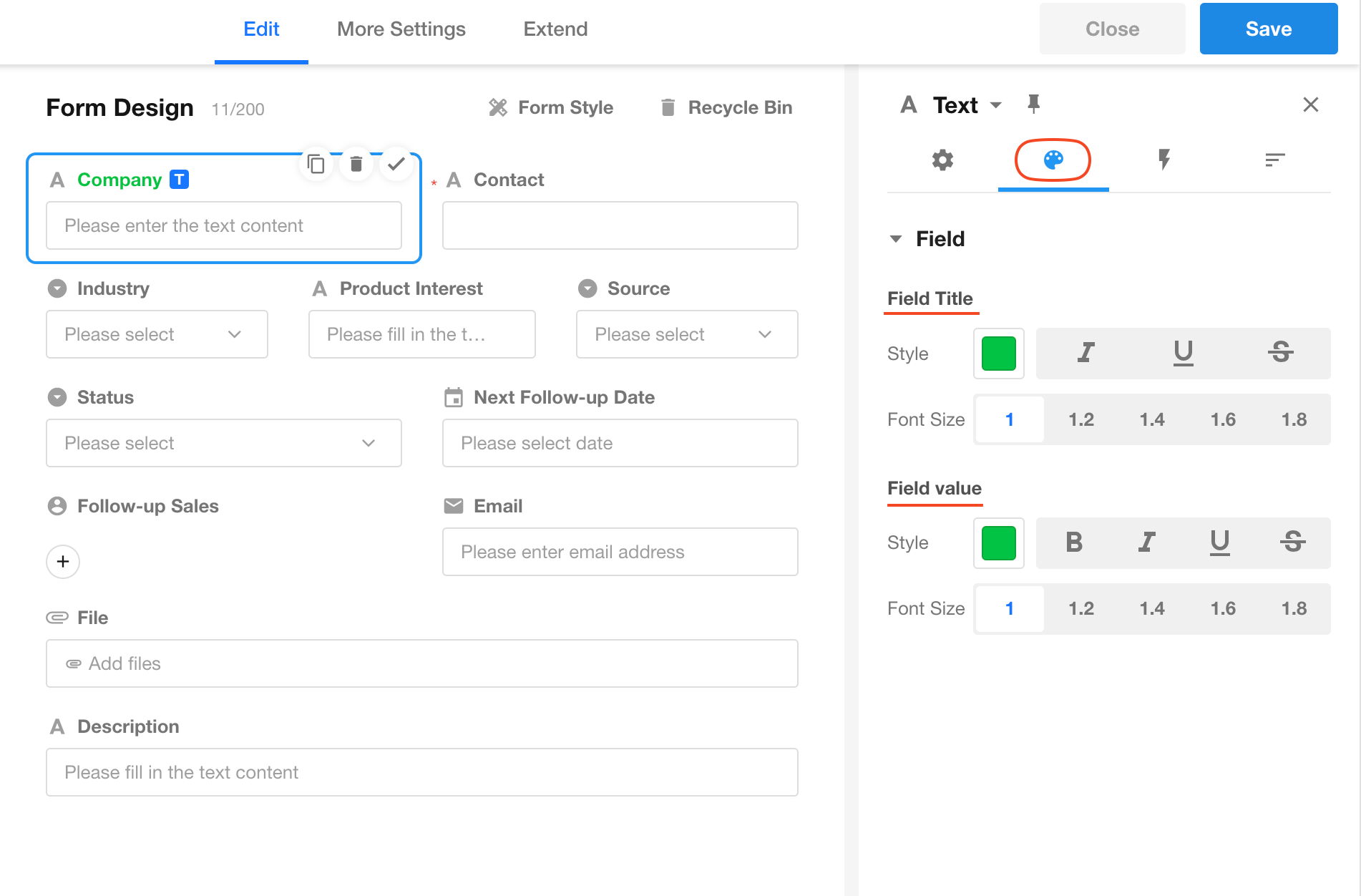
Field Style and Color
You can configure individual field name and value colors/styles in the form editor. Then, choose whether to apply those styles in the view:
-
Enable Show on PC to apply the field styles on desktop views.
-
Enable Show on Mobile to apply them on the App or H5 record cards.
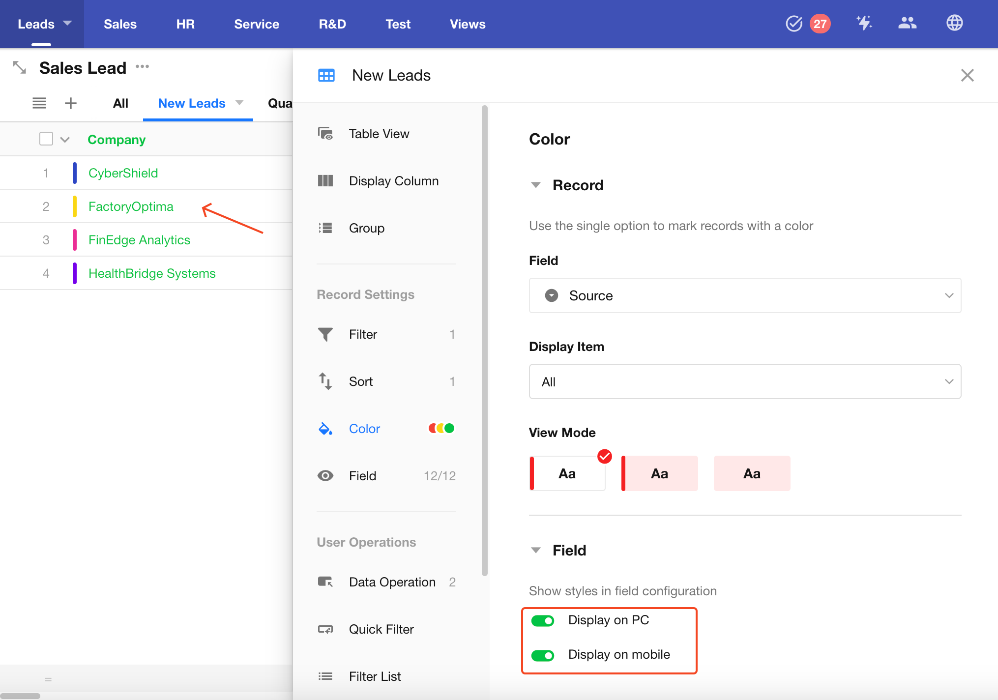
The style is configured in the field's Style settings:
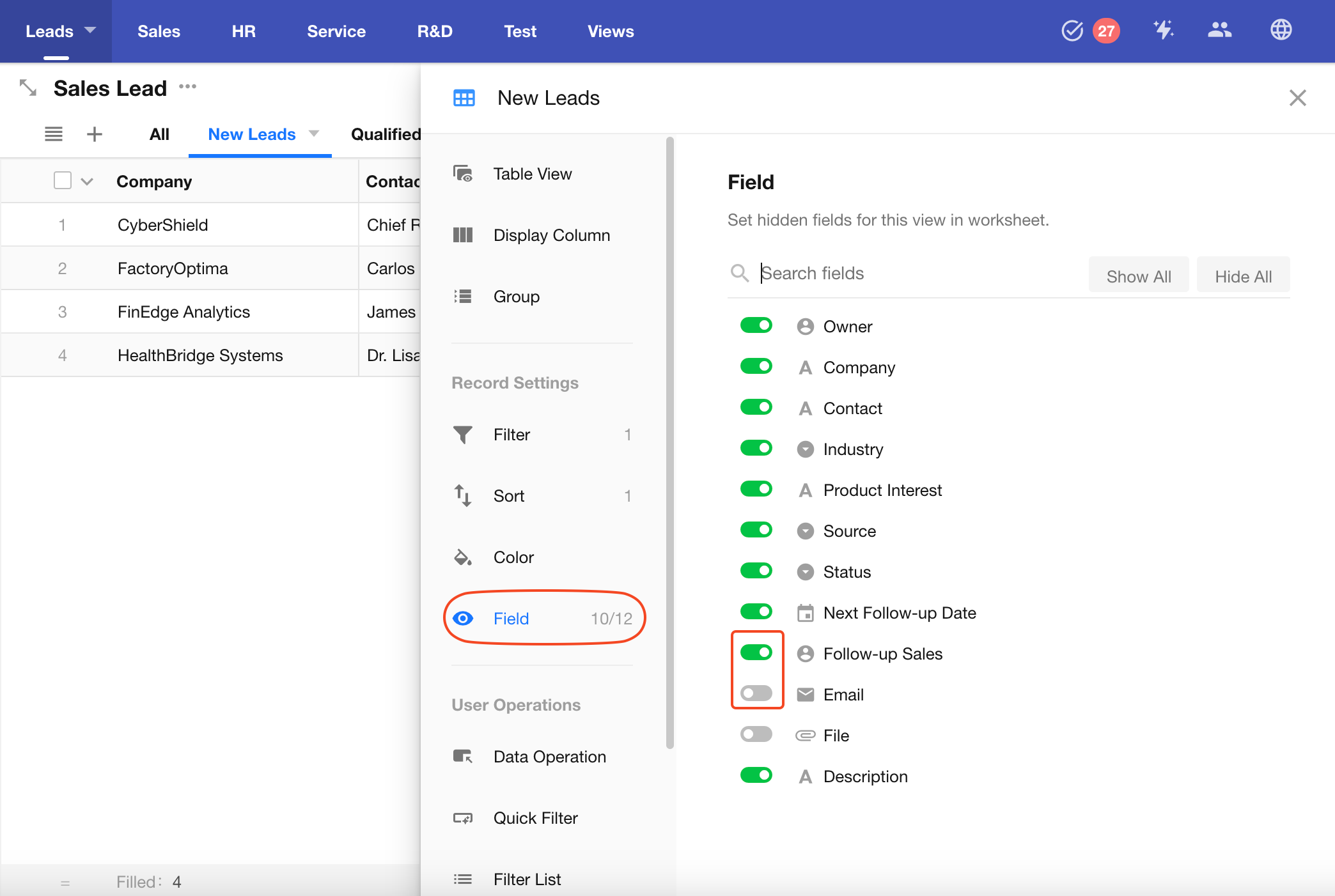
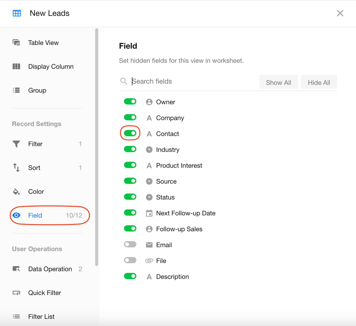
Show/Hide Fields
You can hide unnecessary fields in the view. Hidden fields will not appear in the record list or the record details page when accessed from the view.
How to Hide Fields:
Toggle the switch in front of each field name. Blue = visible, Gray = hidden. You can search to quickly locate and toggle fields.
Hidden fields are displayed at the bottom of the list.
For example, "10/12" indicates that 10 out of 12 fields are visible, while 2 are hidden.
Auto Refresh
You can enable auto-refresh for the view, so it periodically updates to display the latest data.
- Minimum interval: 10 seconds
- Maximum interval: 5 minutes
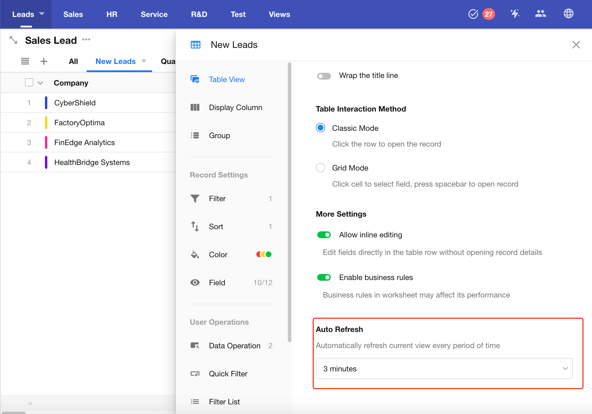
Table View-Specific Configurations
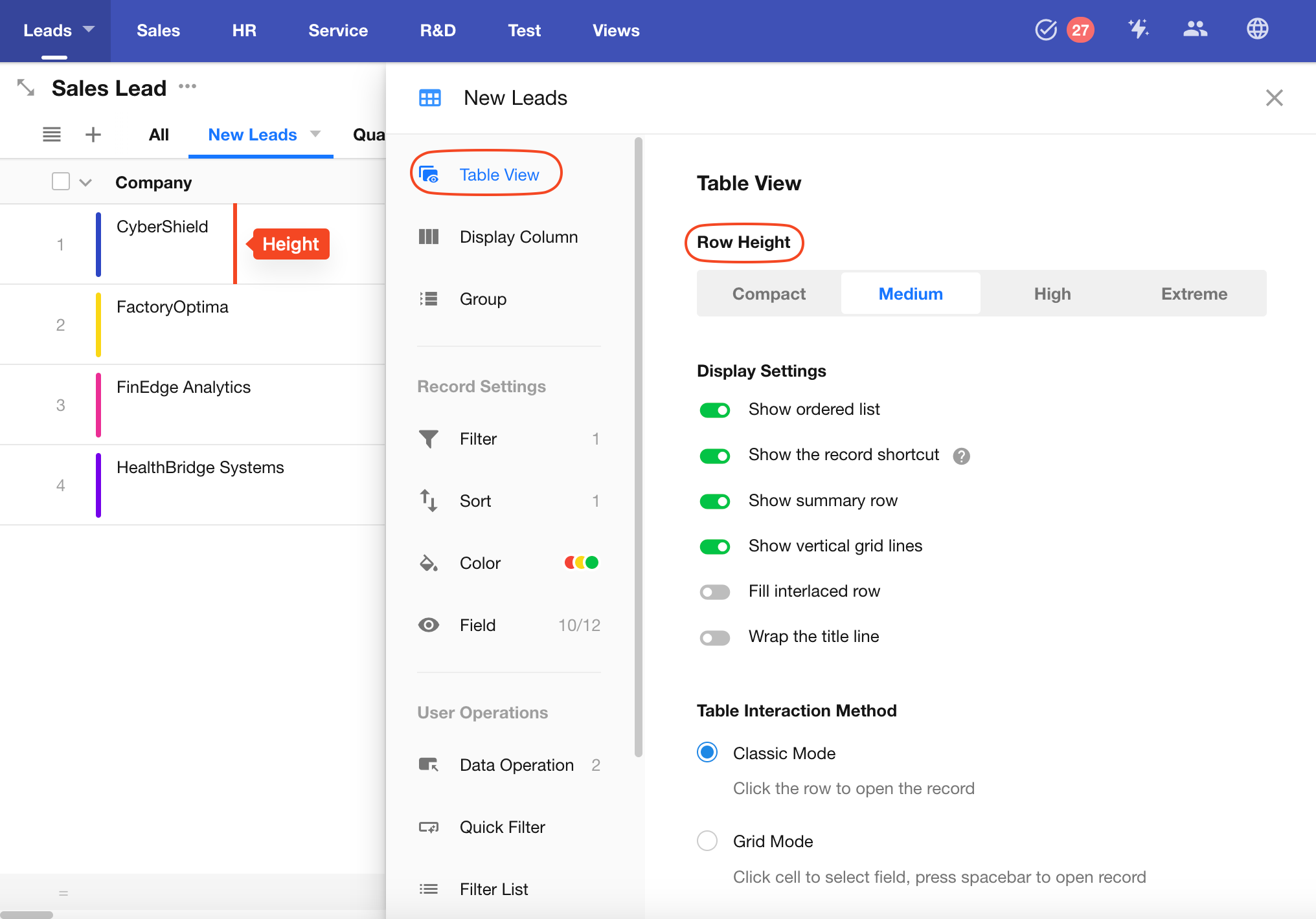
Set Row Height and Column Width
-
Adjusting Row Height
-
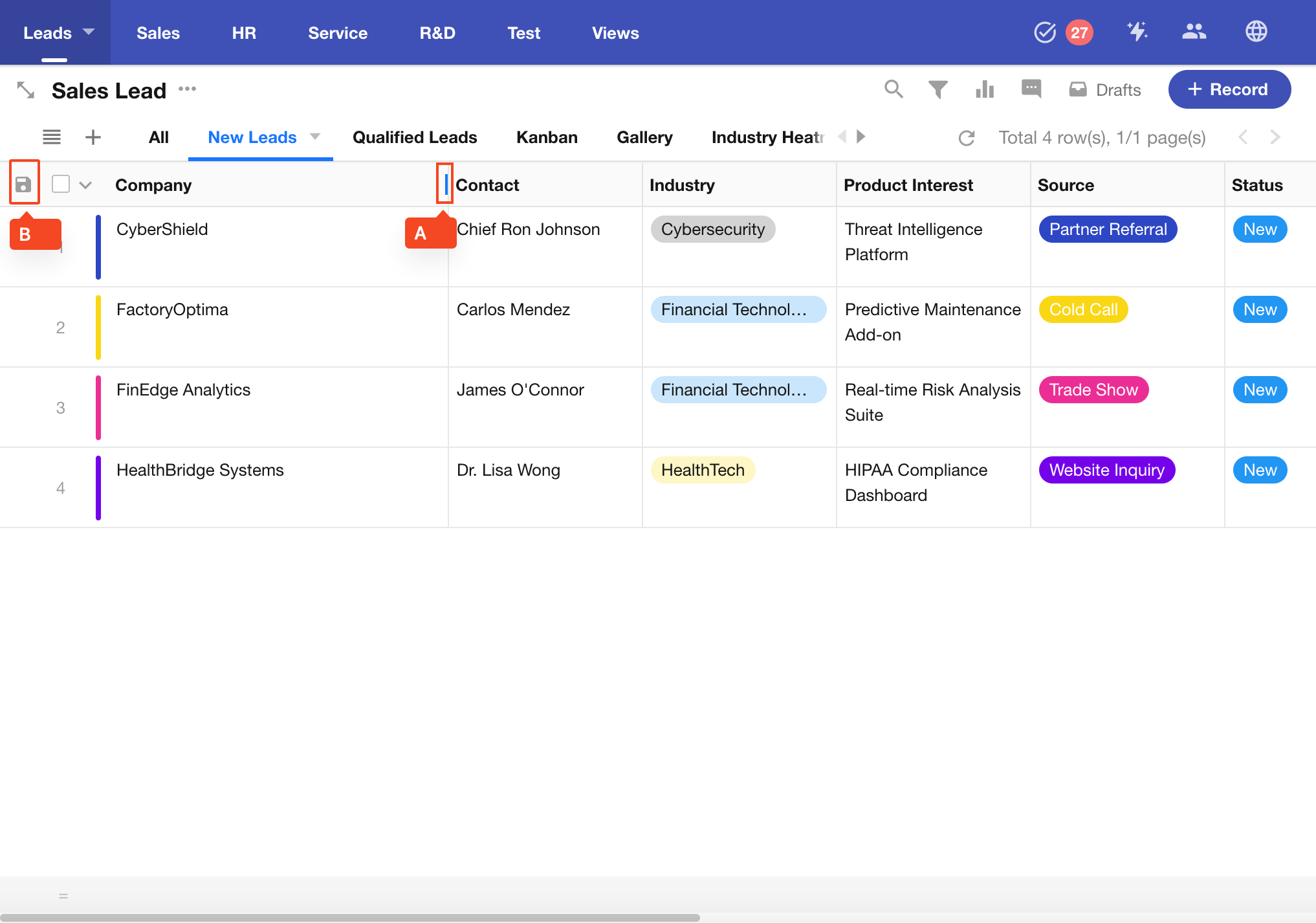
Adjusting Column Width
For example, to adjust the column width of the Company field, hover your mouse over the right border of the field (Position, point A) until the cursor changes to a horizontal resize icon. Then drag left or right to resize.
If an App Admin makes the adjustment and clicks the Save button (point B), the changes will apply to all users. If a non-admin user adjusts the width, the change is only temporary and won't be saved.
You can also configure column width under Batch Column Style Settings.
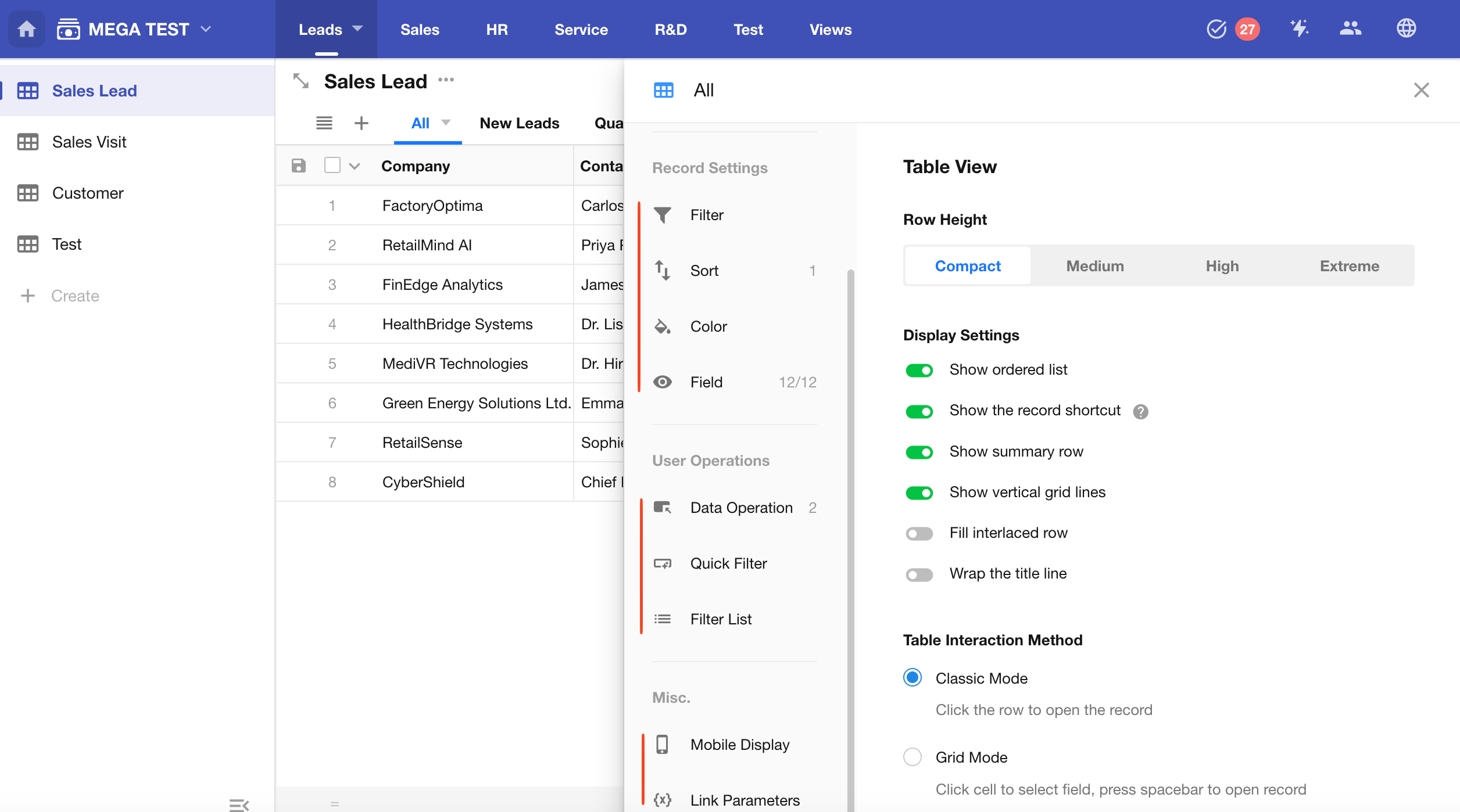
Display Settings in Table View
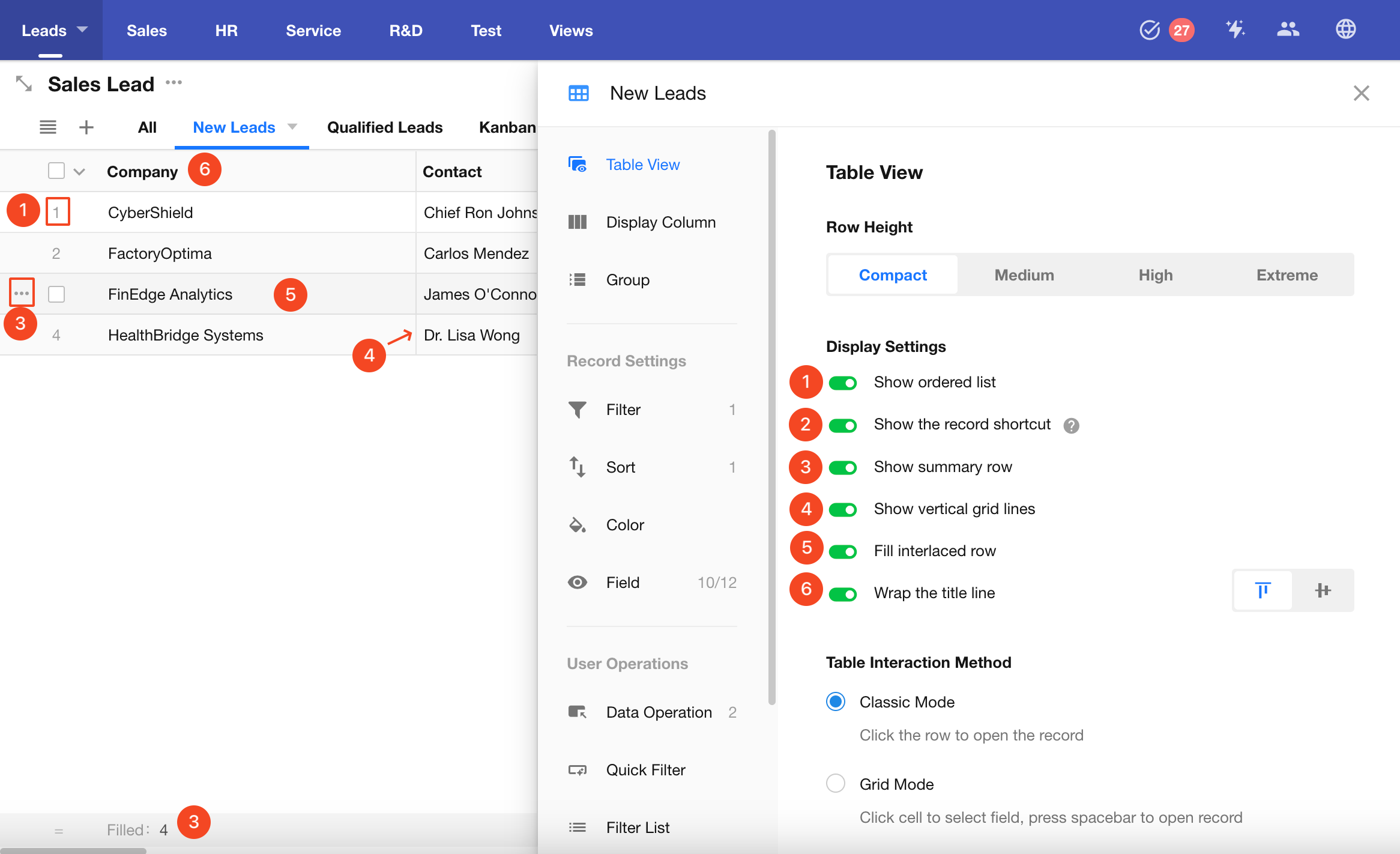
-
1) Show Row Numbers
This displays the current row index based on the configured sorting order.
-
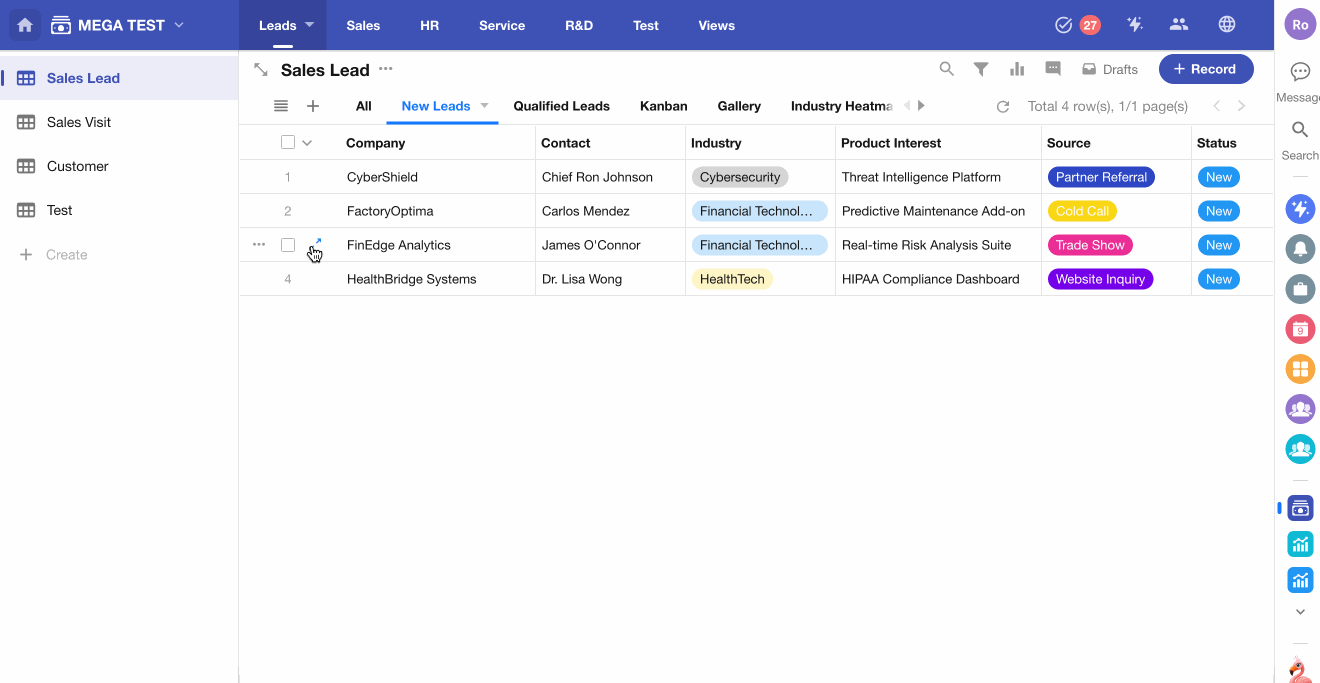
2) Show Record Quick Actions
When hovering over a record, a "More" button appears on the left side. Click it to quickly access actions like share, copy, or delete.
-
3) Show Summary Row
A summary row will appear at the bottom of the view to aggregate values from each column.
-
4) Show Vertical Grid Lines
Toggles the visibility of vertical gridlines between columns.
-
5) Show Alternate Row Colors
Enables alternating background colors for rows, improving readability. When disabled, all rows use the default background.
-
6) Enable Title Line Wrapping
If field names are too long, enable wrapping to reduce column width. When wrapping is enabled, you can align the text as top-aligned or vertically centered.
Interaction Modes for the Table
Table views support two interaction modes: Classic Mode and Grid Mode.
-
Classic Mode (default)
- Open Record Detail: Click any cell to open the record's detail page.
- Quick Edit: Hover over a cell and click the Edit button to modify the value.
-
Grid Mode
-
Open Record Detail: Hover over a record to display the Expand icon on the leftmost column. Click it to open the detail page, or press the Space after selecting a cell.
-
Quick Edit: Click once to select the cell, then:
- Use arrow keys to navigate between cells.
- Press Enter or click again to activate edit mode.
- For single select fields, use arrow keys to choose options.
-
Inline Editing
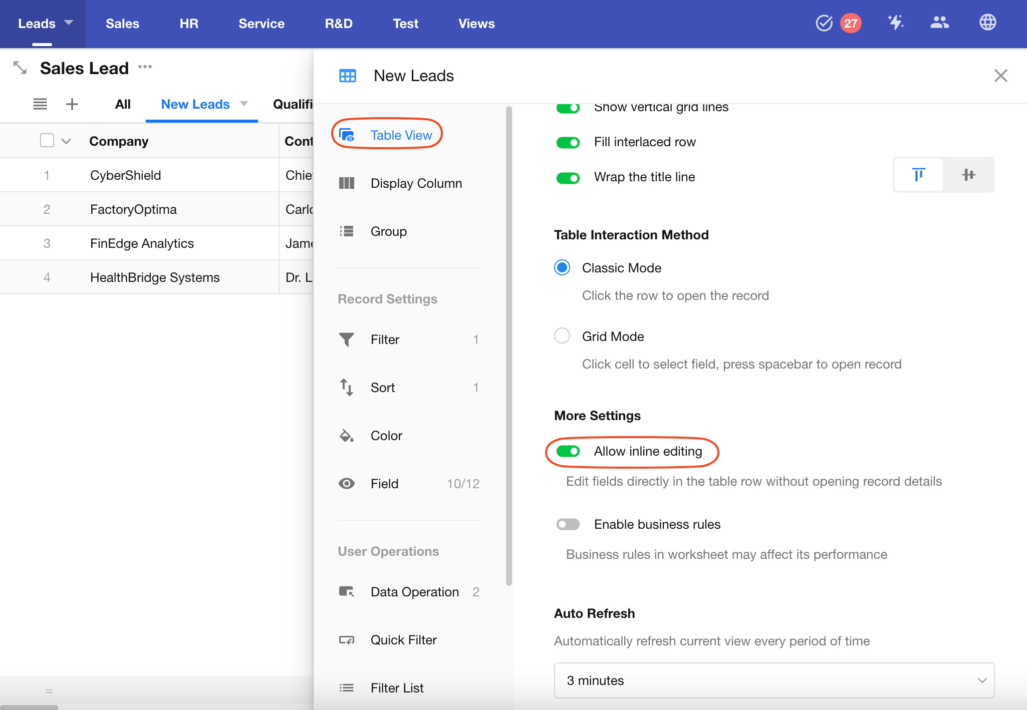
Inline editing allows users to directly modify field values within table cells, without opening the record's detail page.
When you hover over a cell, an Edit button will appear. Click it to modify the field directly.
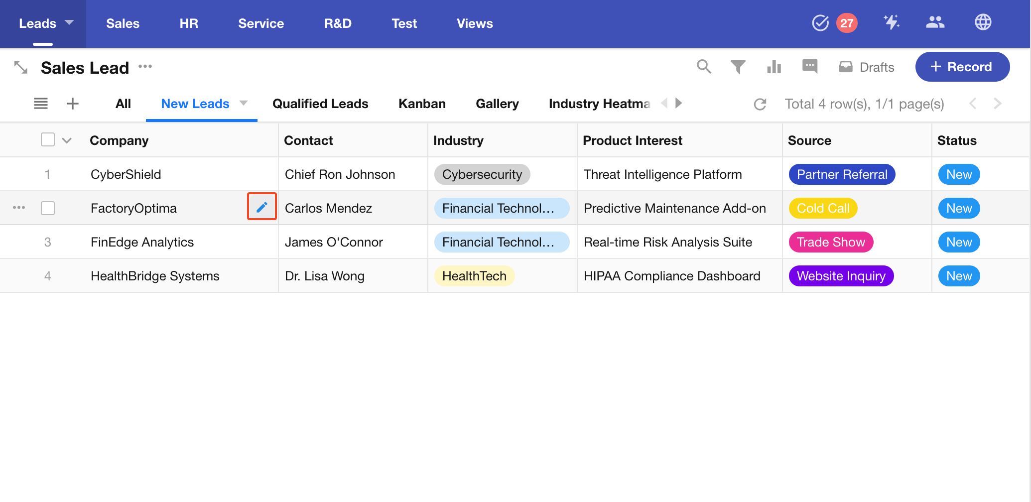
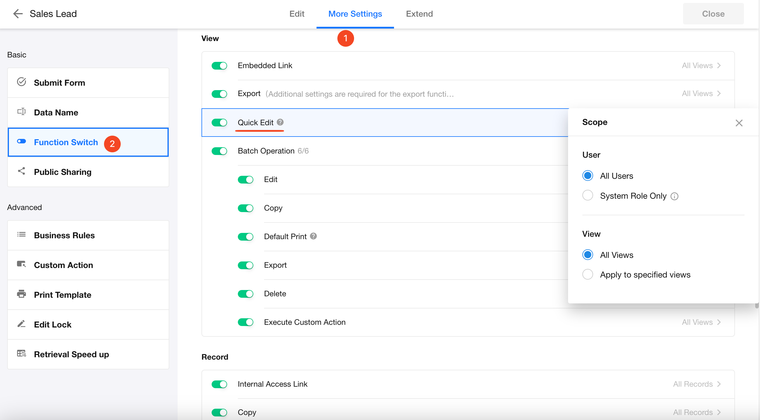
This setting can be toggled both in view configuration and in function switch. If the two settings conflict, the feature will be disabled.
If inline editing is not available, it may have been disabled by the App Admin, or your user role does not have permission.
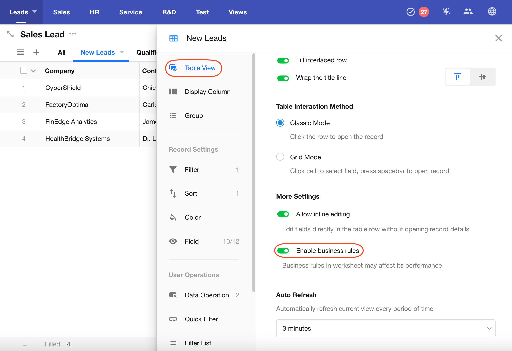
Enable Business Rule
When enabled, business rules configured for the worksheet will also apply during inline editing in the table. However, enabling this may affect performance.
Business rules are always enforced when editing records through the detail page.
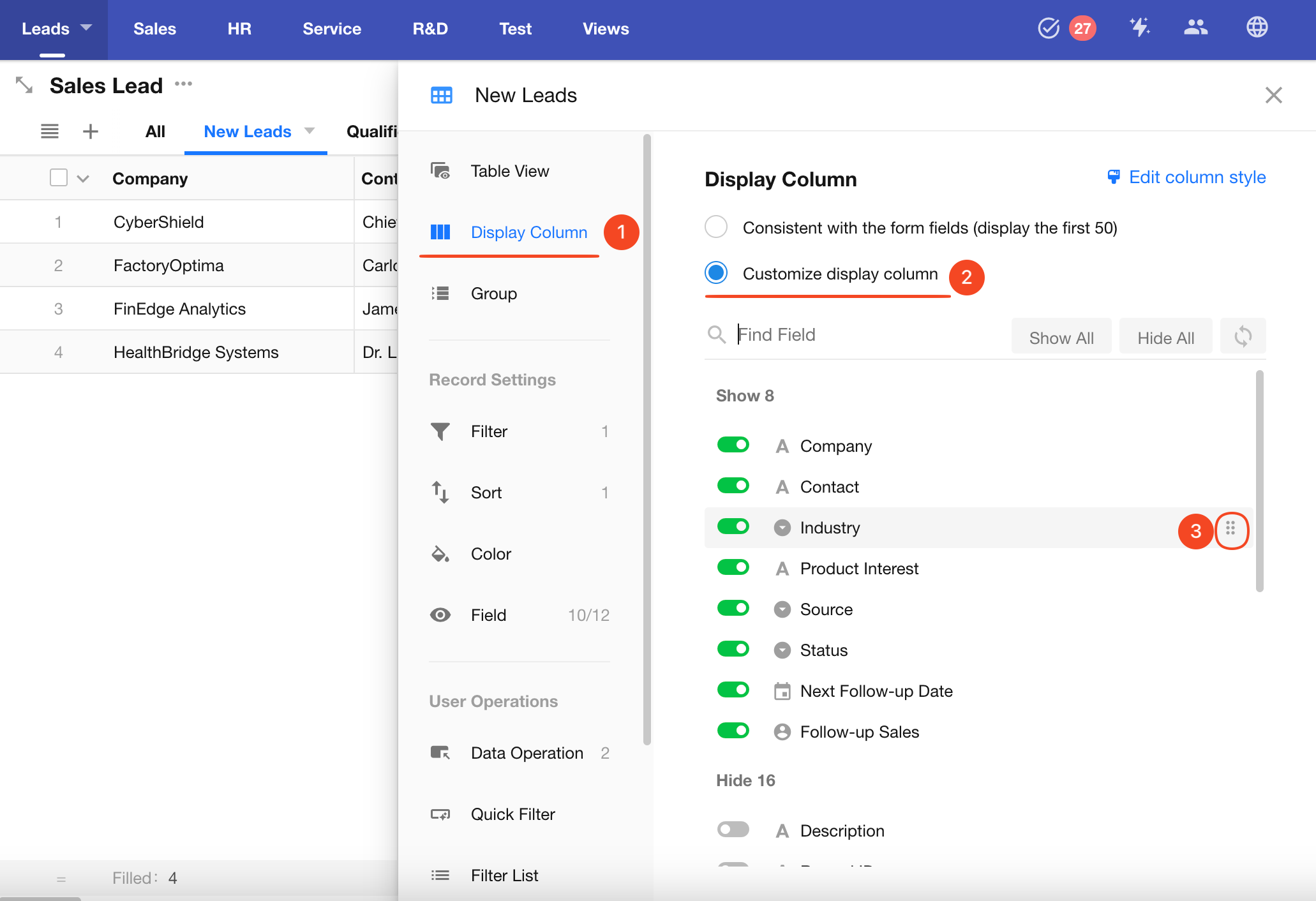
Display Column: Configure Column Visibility and Style
A worksheet may contain many fields, but in most cases, only a few key fields need to be displayed in the table. Users can open the record detail page to view additional fields. This keeps the table concise and allows users to focus on key information.
For example, if a Sales Lead worksheet has 50 fields, the New Leads view might only show 9 important fields. Users can view other fields by opening the detail page.
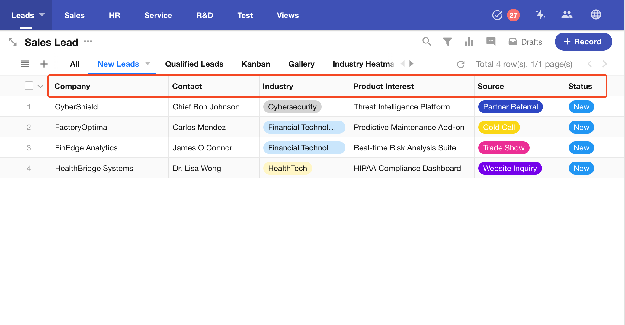
Prerequisite: Field Must Be Set as Visible
Only fields marked as visible in the Field section of the view configuration can be shown in the table.
Two Display Column Modes
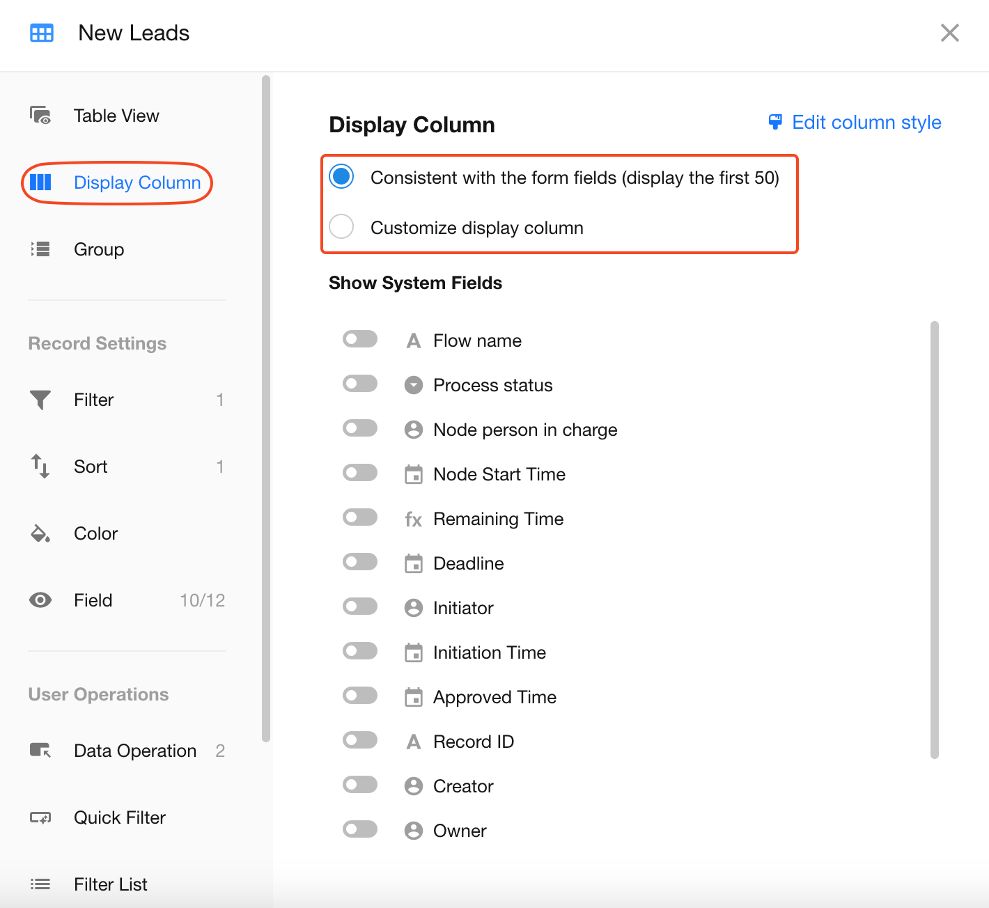
1) Consistent with the form fields
This option displays all visible fields configured in the Field section of the view. You can also add up to 6 system fields (Owner, Record ID, Creator, Last Modified By, Created Time, Last Modified Time).
Note: This mode only shows the first 50 fields.
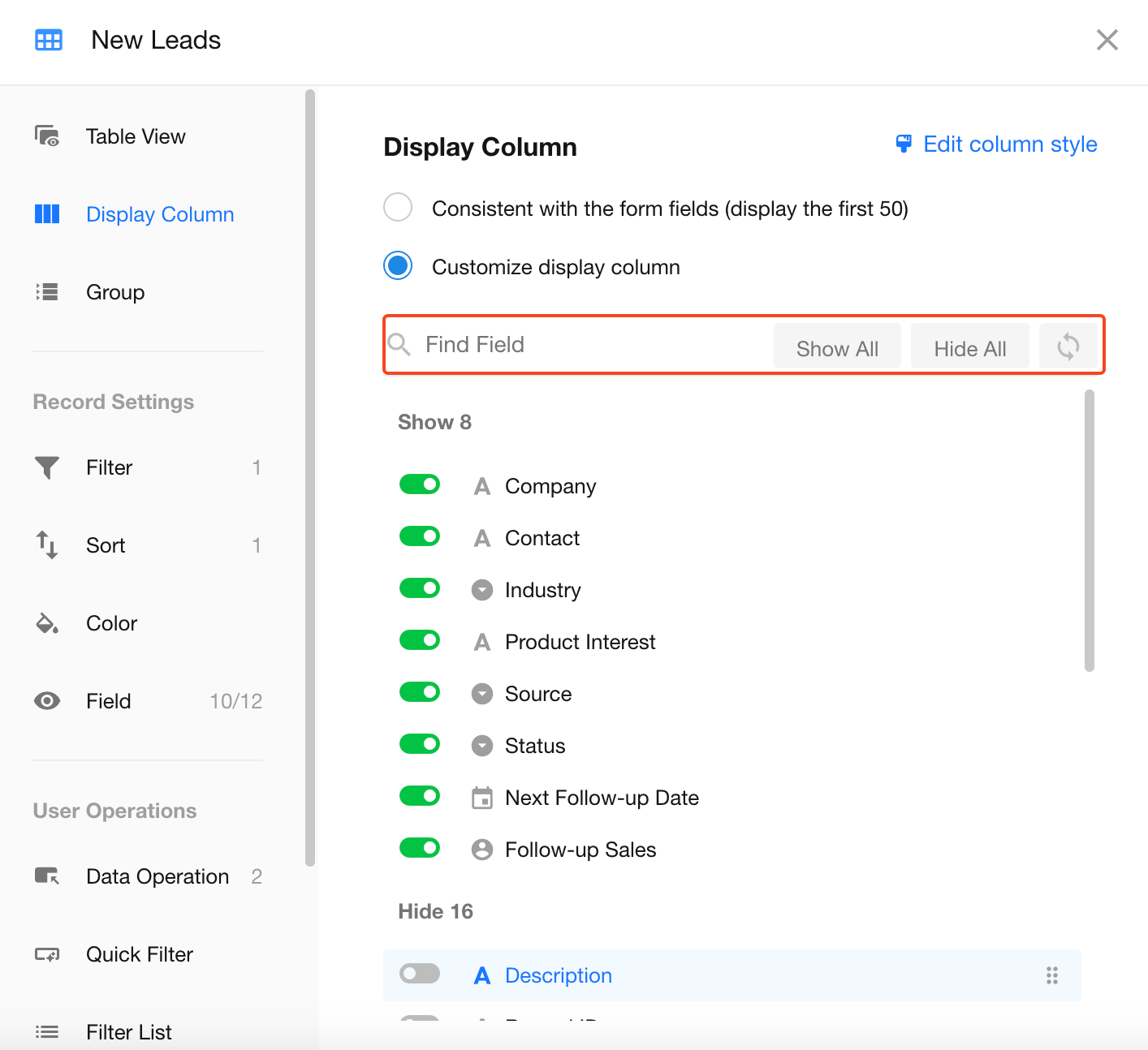
2) Customize display columns
You can customize which fields to display based on the visible fields in the view configuration. Fields can also be reordered freely.
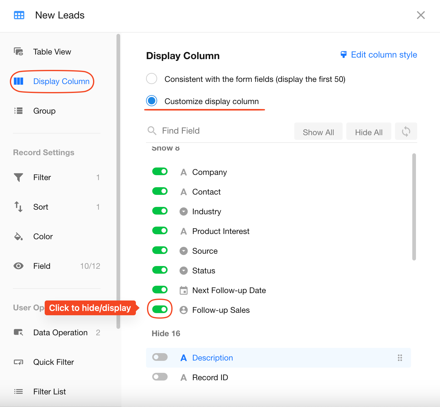
Quick Actions
-
Use search to quickly find fields when there are many.
-
Show All: Show all fields at once.
-
Hide All: Hide all fields at once.
-
Reset Order: Match the field order in the worksheet (only the first 50 fields will display by default).
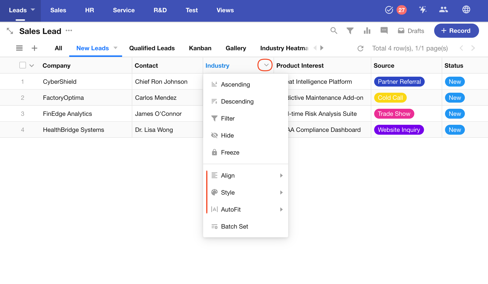
Column Style (Alignment/Width)
You can batch edit column styles, including text alignment, column width, fields statistics, and field-specific display styles (single-select and file fields).
Access via: View Configuration > Display Column > Edit Column Style
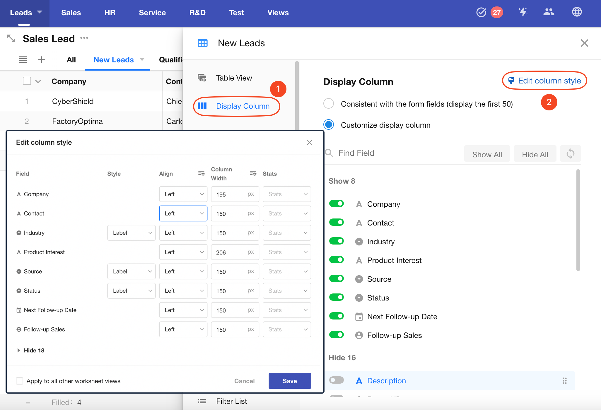
Or click any column header and select Batch Settings to open the style panel.
-
Text Alignment
Options include: Left, Center, and Right alignment.
Supported field types: Text, Telephone, Number, Currency, Email, Date, Date/Time, Time, ID Number, Region/City, Auto Number, Check items, Formula, Concat, Level, Created Time, Last Modified Time, Rollup, Positioning, Cascading, Foreign Field (depending on related field).
-
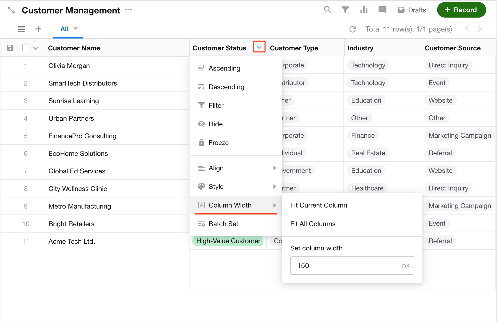
Column Width
You can:
- Manually set the width of a column in the table view
- Adjust the width by dragging the column header
- Click the column header settings icon to enable Auto Fit
-
Field Statistics
Set a default field statistics method at the bottom of the table. Available options depend on the field type.
-
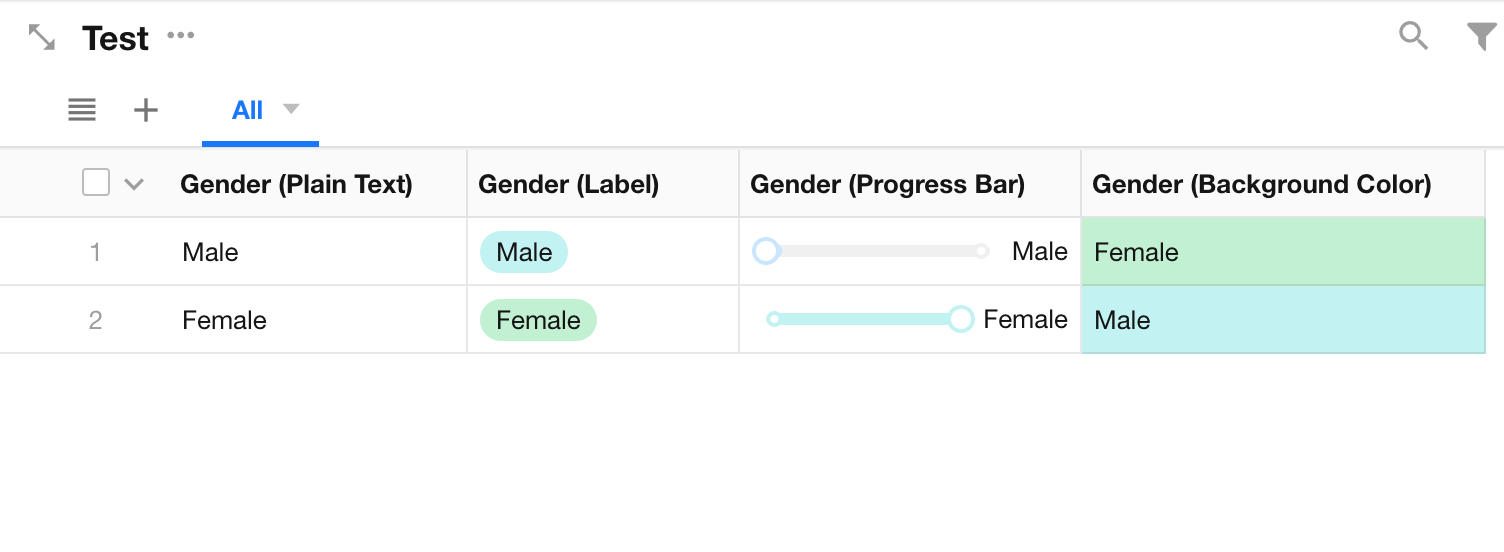
Single-Select Field Display Style
Options include: Plain Text, Label, Progress Bar, and Cell Background Color.
-
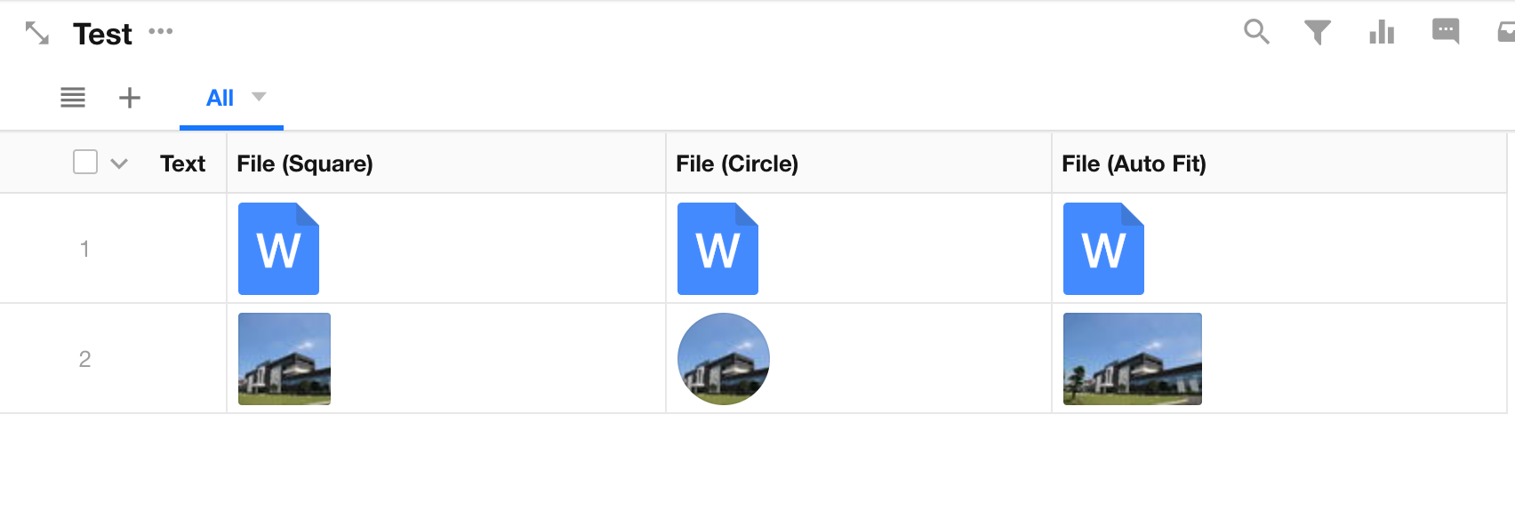
File Field Display Style
Images in file fields can be displayed as: Square, Circle, or Auto Fit.
Apply to Other Table Views
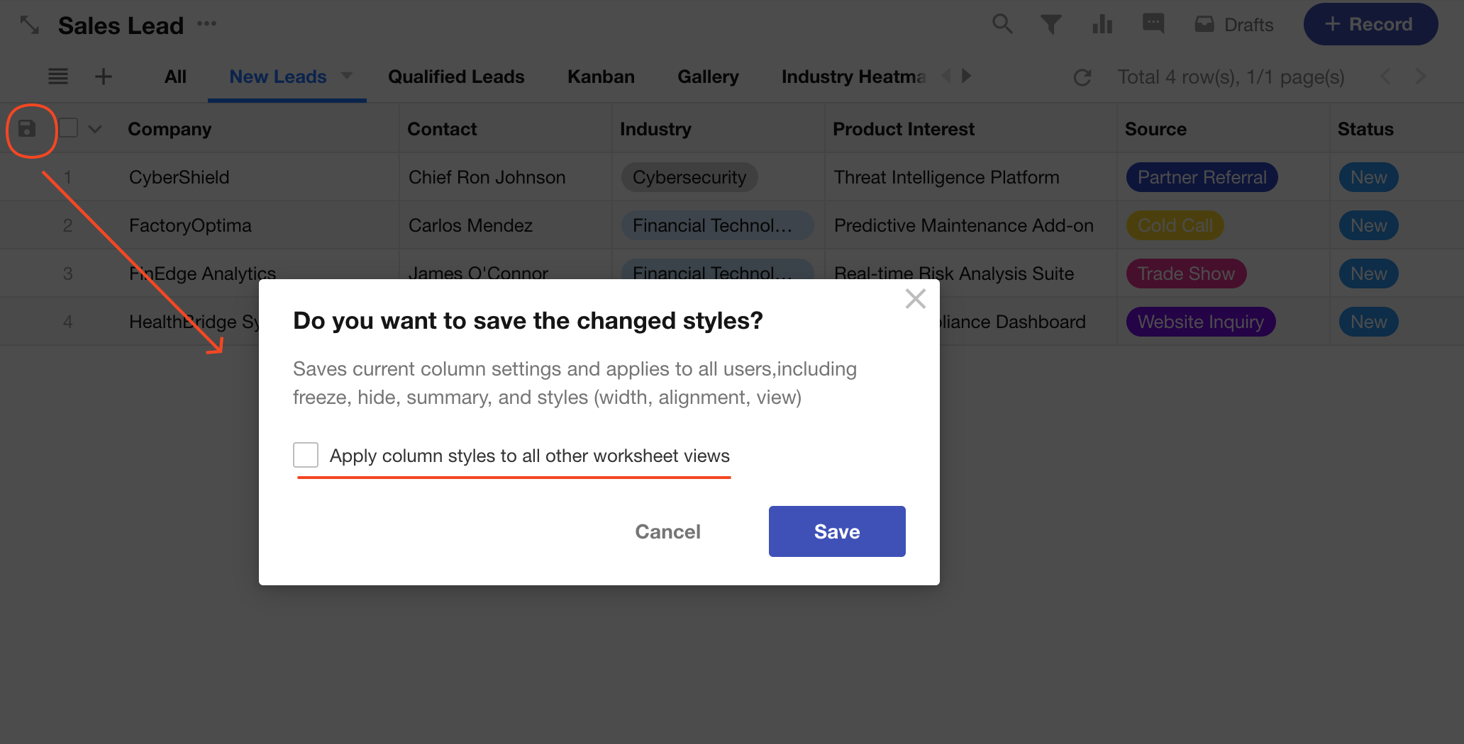
If checked, the same column widths, alignments, and display styles will be applied to all table views in the worksheet. If not selected, changes only affect the current view.
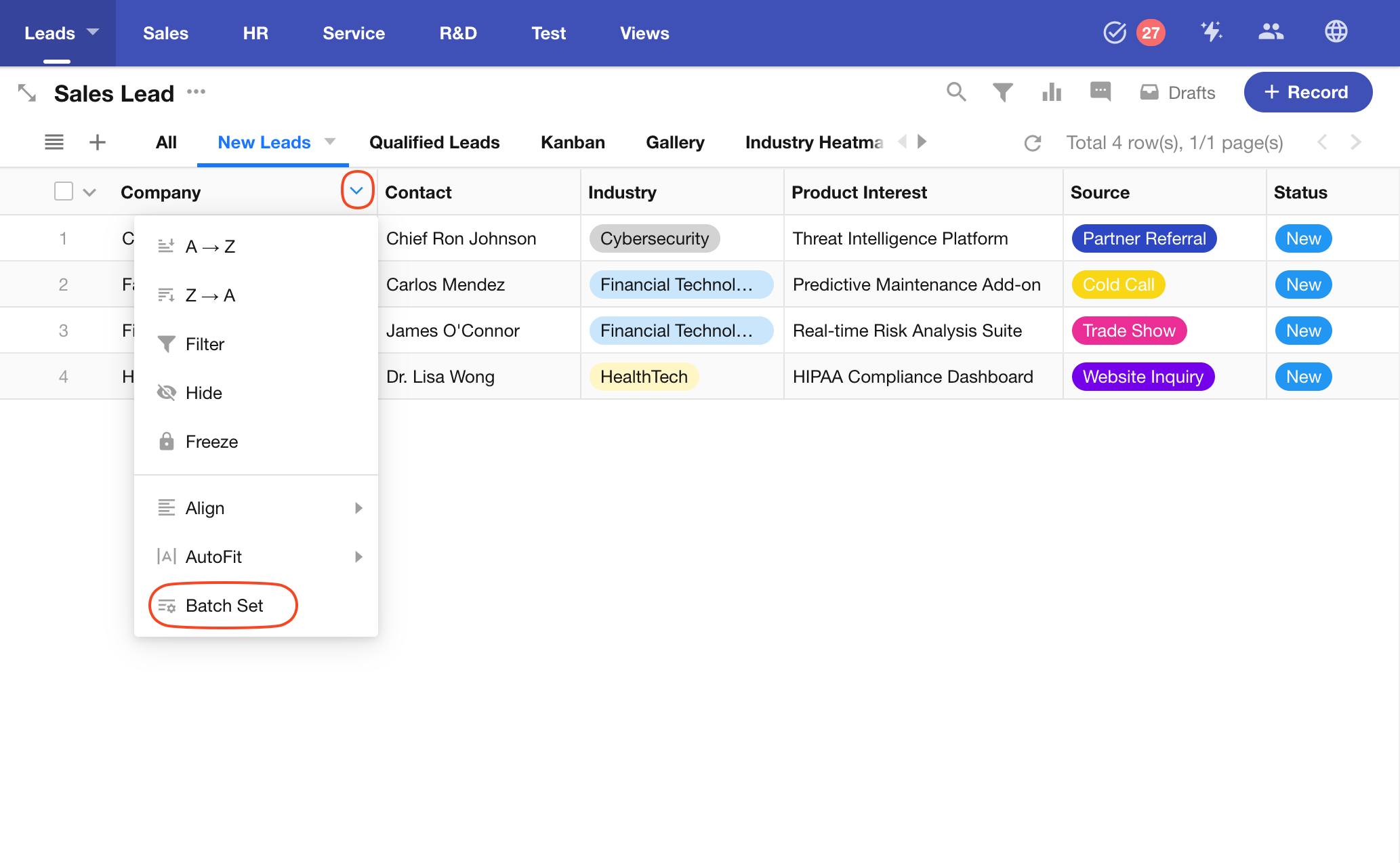
Quick Style Setup for a Single Column
You can also set styles for individual columns quickly in the table.
After making changes, click Save and choose whether to apply the styles to other table views in the worksheet.
Notes
-
Only fields marked as visible in the Field section can be configured under Display Column.
-
Fields hidden via Display Column will still be visible in the record detail page unless otherwise hidden in the Field section, or restricted by role permissions or business rules.
-
In Custom Display Column mode, newly added fields are hidden by default. You must manually set them to be displayed.
Column Order
You can reorder columns in the table to prioritize key fields.
To reorder columns: Go to the view configuration page > click Display Column > choose Customize Display Column. Then drag fields up or down to change their order.
This only affects the column order in the table view. The field order in the record detail page always matches the form layout.
Personal Column Settings
The displayed columns and their default order are configured by the application administrator. Based on these defaults, each user can further customize the columns to suit their own preferences.
Click the Column Settings icon to the right of the last column to choose which fields are displayed and reorder the columns as needed. These settings apply only to your own view and do not affect other users.
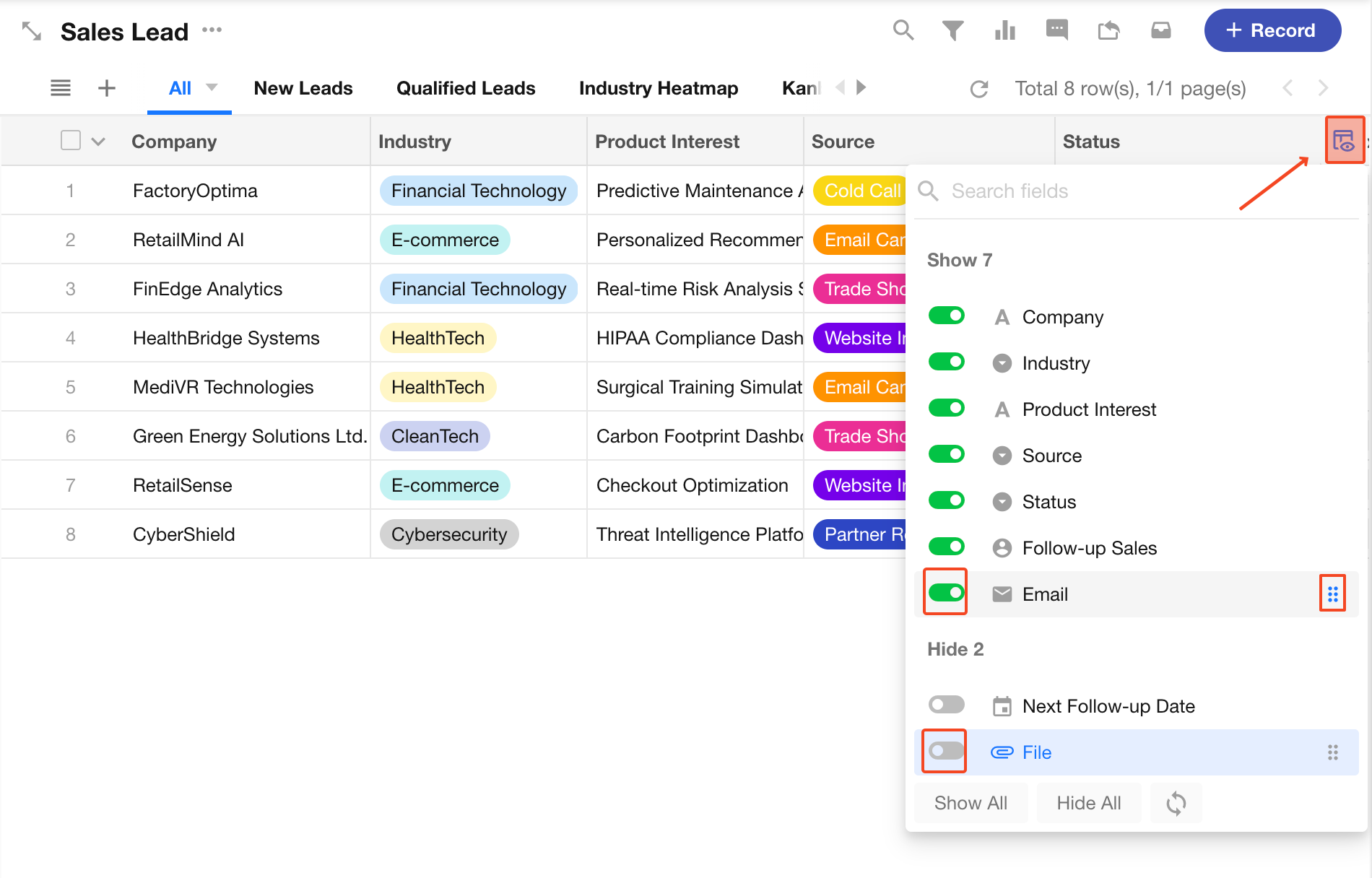
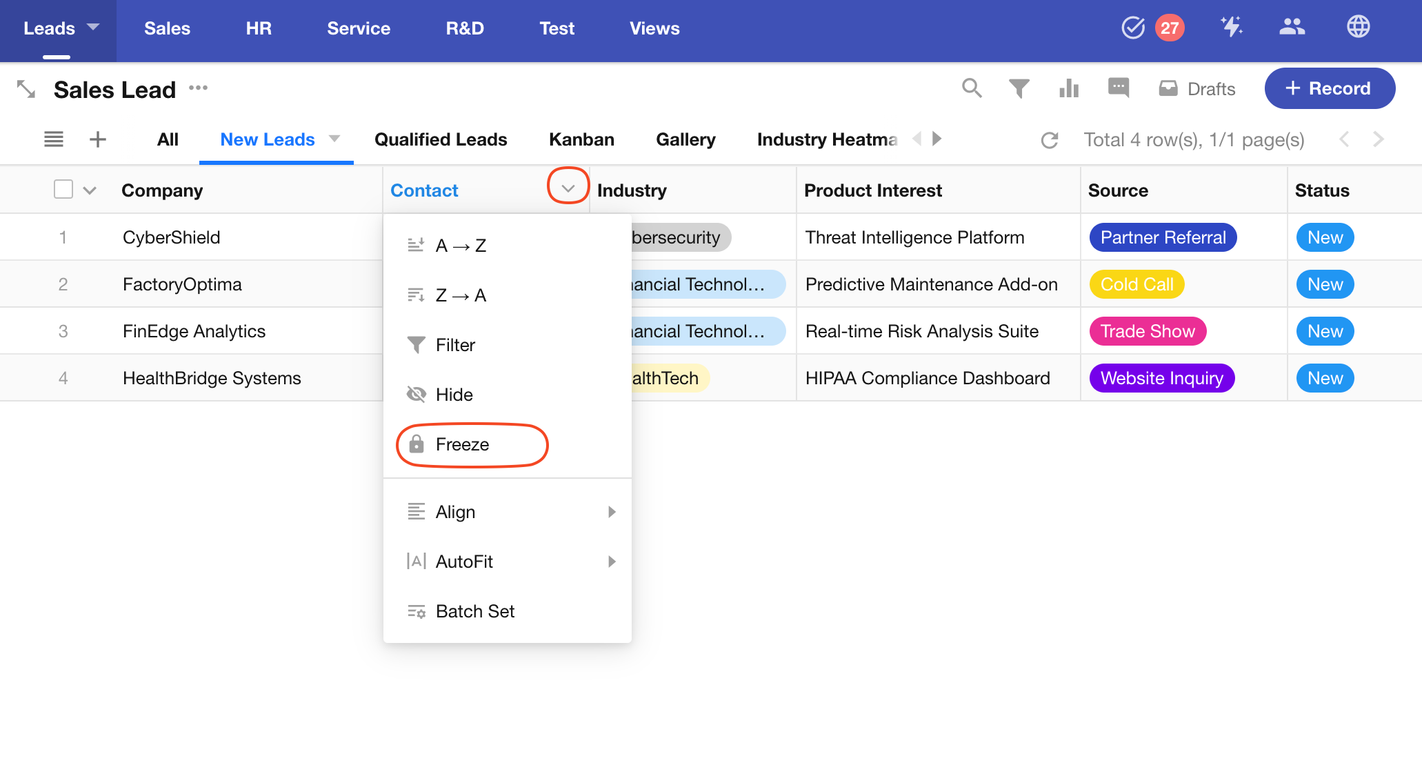
Freeze Columns
Click a column header and select Freeze to lock that column and all columns to its left. When scrolling horizontally, the frozen columns remain visible. You can freeze up to 10 columns.
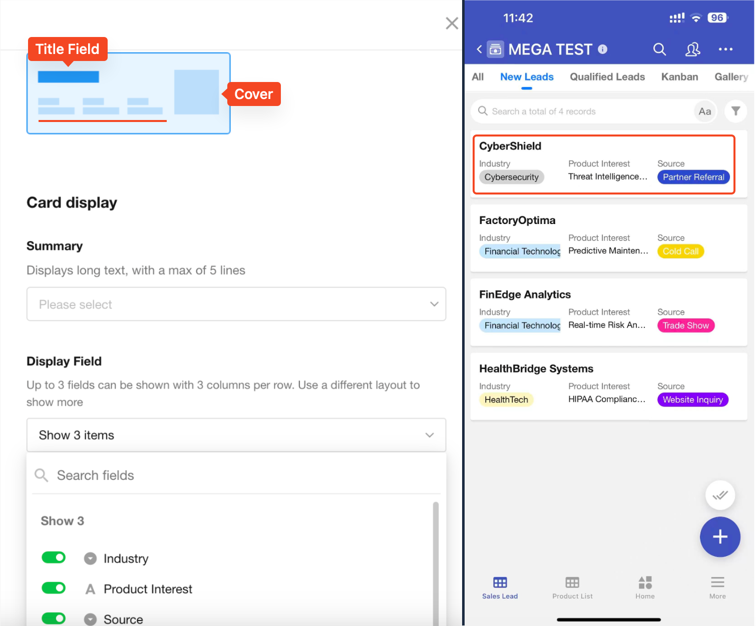
Display Configuration on Mobile
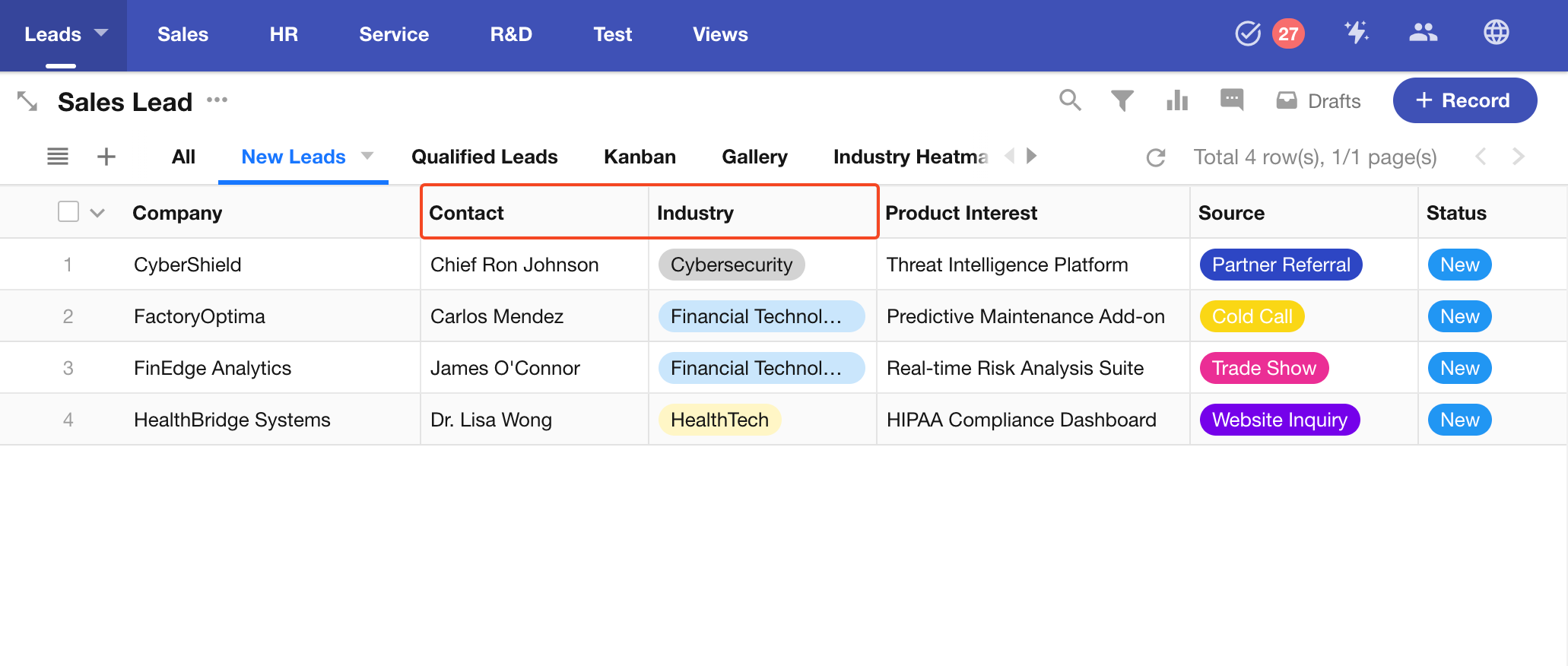
Records in the table view appear as cards on mobile (App and H5). You can customize the card layout to enhance mobile usability.
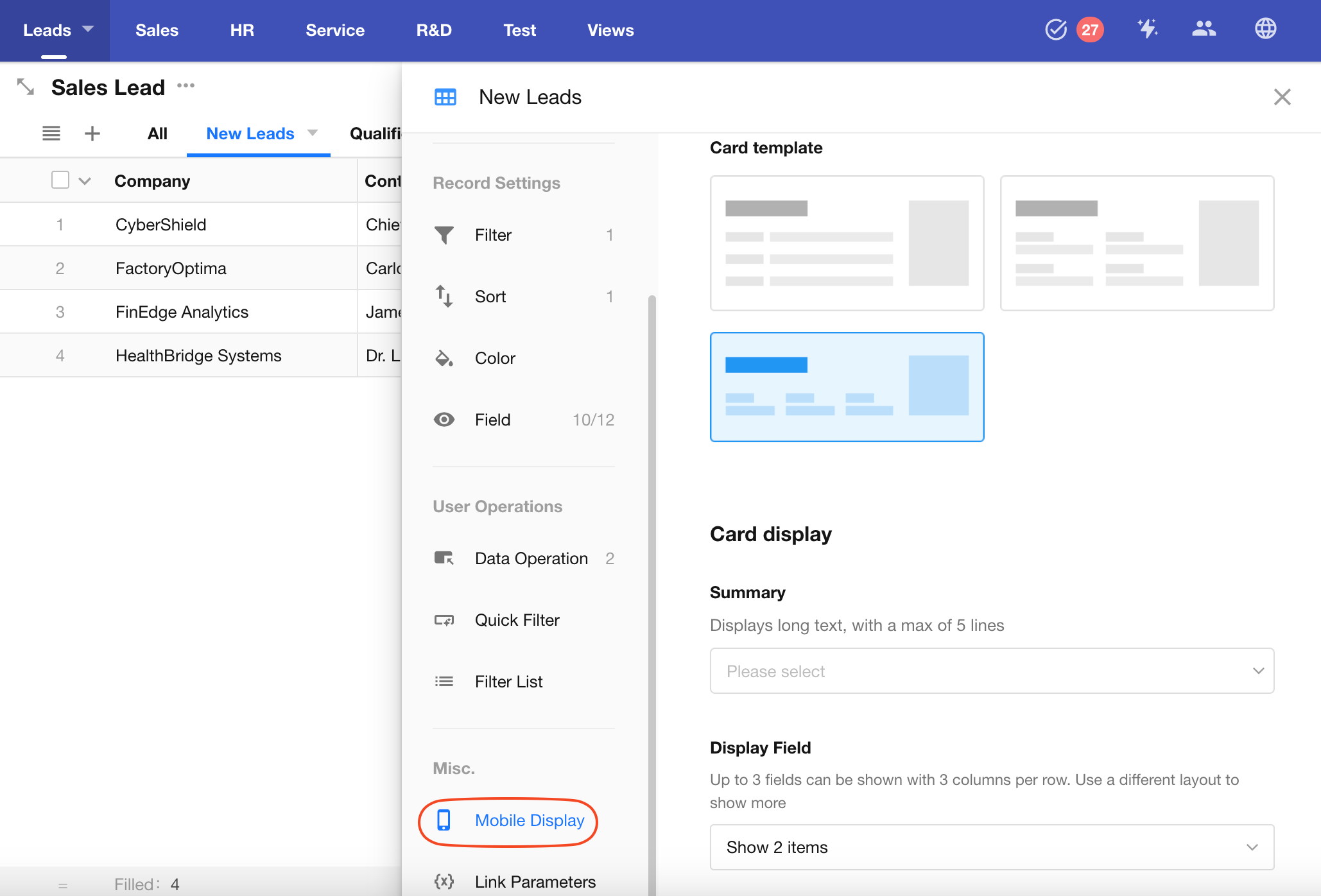
As shown, if you select a card template and set it to show fields like Industry, Product Interest, Source, the card will appear with those fields on mobile.
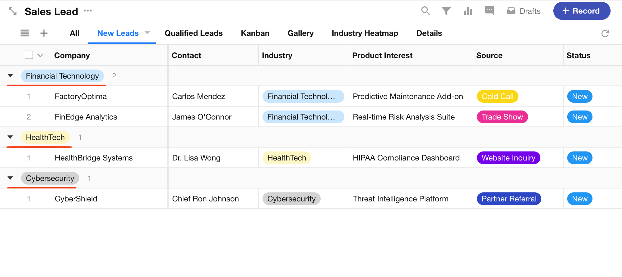
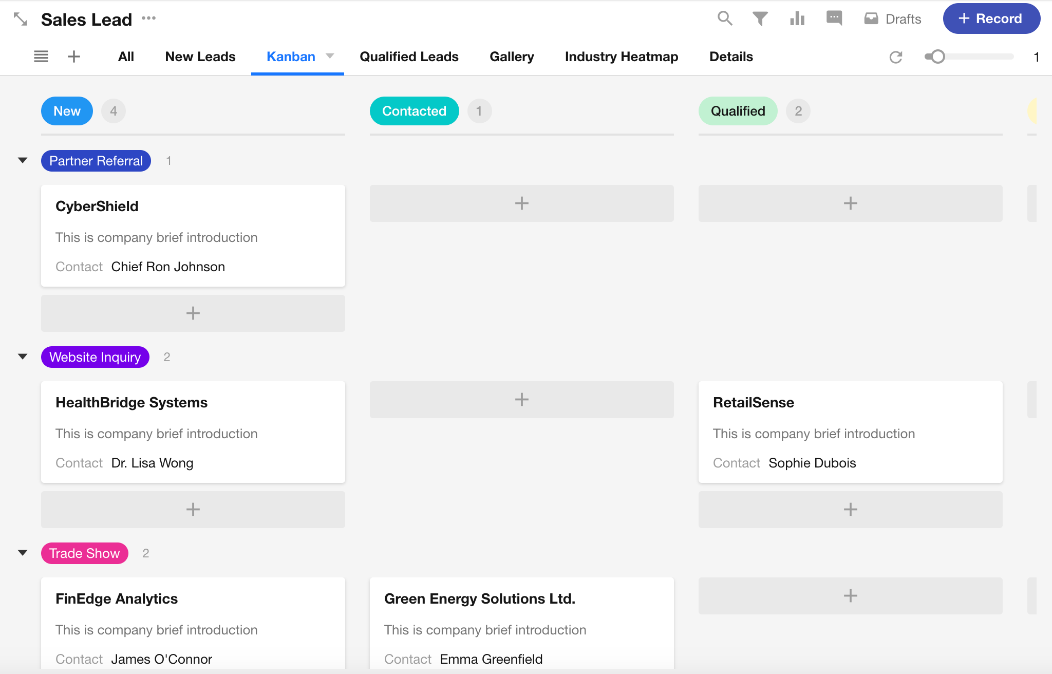
Grouped Records Display
In Table View, Kanban View, and Gallery View, you can group records by a specific field to enhance the structured display of data.
Table View Example:
Kanban View Example:
Gallery View Example:
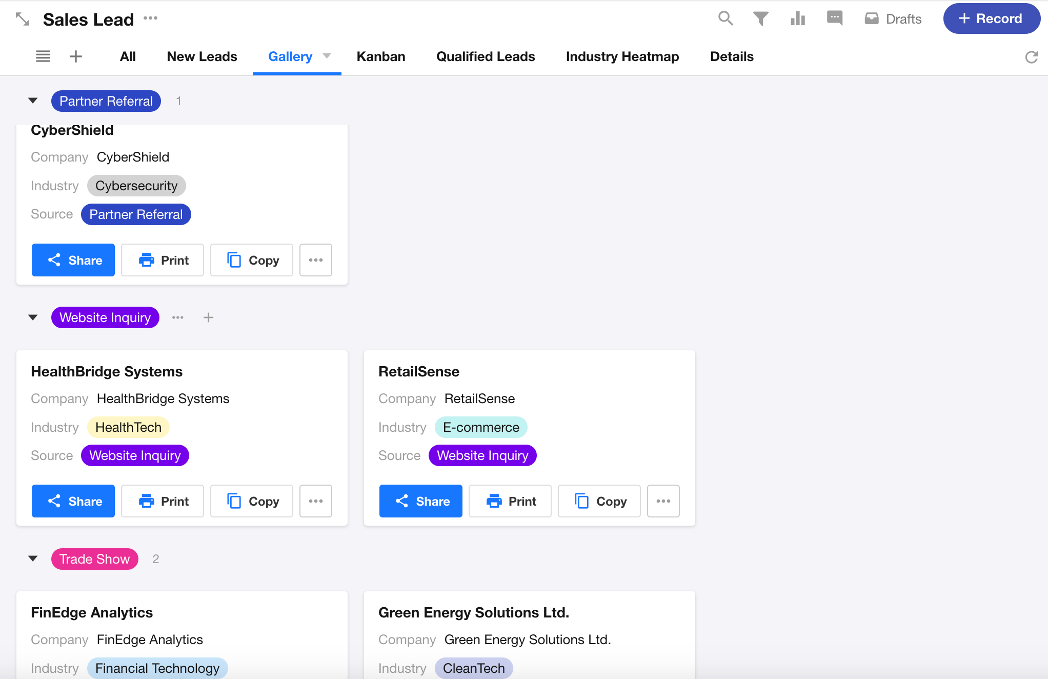
To configure grouping, go to View Configuration > Group, and select a field to group by.
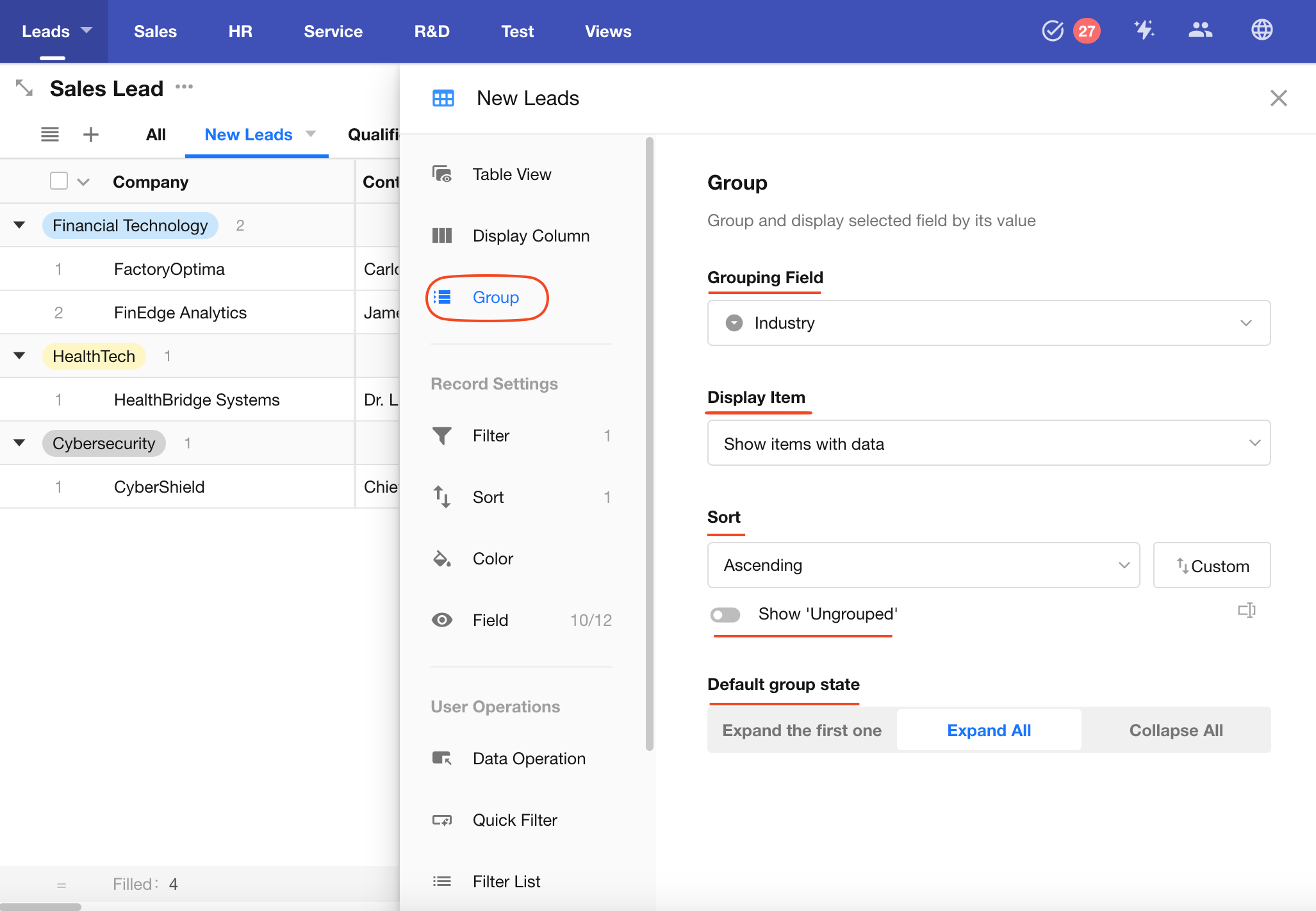
Supported Fields for Grouping
| View Type | Groupable Fields |
|---|---|
| Table/Gallery View | Single-Select, Multi-Select, Level, Relationship (Dropdown/Card), Members/Department/Org-Roles (both single and multiple selection), Foreign Field(data storage) |
| Kanban View | Single Select, Level, Relationship (single record), Members/Department/Org-Roles (single selection), Foreign Field(data storage) |
Grouping and Record Limits
| View Type | Record Limit | Group Limit |
|---|---|---|
| Table/Gallery View | No specific limit | Up to 50 groups |
| Kanban View | Up to 1000 records | No group limit |
Additional Notes
-
If a record's grouping field is empty, it will be placed in the "Ungrouped" group. You can manually choose whether to show or hide this group.
-
You can set the default group expansion state when opening the view:
- Expand first group only
- Expand all groups
- Collapse all groups
User Operations
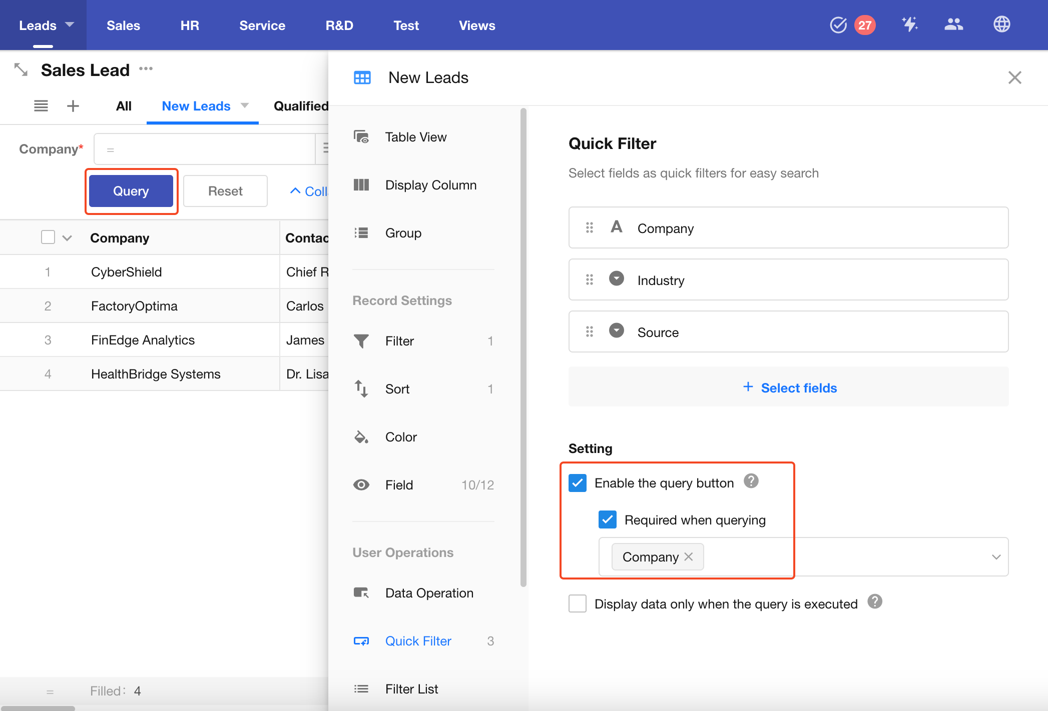
Quick Filter
Quick filters allow you to display multiple filter fields at the top of the view, making it easier for users to search and locate records efficiently.
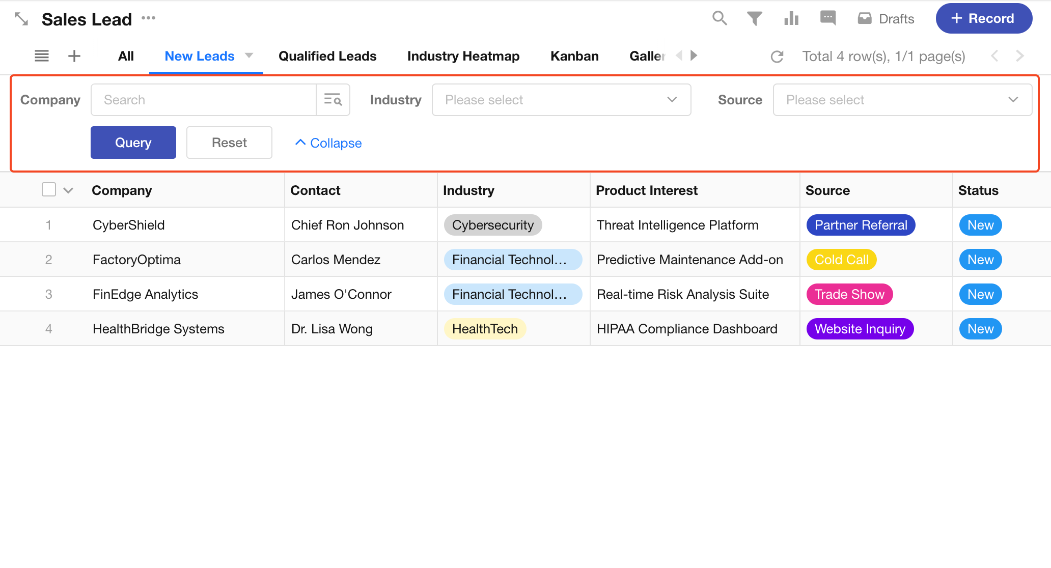
Add Filter Fields
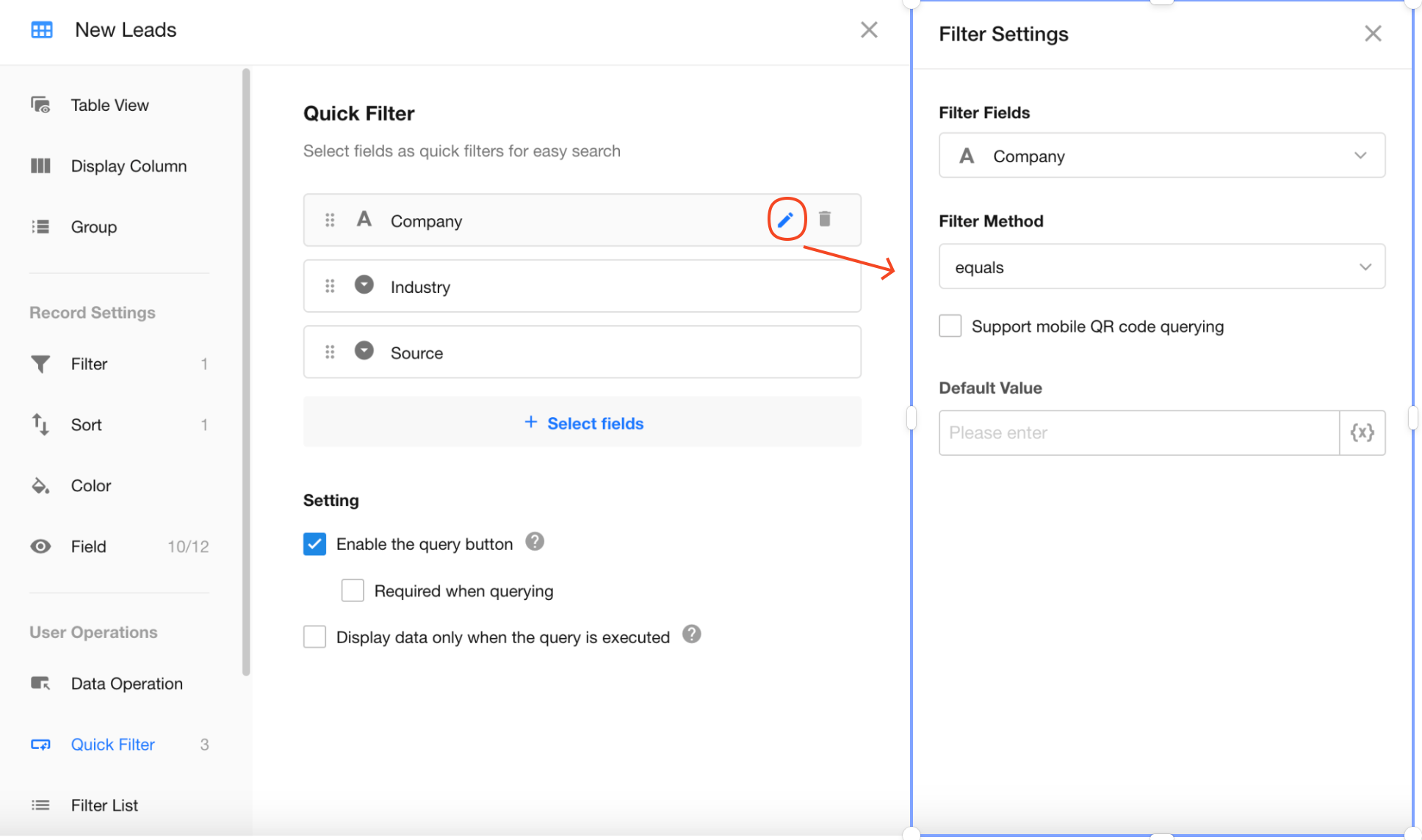
Go to View Configuration > Quick Filter, then click the Select Fields button to add fields for quick filtering.
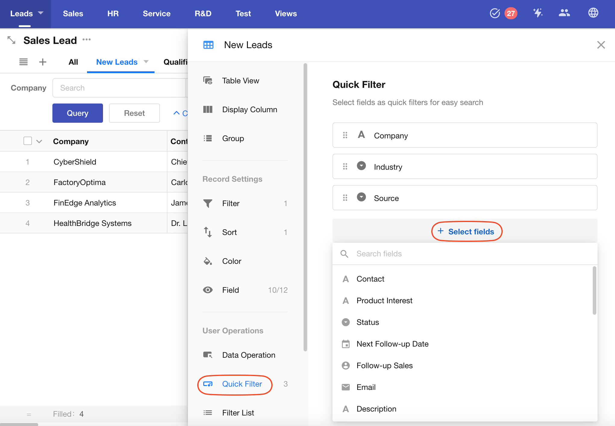
Once fields are selected, certain fields may require a filter method and default value to be configured.
If a quick filter field is assigned a default value, the view will load with only the records matching that value. Default values also support link parameters.
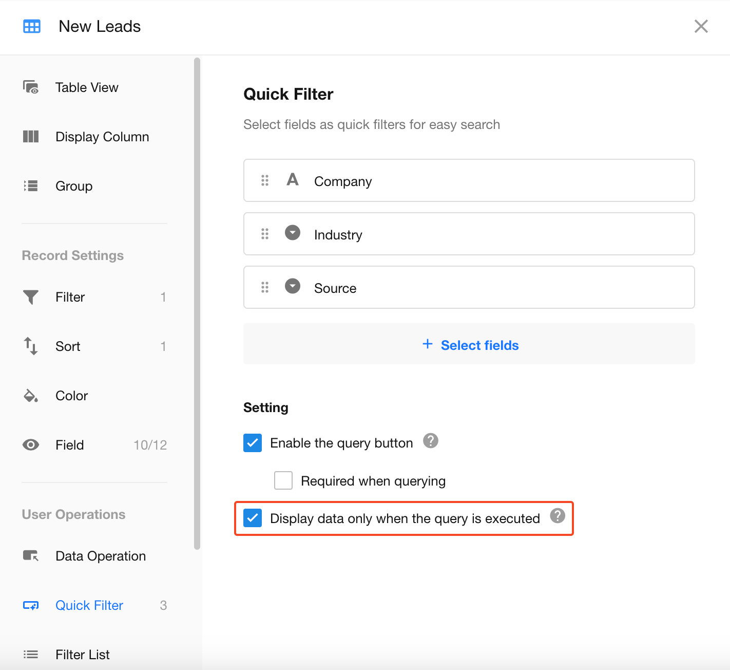
Enable the Query Button
-
When the Query Button is enabled
- By default, all visible records are displayed when users open the view. If default filter values are configured, records are automatically queried based on those values.
- Filter fields can be configured as required. Users cannot execute a search until required fields are completed.
- For input fields, pressing Enter after entering a value triggers the search.
-
When the Query Button is disabled
A search is executed automatically whenever a filter value is entered or selected.
-
If more than three filter fields are configured, the Query Button is enabled automatically.
Display Data Only After Query
When Display Data Only After Query is enabled, no records are displayed when users enter the view. Records are shown only after a search is performed and matching results are returned.
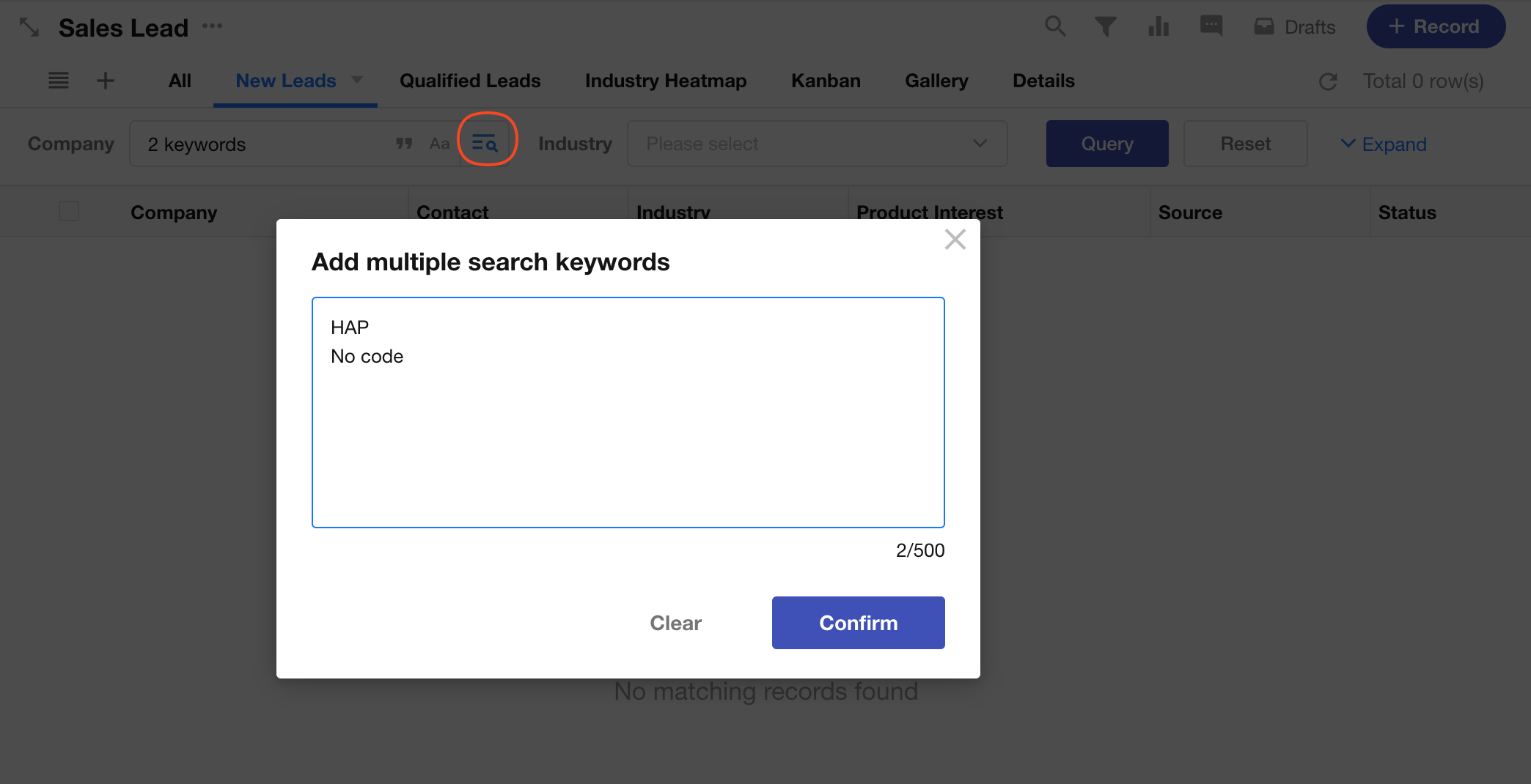
Search Multiple Keywords in Text Fields
When searching a text field, you can enter multiple keywords at the same time. Records that match any of the specified keywords will be included in the results.
Click the button on the right side of the search box → Enter keywords (press Enter to add each keyword on a new line) → Click Confirm to start the search.
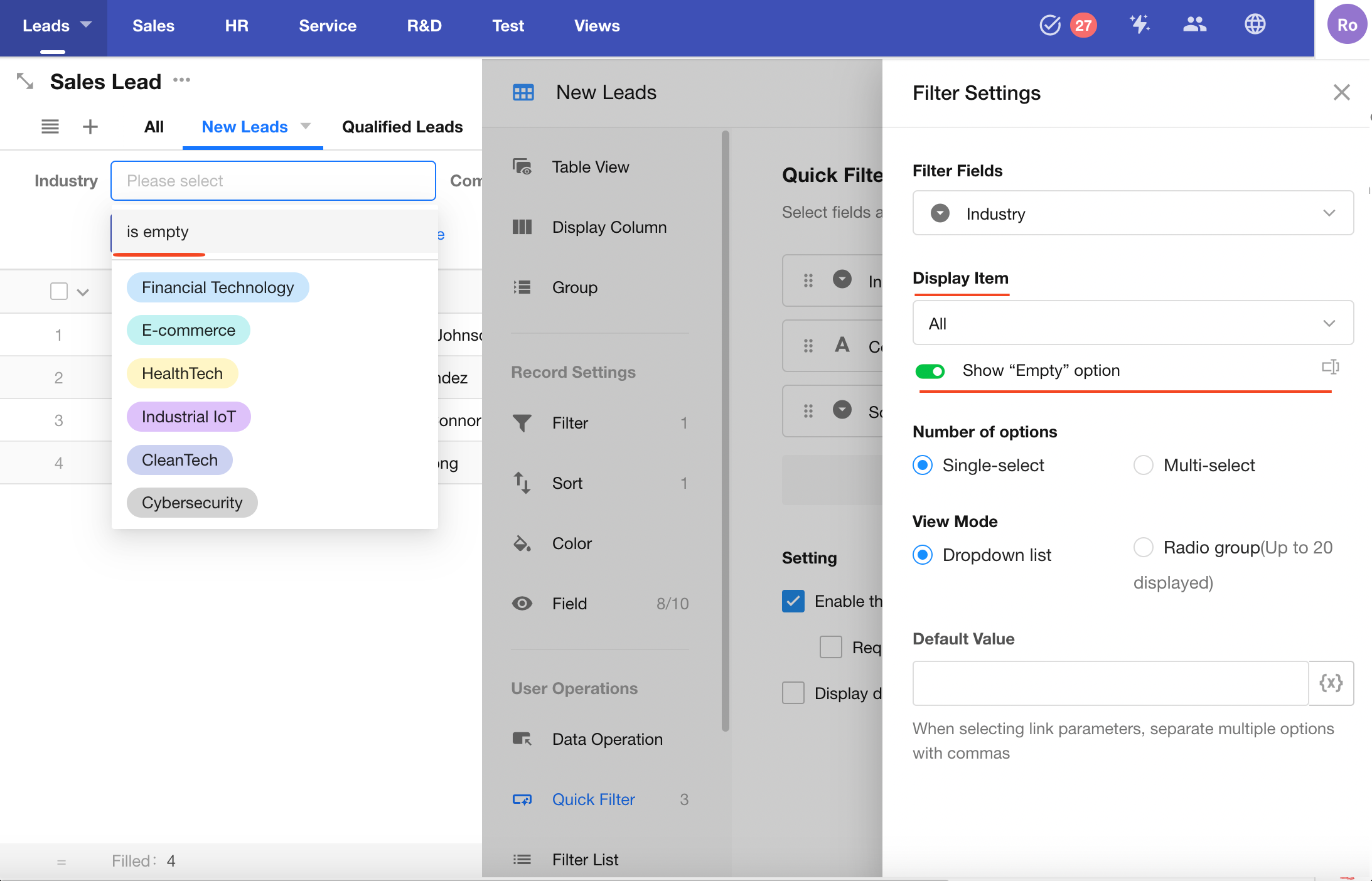
Display Options for Option-Type and Relationship Fields
Single Select / Multi Select Fields
For option-type fields, you can choose which options are shown in the filter.
For example, the "Status" field in a sales lead worksheet may include: New, Qualified, Unqualified, and Contacted. In the quick filter, you can choose to display only "New" and "Qualified", or all options.
You can also include an "Empty" option for records where the field is empty. The label for this option is customizable (e.g., rename to "Not Set").
Relationship Fields
Relationship fields (single record or multiple records) can also be treated as option-type fields, where options are dynamic data.
By default, all related records (title field) are listed.
You can choose to:
- Show all related records
- Show only specified related records
- Show related records that meet filter conditions
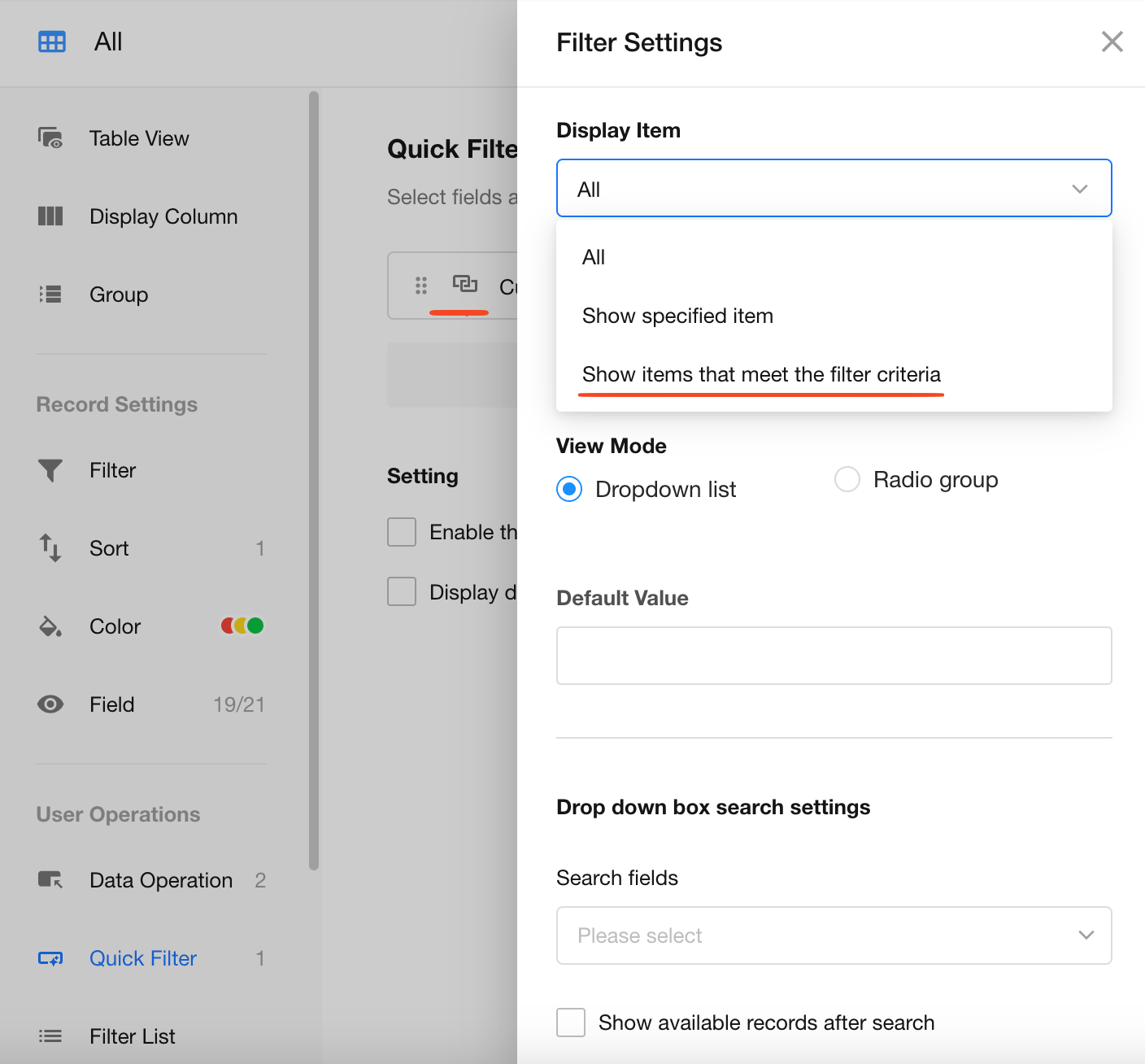
When configuring filters for related records, dynamic values can be used.
For example, you can reference the value of another quick filter field.
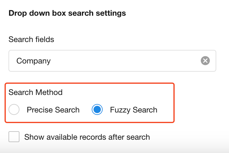
When using dropdown mode for relationship fields, only text-type fields (text, telephone, email, ID number, auto number, etc.) are searchable.
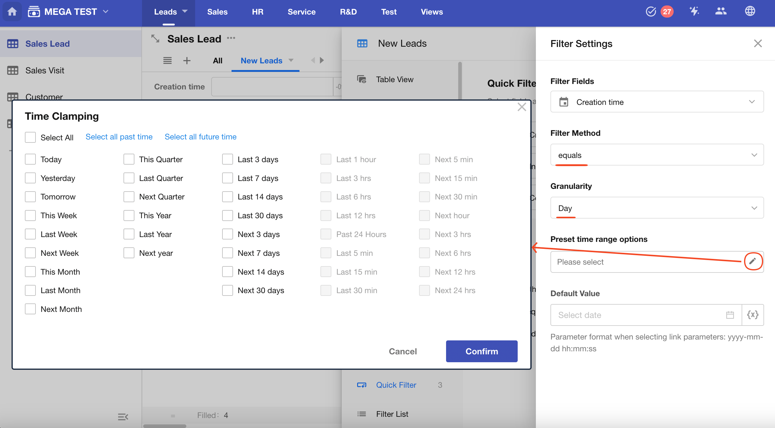
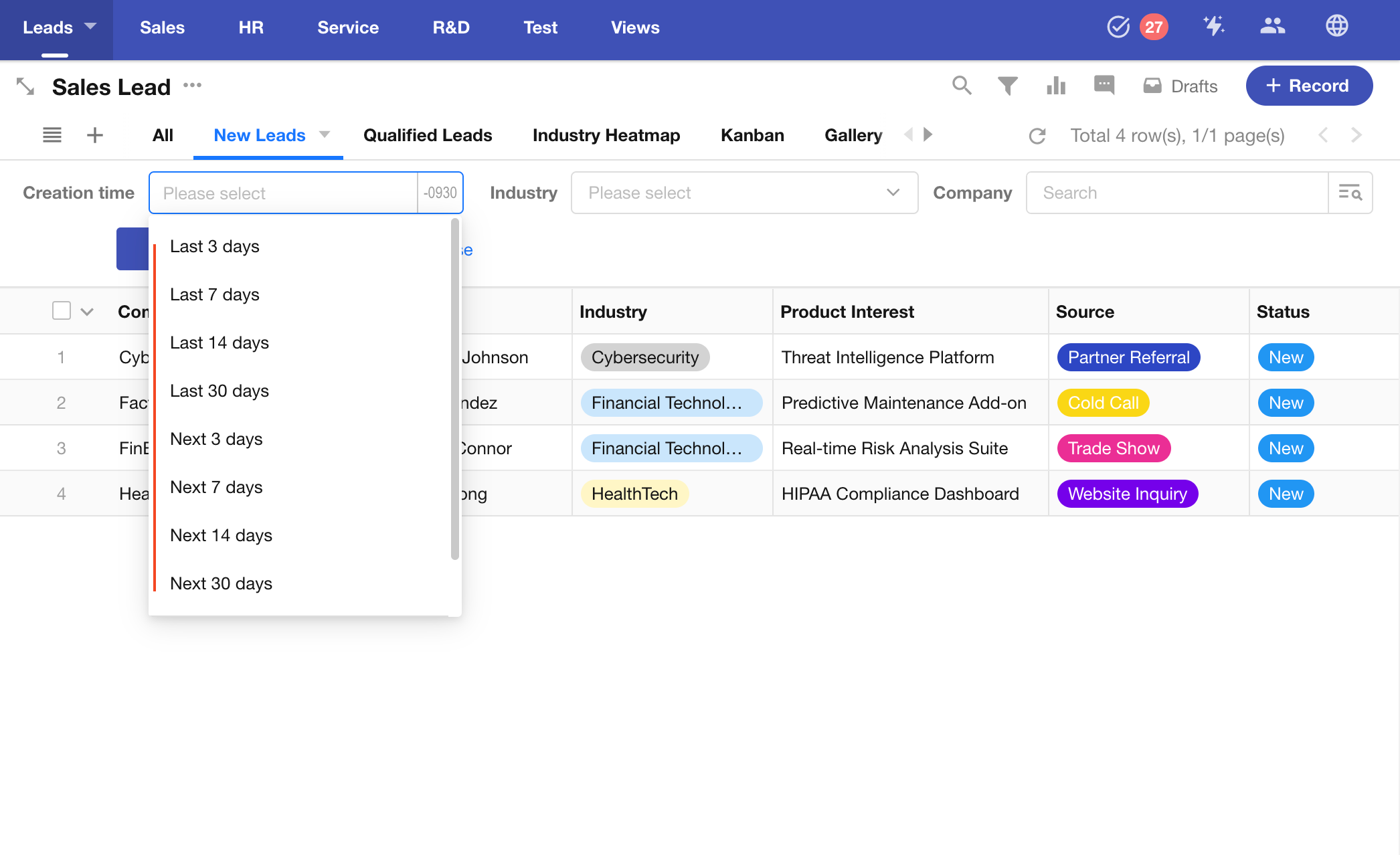
Preset Filters for Date/Time Fields
For date or datetime fields, you can predefine common date ranges to help users quickly select a time period.
The available presets depend on the field's granularity.
For example, if the field supports day-level precision, options like "Past 1 Hour" or "Next 5 Minutes" are not allowed.
Result:
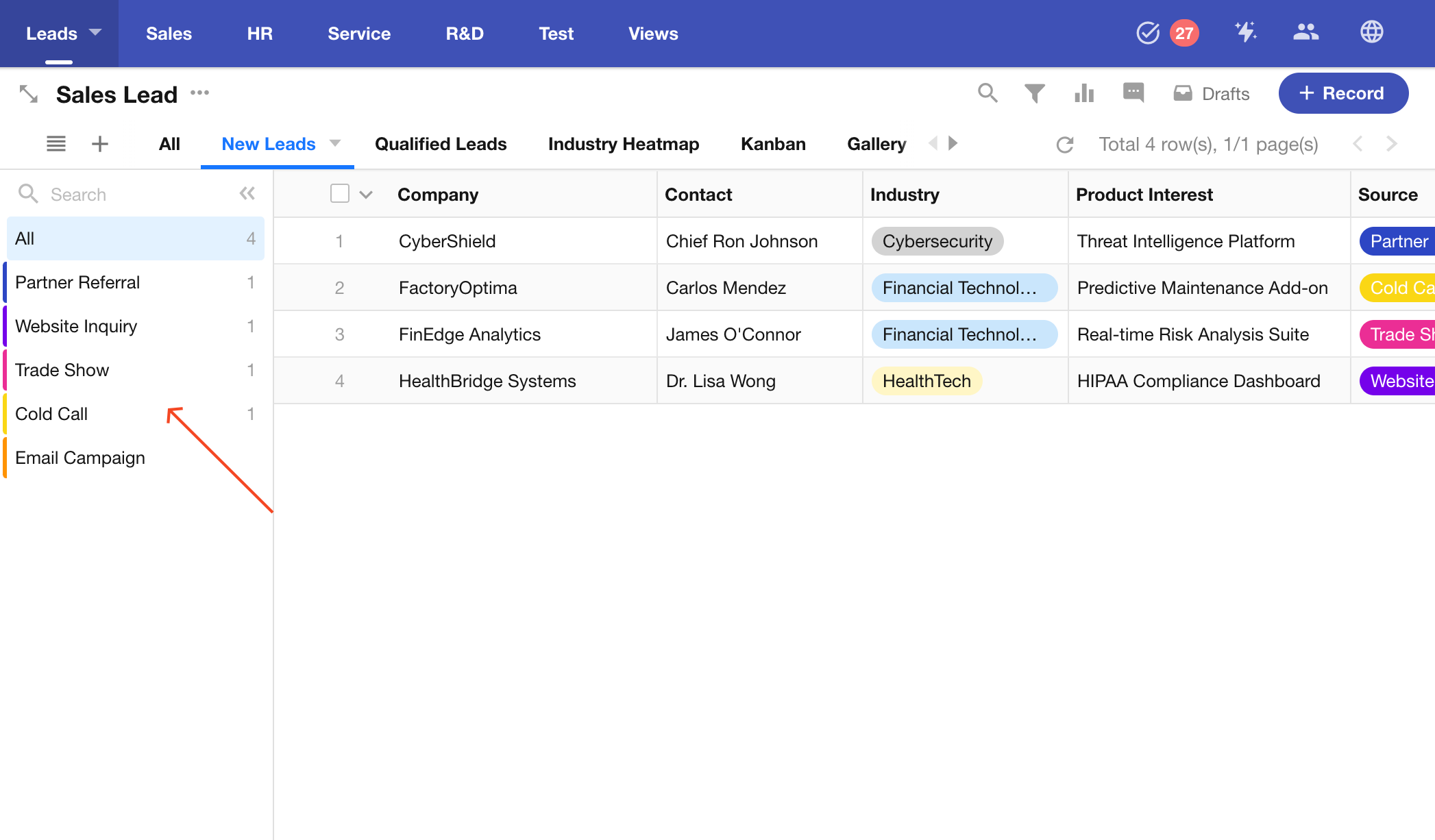
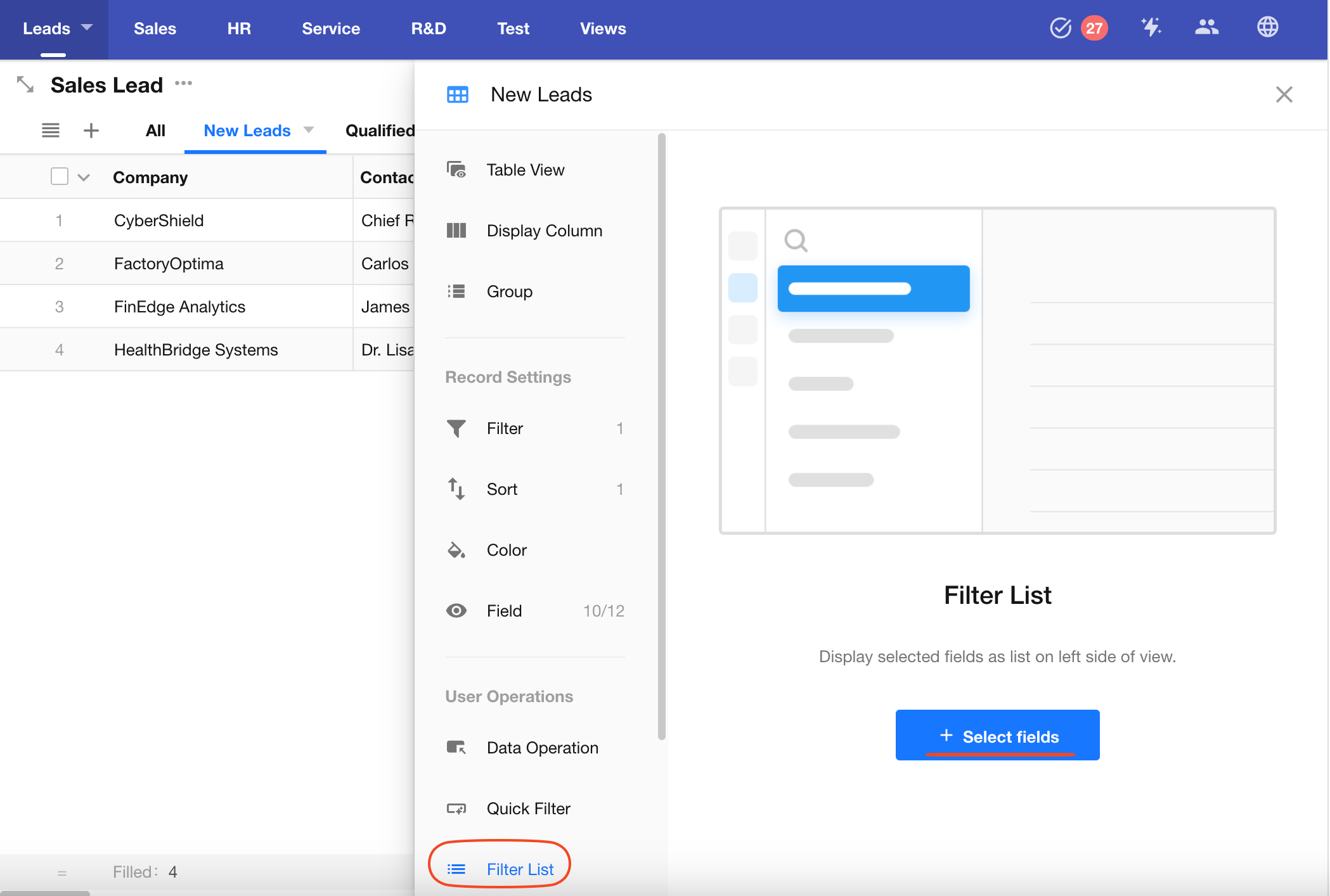
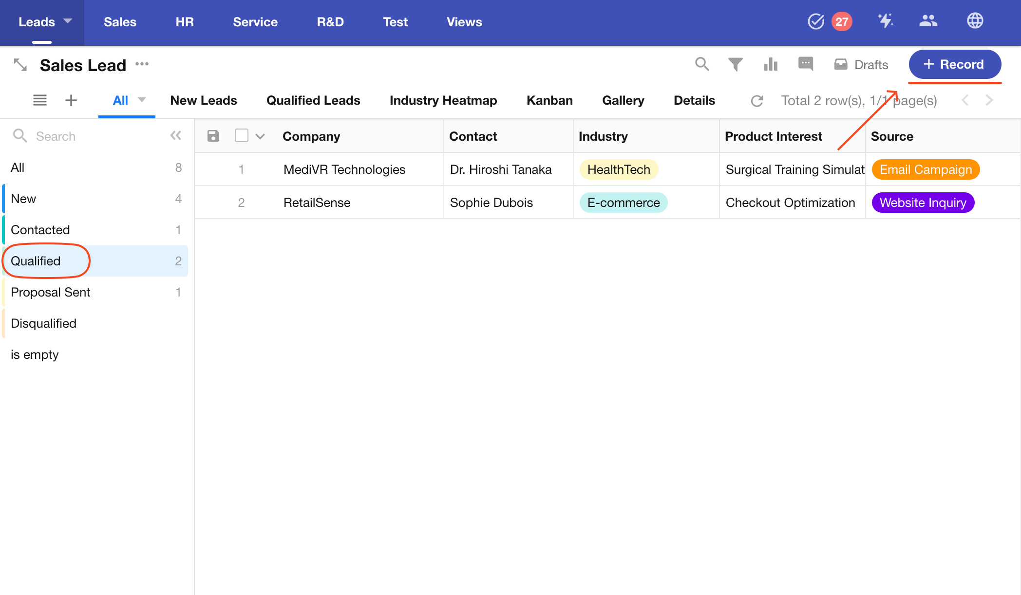
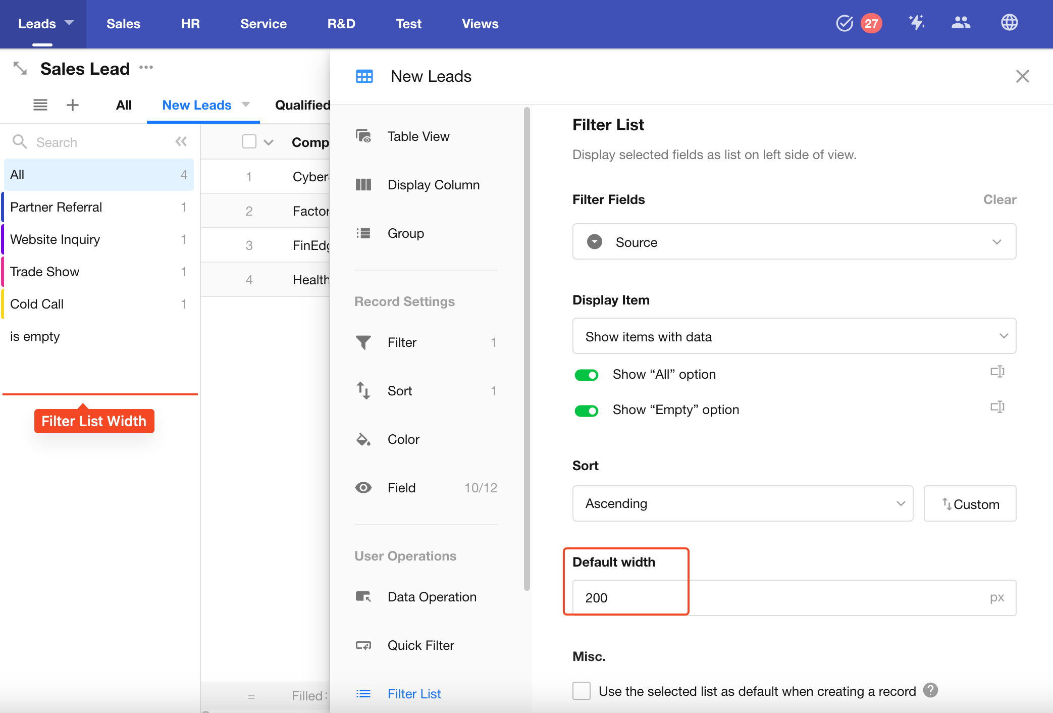
Filter List
In a filter list, you can select an option-type field and display its options as a list on the left side of the view. This allows users to quickly filter and view records based on specific field values.
Supported field types for filter list include:
Single Select, Multi Select, Level, Members, Department, Org-Roles, Cascading, Relationship (single record), Foreign Field (data storage).
Example:
Select an Option-Type Field
Only one option-type field can be selected at a time, such as: Single Select, Multi Select, Relationship, Cascading, Members, Department, Org-Roles, Region/City, etc.
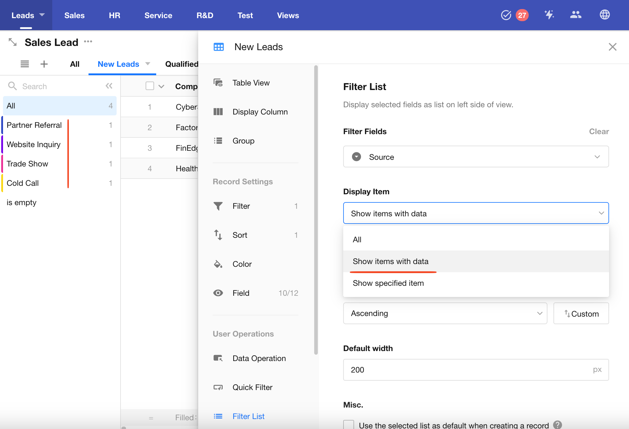
Display Options
In addition to the options within the field itself, you can include "All" and "Empty" as filter options and rename them as needed.
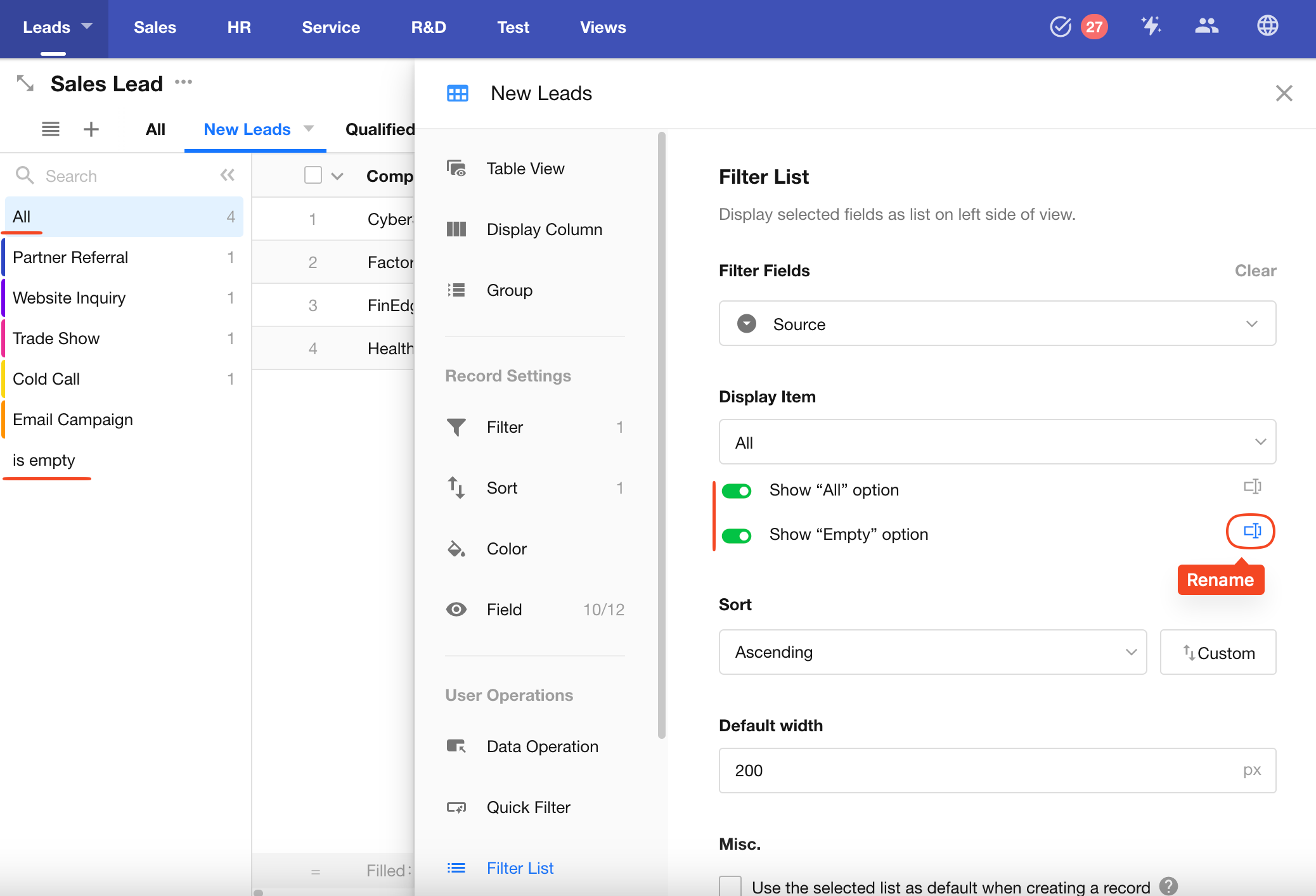
You can choose to show only options that have records, or limit the displayed options to specific ones.
If a relationship field is used as a filter list, you can further configure the filter conditions for the related records.
Learn more
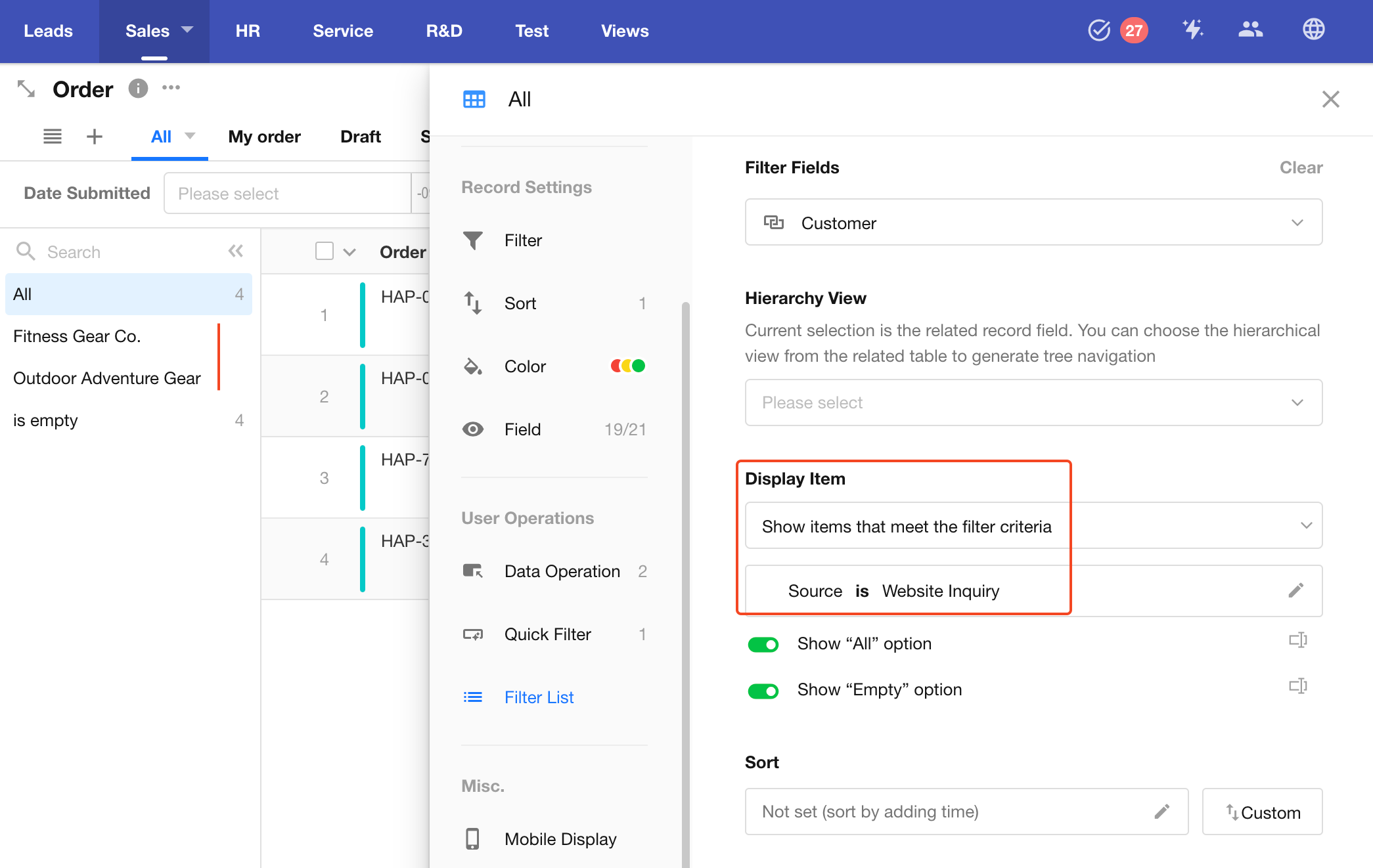
If the related worksheet has an org view enabled, related records will also be shown hierarchically in the filter list.
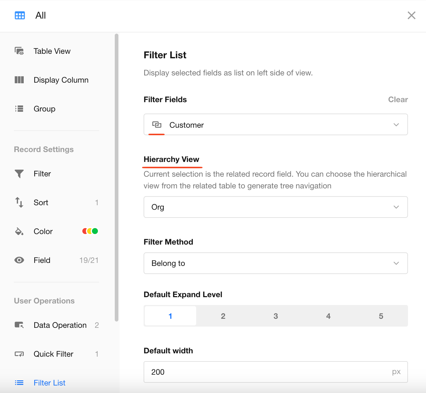
Options Sorting
Options within the filter list can be sorted.
Note: The "All" option is always displayed at the top.
For relationship fields, sorting is only supported when "Display specified items" is selected.
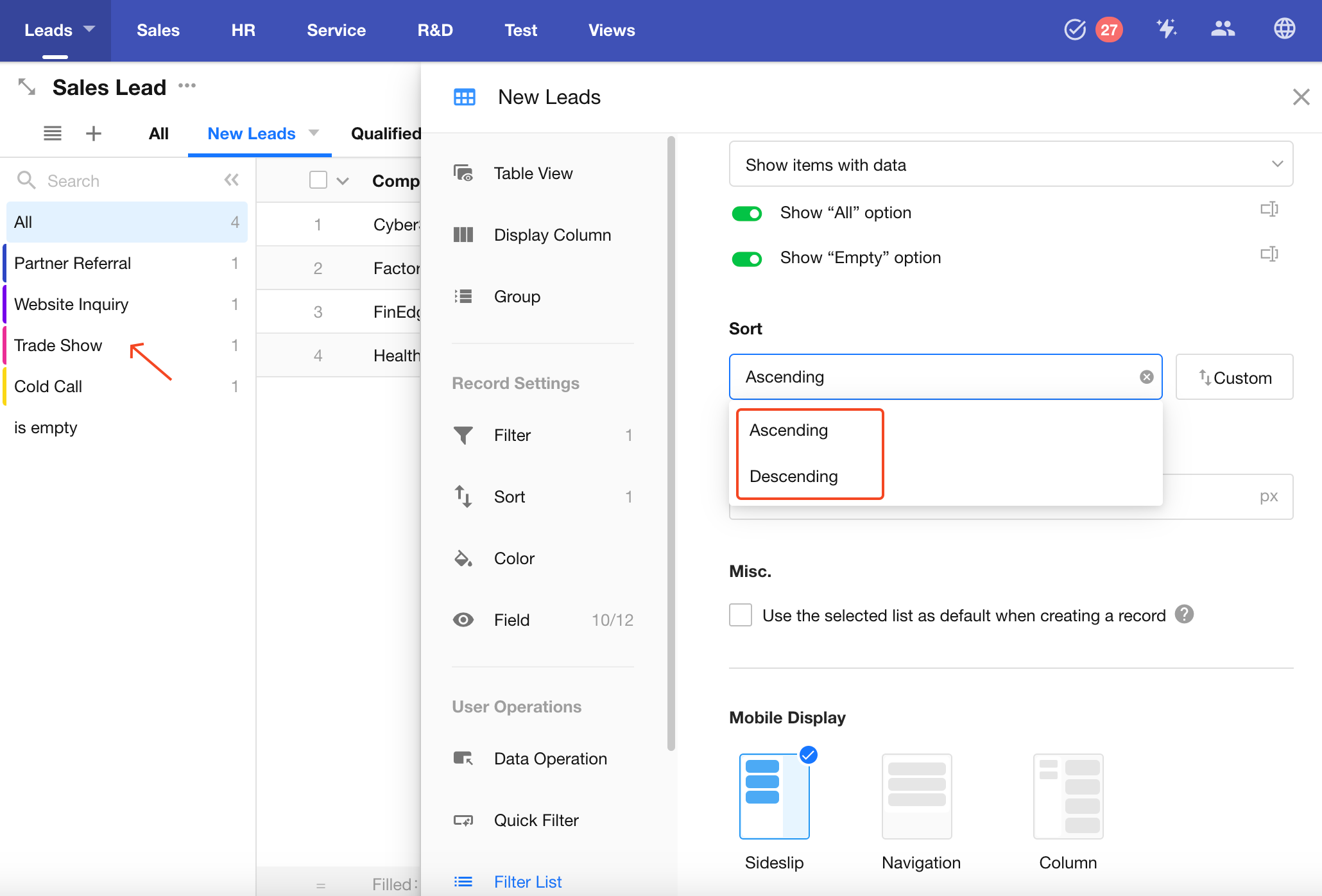
Use Selected Option as Default for New Records
You can set the currently selected filter option as the default value when creating a new record.
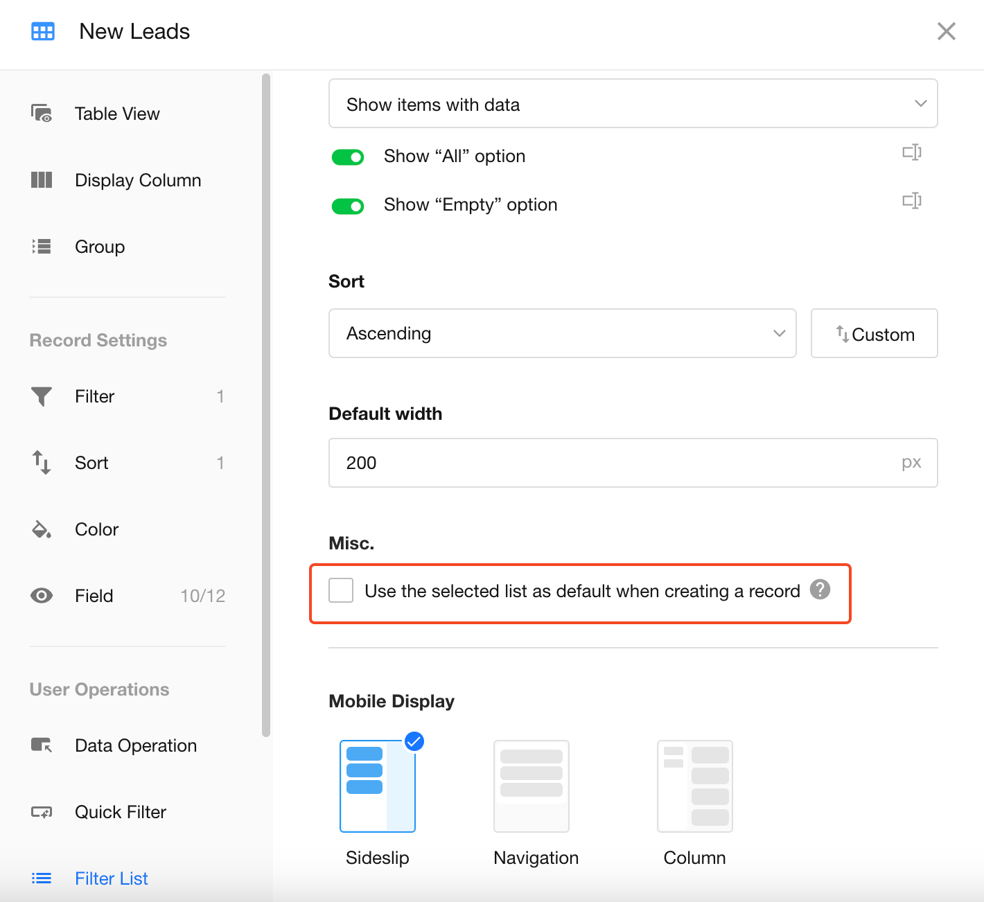
For example, if you select "Qualified" in the filter list, the "Status" field in the new lead record will default to "Qualified".
Filter List Width
The default width of the filter list is 200px.
You can adjust it between 100px and 500px.
Custom Action
Was this document helpful?