Introduction to 38 controls
Fields with the same data characteristics are encapsulated as controls, each with corresponding format validation and properties.
HAP provides 38 types of controls, which basically cater to the diversity of business data. It is important to choose the right control according to the data type, which has a significant impact on data collection, referencing and analysis.
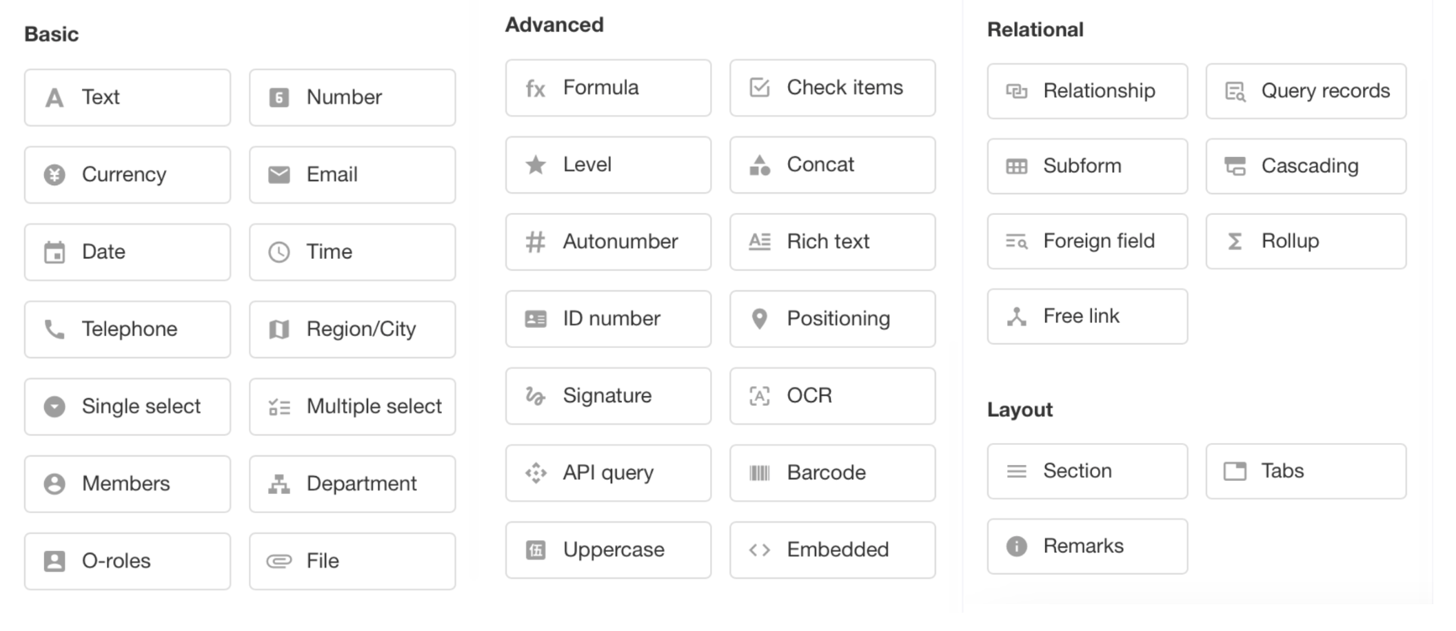
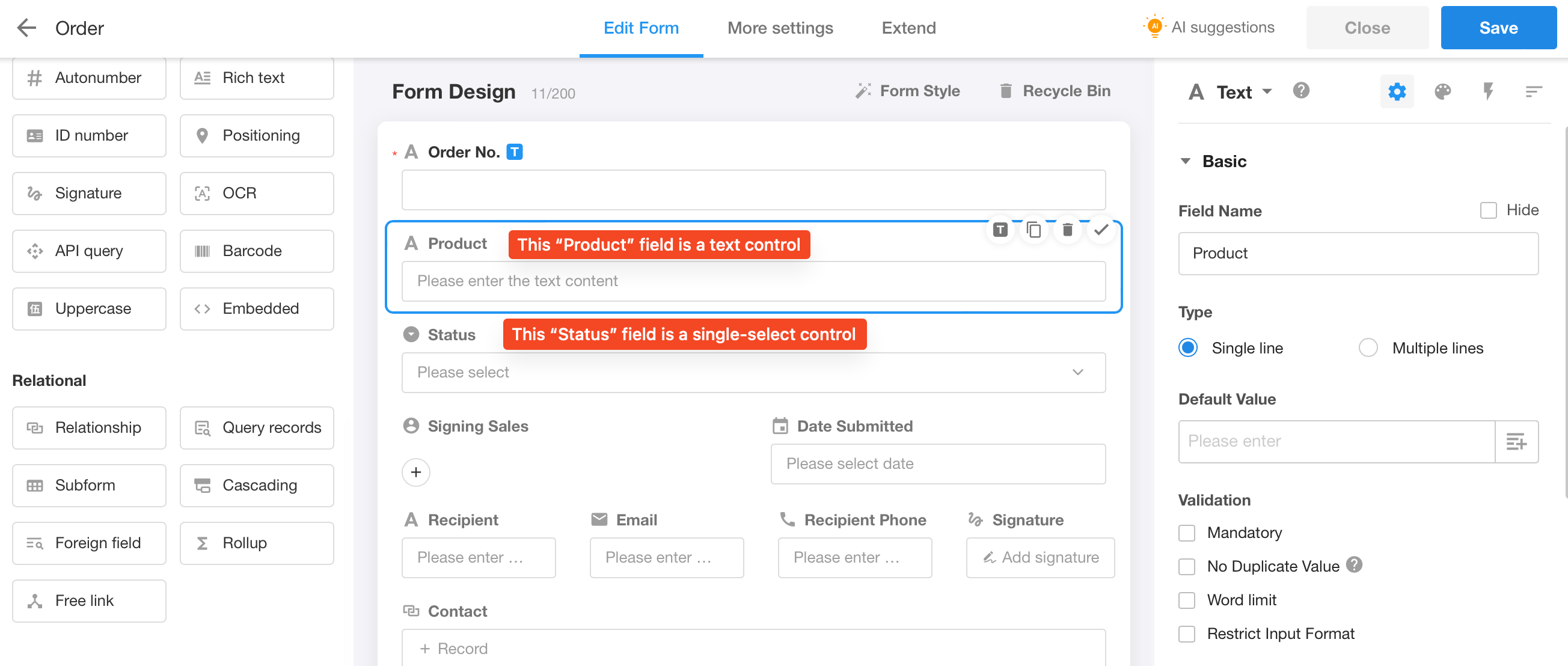
1. Worksheet and Field, Field and Control
Worksheet and Field: Worksheets are used to store datasets of business objects, where each row of record in a worksheet represents a business object. Each object has many different attributes, and a worksheet is composed of multiple attributes, like order number, signing date, and order amount. In a worksheet that stores data for these objects, the object's attributes are called fields. For example, in an order worksheet, there may be fields such as order number, signing date, and order amount.
Field and Control: In order to ensure data standardization and correct input, various formatted field types, known as controls, have been pre-set. These controls include types such as date control, email control, and currency control. When adding a field, it is necessary to first select the appropriate control based on the data type of the field.
2. Introduction to 38 controls
Text
-
For recording name, number, bank account number, meeting minutes, order details, etc.
-
It can be set to single line or multi-line.
-
Support for restricting input format through "regular expressions".
-
Support for setting default values for text fields.
-
Its width can be set to 1/4, 1/3, 1/2 of the line or the width of the entire line.
-
Support for unique field values by checking [No duplicate value].
-
Support for setting [word limit].
-
You can check [Allows barcode scanning] and [Allow QR code scanning] to scan the barcode or QR code to read the content into the text field.
-
If [Parse links] is checked, users can go to the corresponding page by clicking the link.
Number and Currency
-
Support for setting the unit and decimal place.
-
Support for setting the default value.
-
Support for setting the unit to be displayed before or after the number (prefix or suffix).
-
Support for setting [Limit numerical range].
-
Support for setting [Display thousandths] or [Display by percentage].
-
Enter up to 16 digits.
- Due to the fact that in number and currency fields, if the number exceeds 16 digits, it will be stored in scientific notation, resulting in inconsistency with the original content. For non-computational types with long number content, such as bank account numbers, business IDs, etc., text controls should be used; and for phone numbers, telephone controls should be used.
Difference between Number and Currency:
- The uppercase control can only be related to the currency control.
- You can set [Display by percentage] in number control.
- You can set the input method, pedometer or progress bar in number control.
Email
This field requires the validation of the email format, email like xxx@xx.xx can be saved, such as tony@md.com and 123@qq.com.
Date
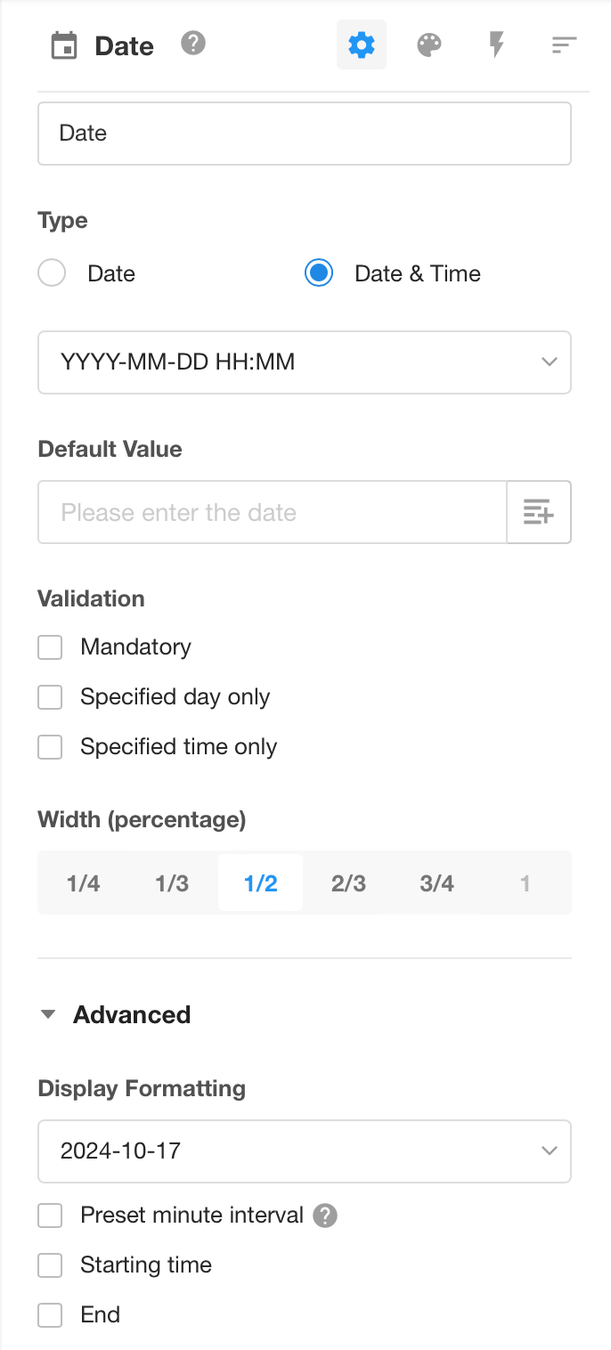
-
Supports date and date & time types with six display formats:
- Year
- Year–Month
- Year–Month–Day
- Year–Month–Day Hour
- Year–Month–Day Hour:Minute
- Year–Month–Day Hour:Minute:Second
-
Supports setting a default date and time
-
Supports selection and display based on the user’s time zone or the application time zone
-
Supports setting the default date.
-
Supports setting custom options.
- Weekday limit: e.g., only allow selecting weekdays
- Time window: e.g., allow selection only between 9:00–18:00
- Time interval: e.g.,
- 1-minute interval: allows selecting any hour and minute
- 1-hour interval: restricts to full-hour selection only
- Start date: restricts selection to dates on or after a defined start date
- When set, the date picker can default to this start date
- End date: restricts selection to dates on or before a defined end date
-
In addition to standard formats like ISO, US, EU, and China, you can also define a custom display format for full control over how the date is rendered.
Format requirements for writing time through workflow, API, function, and importing
The following 4 formats are supported:
- YYYY (year) MM (month) DD (day) HH: mm: ss
- YYYY-MM-DD HH: mm: ss
- YYYY/MM/DD HH: mm: ss
- MM/DD/YYYY HH: mm: ss
Note:
-
Date in DD/MM/YYYY format is not supported, it will be recognized as MM/DD/YYYY.
-
Date in YYYYMMDD format is not supported. If you enter a date in this format, the field will be empty or the original value will be cleared.
-
For the date written by function, the default value only can be in the format of Year-Month-Day for now.
-
If the number of month, day, hour, minute and second is less than 10, it doesn't matter whether there is a zero before the number.
-
The number of month, day, hour, minute, and second cannot be greater than the actual reasonable number, otherwise the field will be empty or the original value will be cleared.
Example
| Write/Import | Result |
|---|---|
| 20221212 16:15 | Empty field, not supported format |
| 14/4/2022 08:35 | Empty field, unreasonable number |
| 2/30/2022 8:35 | Empty field, unreasonable number |
| 12/4/2022 08:35:20 | Normal |
| 2022/12/14 16:14 | Normal |
Time
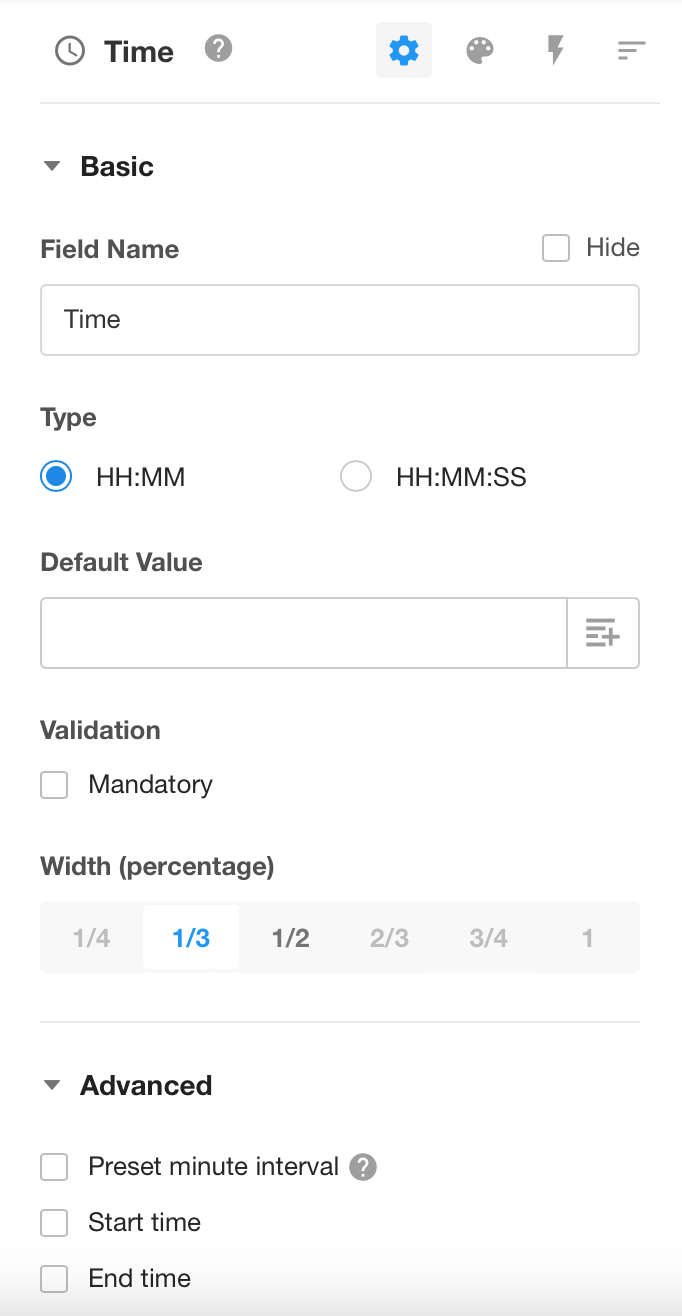
You can choose to display the time in Hour: Minute format or Hour: Minute: Second, withour a date part.
-
You can preset the minute interval, if the interval is set to 1 minute, when adding records and selecting time, you can choose any time, if set to 1 hour, you can only choose the time on the hour.
-
You can set the start time, and when adding a record and selecting time, the time before start time cannot be selected.
-
You can set the end time, and when adding a record and selecting time, the time after end time cannot be selected.
Format requirements for importing time
-
If the number of minute and second exceeds 59, it will be imported as 59.
-
If the number of hour exceeds 23, the field is empty and there is no time format like 24:00:00.
| Import | Result |
|---|---|
| 3:4 | 03:04 |
| 19:45:70 | 19:45:59 |
| 12:60 | 12:59 |
| 19:65:59 | 19:59:59 |
| 24:00:00 | Empty field |
| 29:45:50 | Empty field |
Telephone
-
You can enter a telephone number or a landline phone number. If both are needed, you need to add two telephone controls.
-
You can check [No duplicate value] when editing.
Region/City
There are three types, which are Province, Province-City, and Province-City-County.
If a more detailed address is required, you can select the text control and write the detailed address to the text control.
More details about region/city control
Single-select and Multi-select
You can pre-set the options, and when adding records, users can directly select.
-
There are 3 ways to display options, drop down, tile and progress.
-
You can add, delete, and sort options, as well as set default options.
-
You can set different colors for the options.
-
Data sets can be set as options.
Interconversion of Single-select and Multi-select
If data in a multiple select field has been submitted in a record, after converting the multiple select control to the single select control, the original multi-select data will still be retained.
More details about single select and multiple select controls
Members
-
It is used to select contacts in your organization, your friends or external users.
-
The default selected member can be the creator of the record, or a specified user.
-
Those who are selected in the members field will receive a notification message.
More details about members control
Department
It is used to select departments in the organization. The default selected department can be the department of the record creator.
More details about department control
File
With the file control, you can add and upload multiple files to a record.
More details about file control
Positioning
It can get the user’s location and is available on both mobile terminal and web terminal (GPS is required for telephones). You can check to show the map or to show latitude and longitude.
Users can choose based on which map to display according to their preference. Map Selection
It can get the latitude and longitude of your current position on the App (using the WGS84 coordinate system).
The positioning field supports writing values through workflows and APIs in the following format:
{"x":"116.397590","y":"39.90877","title":"Tiananmen Square","address":"No. 10 Zhonghua Road, Dongcheng District, Beijing"}
In this format, the parameters "title" and "address" can accept empty values.
Formula
With the formula control, you can get a value through the operation of multiple field values.
More details about formula control
Check items
There are three ways to display, which are check box, on-off and yes/no. A default value can be set when editing.
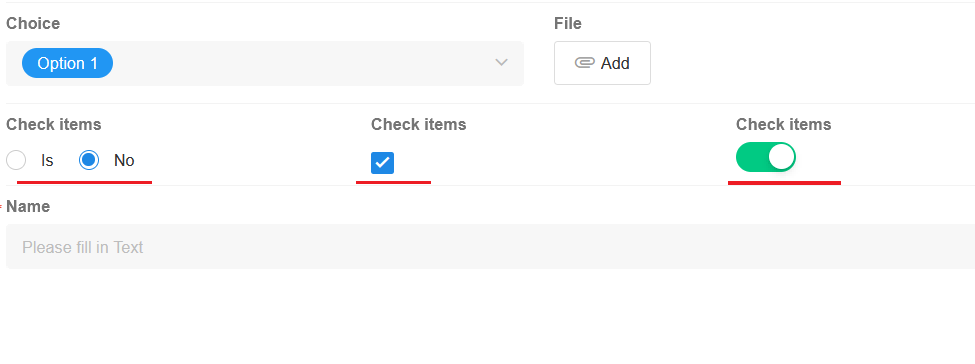
Setting values for the check items field through functions, workflows, APIs, importing Excel files, etc., follows the format below:
-
Setting default values through functions:
If the function's operation result is
true, it represents checked, whilefalserepresents unchecked.For example:
IF('score'>60,TRUE(),FALSE()), orIF('score'>60,true,false) -
Setting values through workflows or importing Excel files:
Support for assigning values through text or number fields, where
trueor1represents checked, andfalseor0represents unchecked. -
Setting values through APIs:
1represents checked, while0represents unchecked.
Level
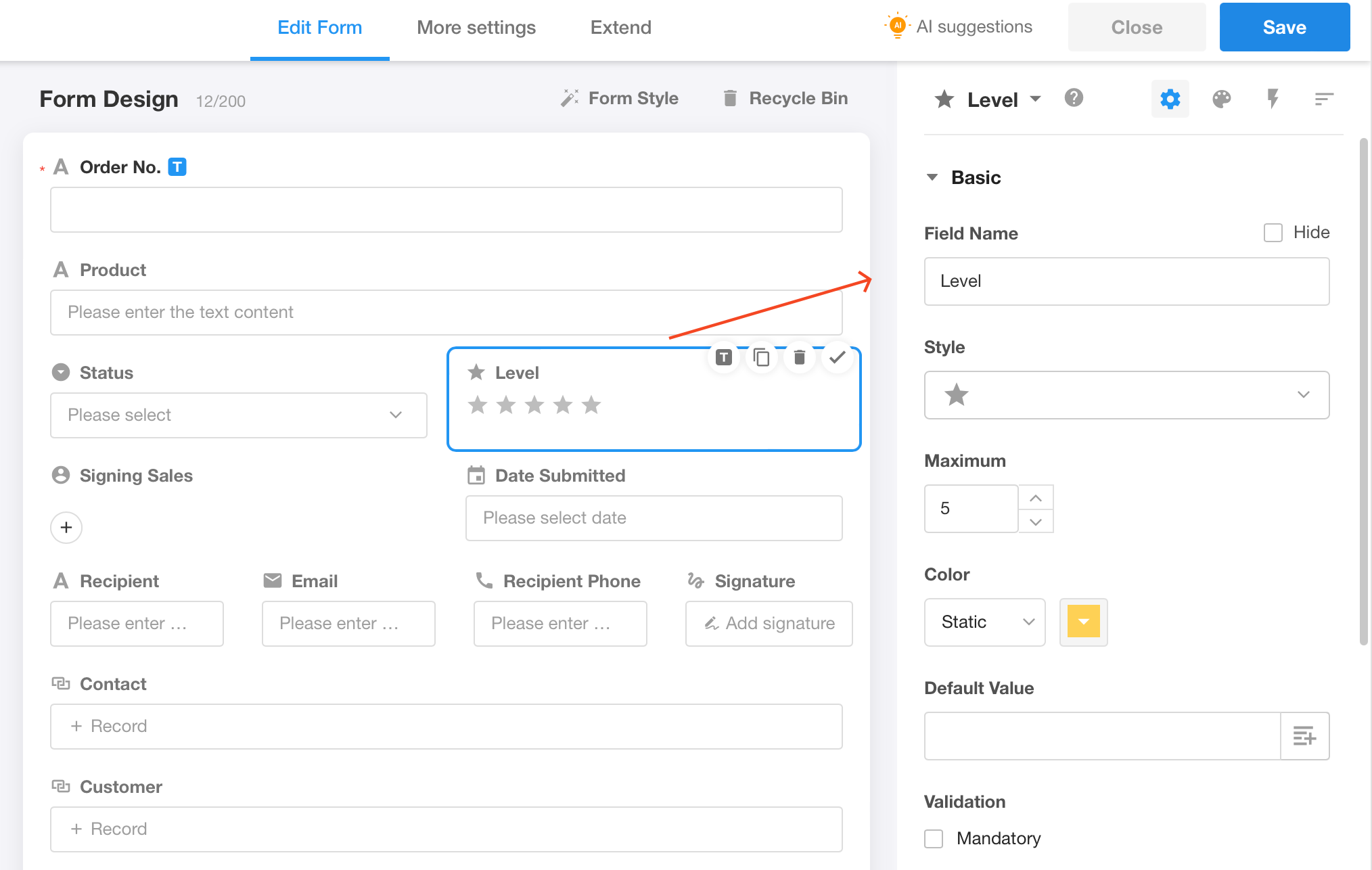
This control helps users to display progress, priority, etc. in a more visual way.
-
A variety of icons or styles to choose from (such as ★, ♥ and many others).
-
You can set the number of levels (1-10).
-
You can set a different color for each level.
-
You can add a description for each level (the corresponding description is displayed when the mouse hovers over the level).
Concat
This control is similar to the CONCATENATE function in Excel, which allows users to concatenate the contents of multiple fields together to create a new value.
More details about concat control
Autonumber
It can automatically assign a unique running number to each new record, and you can also customize the rules.
More details about autonumber control
Rich Text
As shown below, it is a simple text editor for paragraphs of descriptive text. You can also insert images.
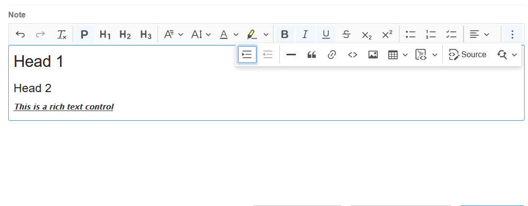
It can be converted to a text control, which by default converts to multi-line text control.
ID Number
This field supports validation for the following four types of identification documents:
- Resident Identity Card (Mainland China)
- Passport
- EEP to Hong Kong and Macao
- EEP to Taiwan
Validation rules for Chinese Resident Identity Card:
- Only 18-digit second-generation ID numbers are supported.
- The first two digits (province code) must be valid.
- Certain ID numbers ending in "0000" are considered invalid formats.
You can configure this field to be:
- Required
- Non-duplicable (unique value only)
Signature
-
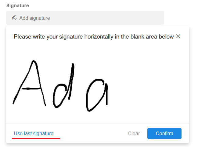
On PC, users can sign with the mouse; on mobile terminal, users can sign manually.
-
Support for setting [Allow the use of the last signature]. The last signature can be reused. For the same user, different signature fields and signatures during workflow approvals will share the same last signature.
-
The signature can be printed.
-
The signature can be written through workflows.
OCR
This control can quickly and accurately recognize text in images and automatically fill in the corresponding fields. Currently text, invoices and ID cards can be recognized.
More details about OCR control
Relationship
Users can relate records from other worksheets or current worksheet in one worksheet, achieving data interactivity and avoiding duplicate entries.
For example, in the Order worksheet, each order requires the contact information, and there is contact information in Contact worksheet, so you can relate the two worksheets.
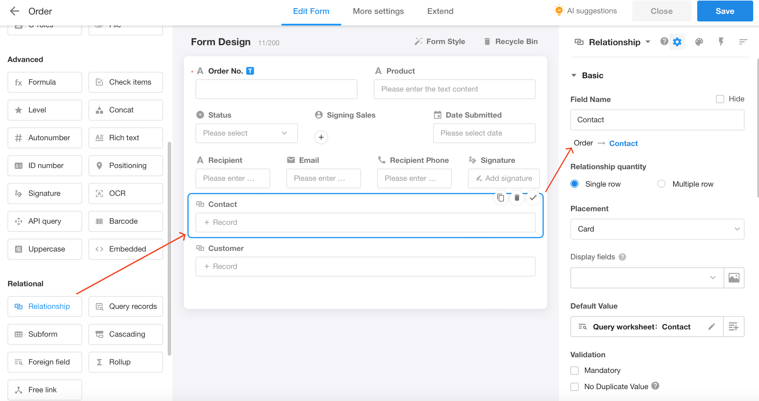
More details about relationship control
Foreign Field
Users can customize the display of a field in the related worksheet.
For example, the Order worksheet is related to the Contact worksheet, if you want to display the position information of each contact at the same time, then the foreign field control can help you.
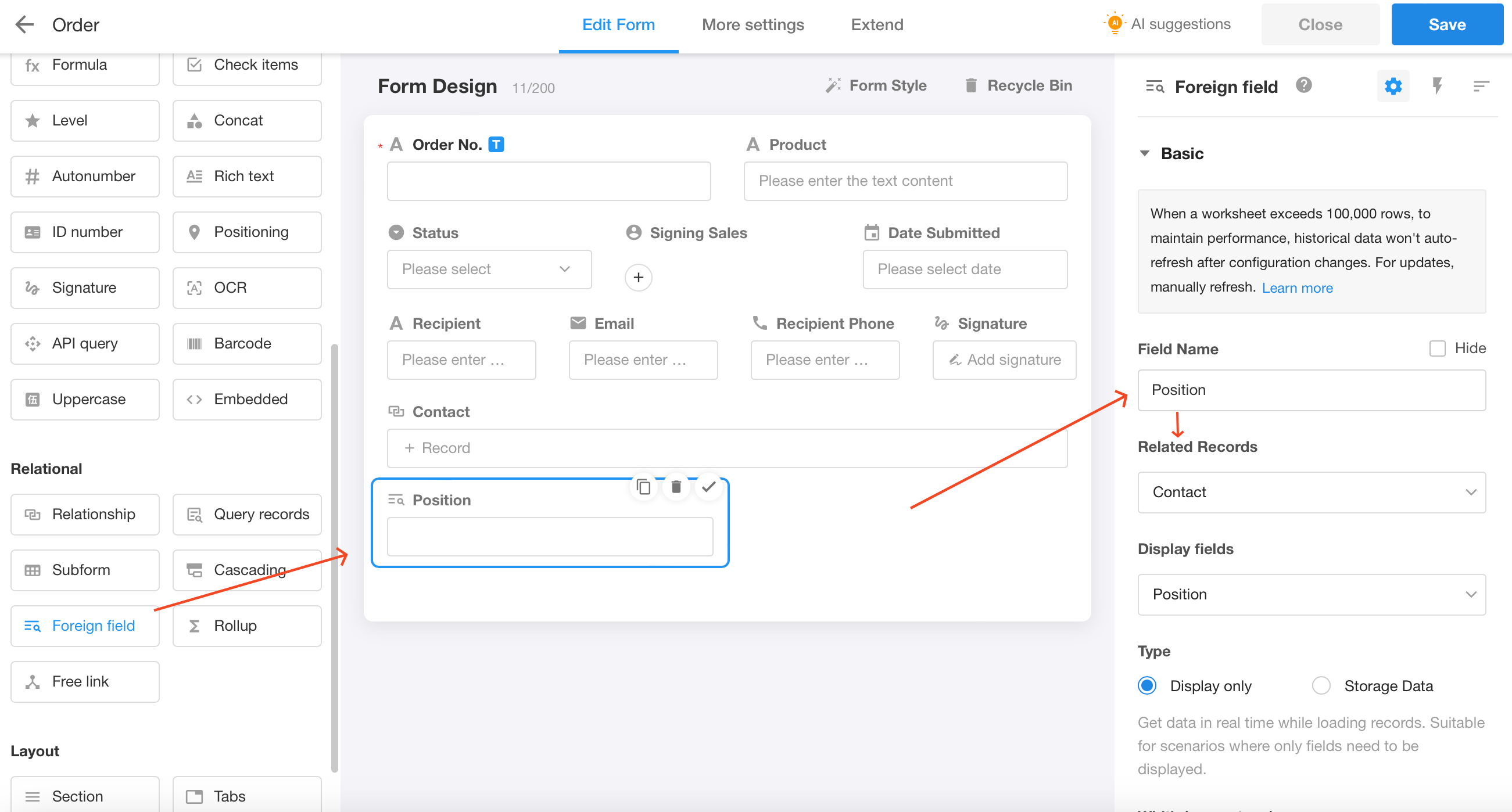
More details about foreign field control
Subform
Business data derived from business objects, which are meaningless apart from the business objects, are suitable for subforms.
In a subform, you can add data in rows when creating a record.
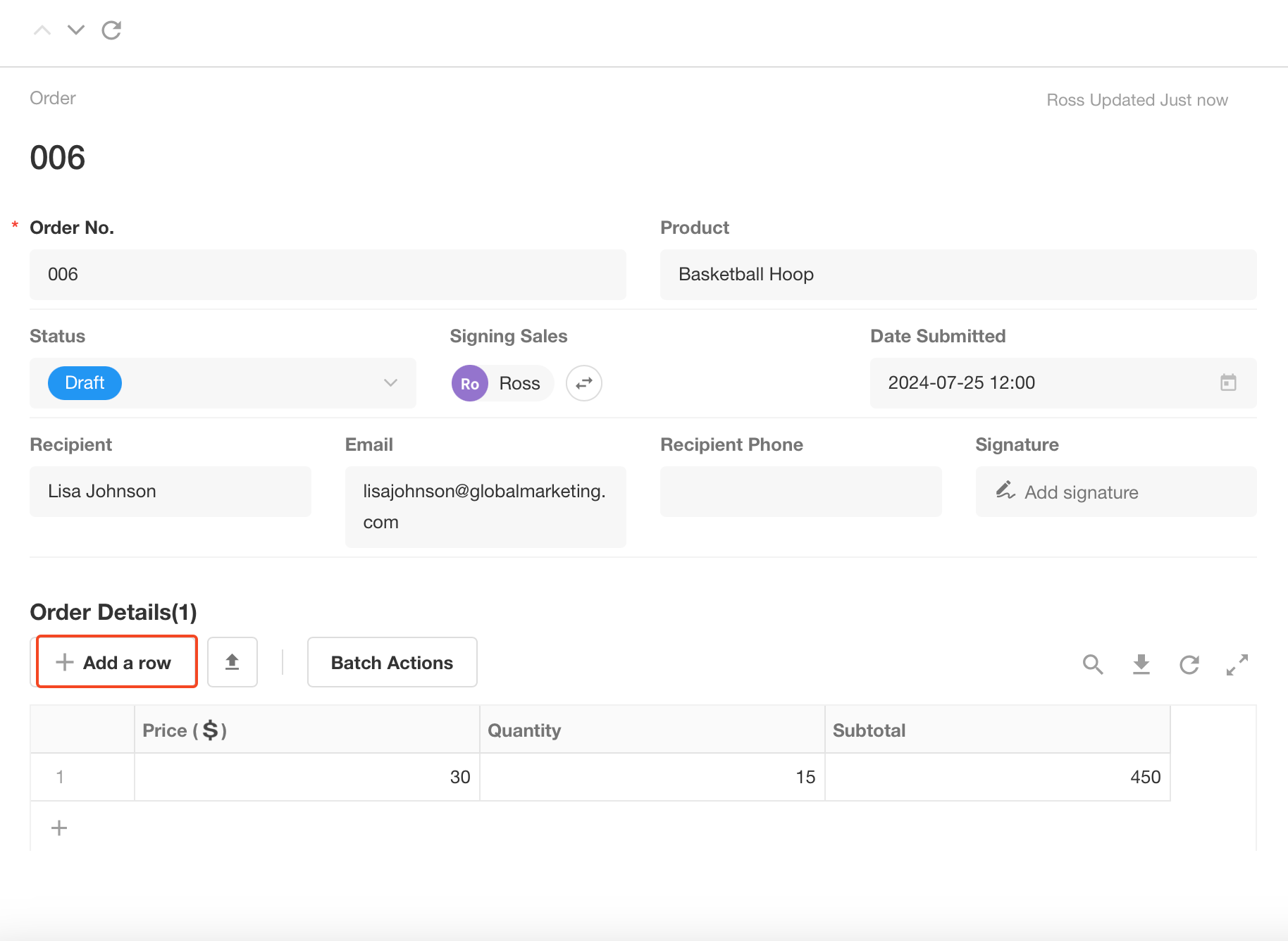
More details about subform control
Cascading
Cascading selection means that based on the previous selection, only the options of the corresponding range are displayed for subsequent selections.
The control supports multiple levels of associations such as secondary and tertiary. The data source is a worksheet with an org view.
For example, a worksheet that collects location of customers, province-city-county, can be referenced as a data source.
More details about cascading control
Rollup
It is used to count the value of a field in a related record or subform. For example, a subform (Order Details) of an order records the sales details of each product, and the rollup control can help to get the sum of the product amounts.
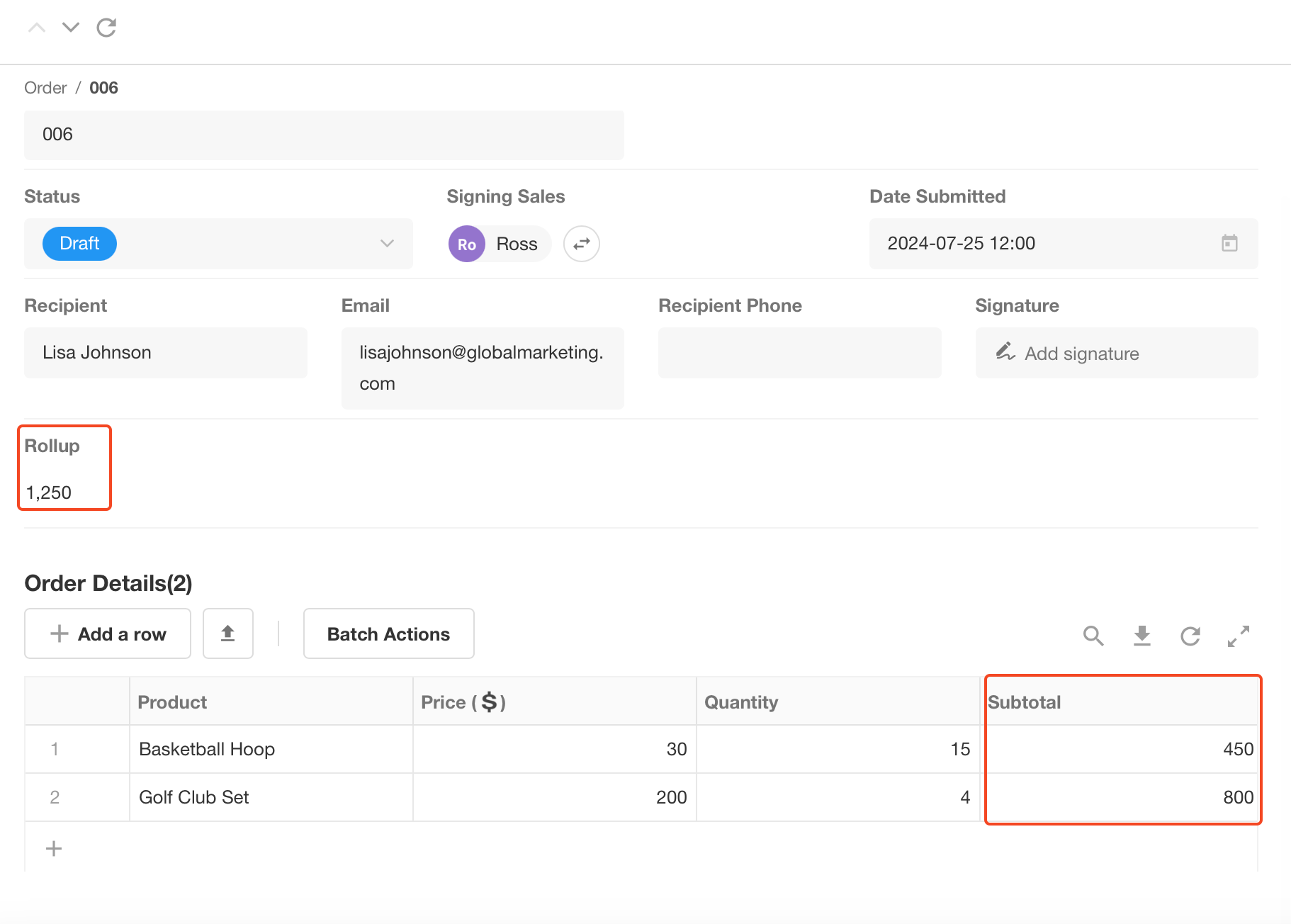
More details about rollup control
Section/Tabs
It can help to display content in sections, with a clear structure. For example, it can divide explanatory text into multiple paragraphs; or divide a form into different sections.
-
Tabs:
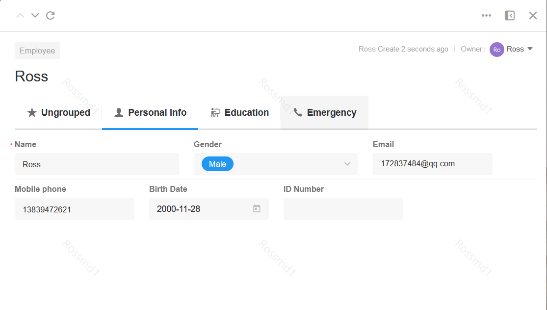
-
Section:
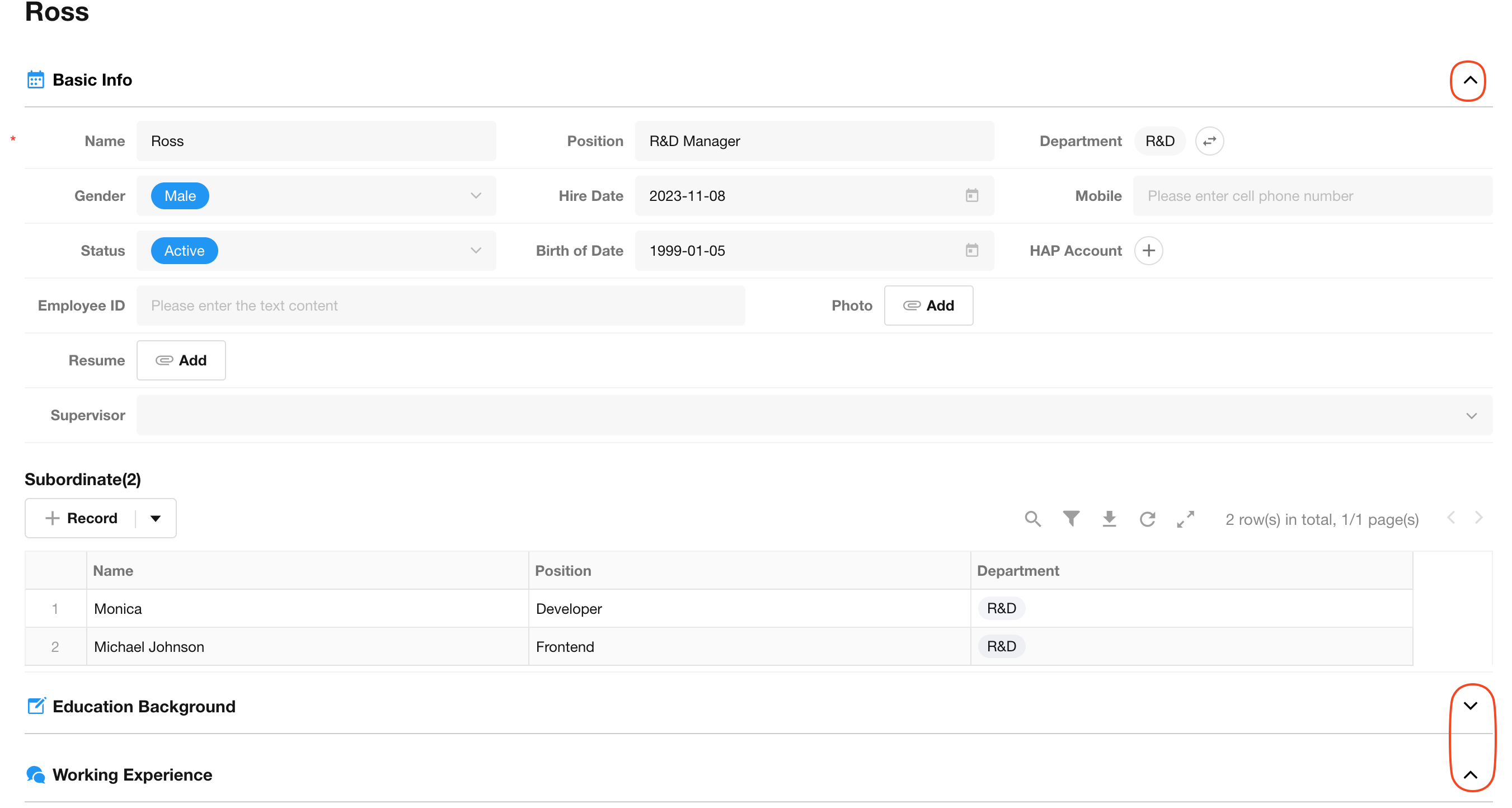
More details about section and tabs control
Remarks
If you want to add instructions to tell the user how to fill in the form correctly, you can select the remarks control, which supports rich text. The notes can only be viewed, not modified. If you need users to add some notes, please select the text control and set the name to “Notes”.
Free Link
With this control, you can add tasks, projects or calendars from the collaboration module. It is a one-way connection. You can only open the related task, project or calendar in the worksheet after adding it, not the other way around.
Uppercase
- If you relate an uppercase field to a currency field, it will automatically display the uppercase amount.
Embedded
It refers to embedding external links or charts in the form and passing the values of other fields in the current form as parameters to enable the display and interaction of custom elements in the form. In addition, embedded fields can be used as covers for gallery views.
-
Embed Chart
Setting:
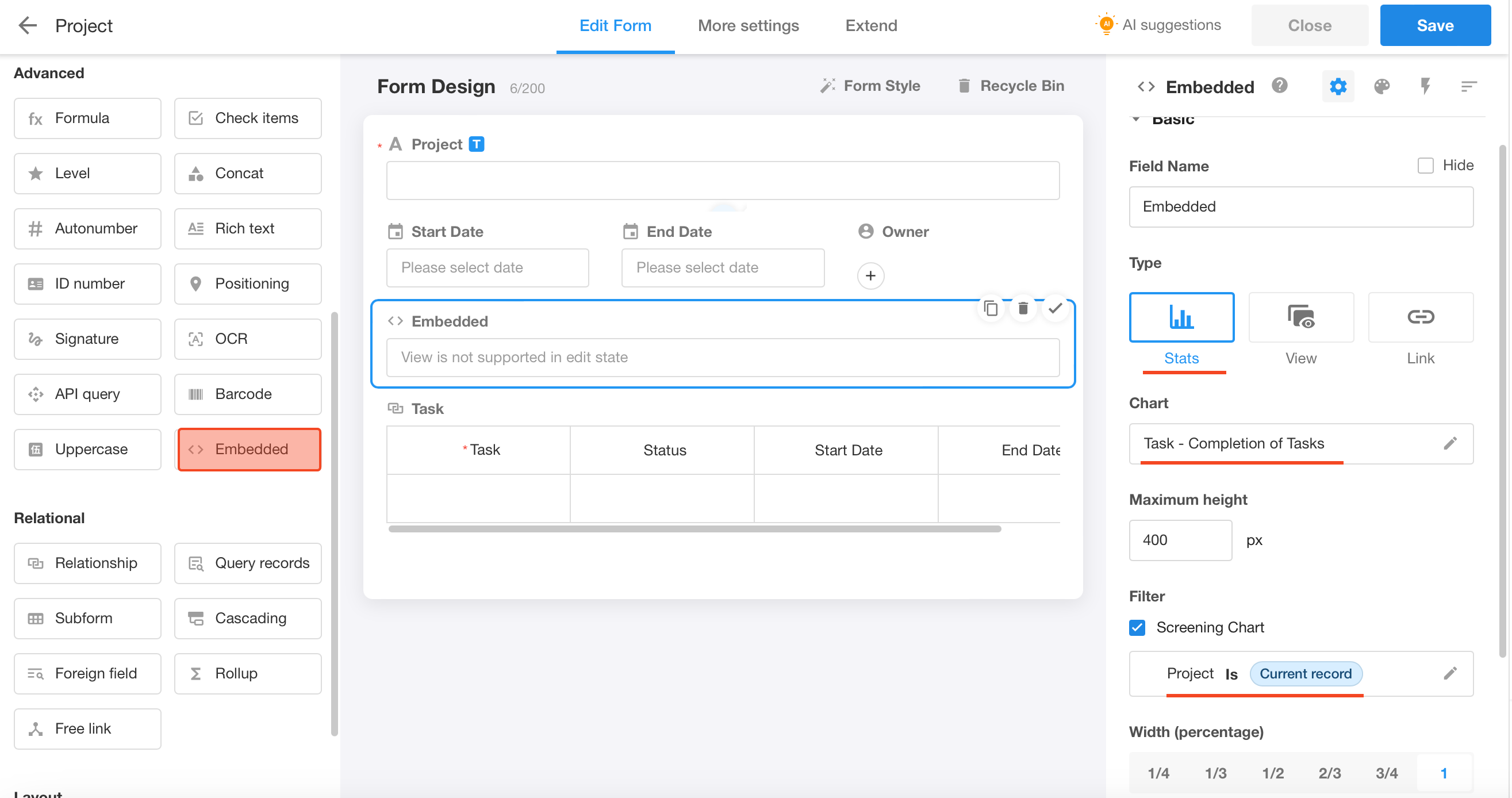
Effect:
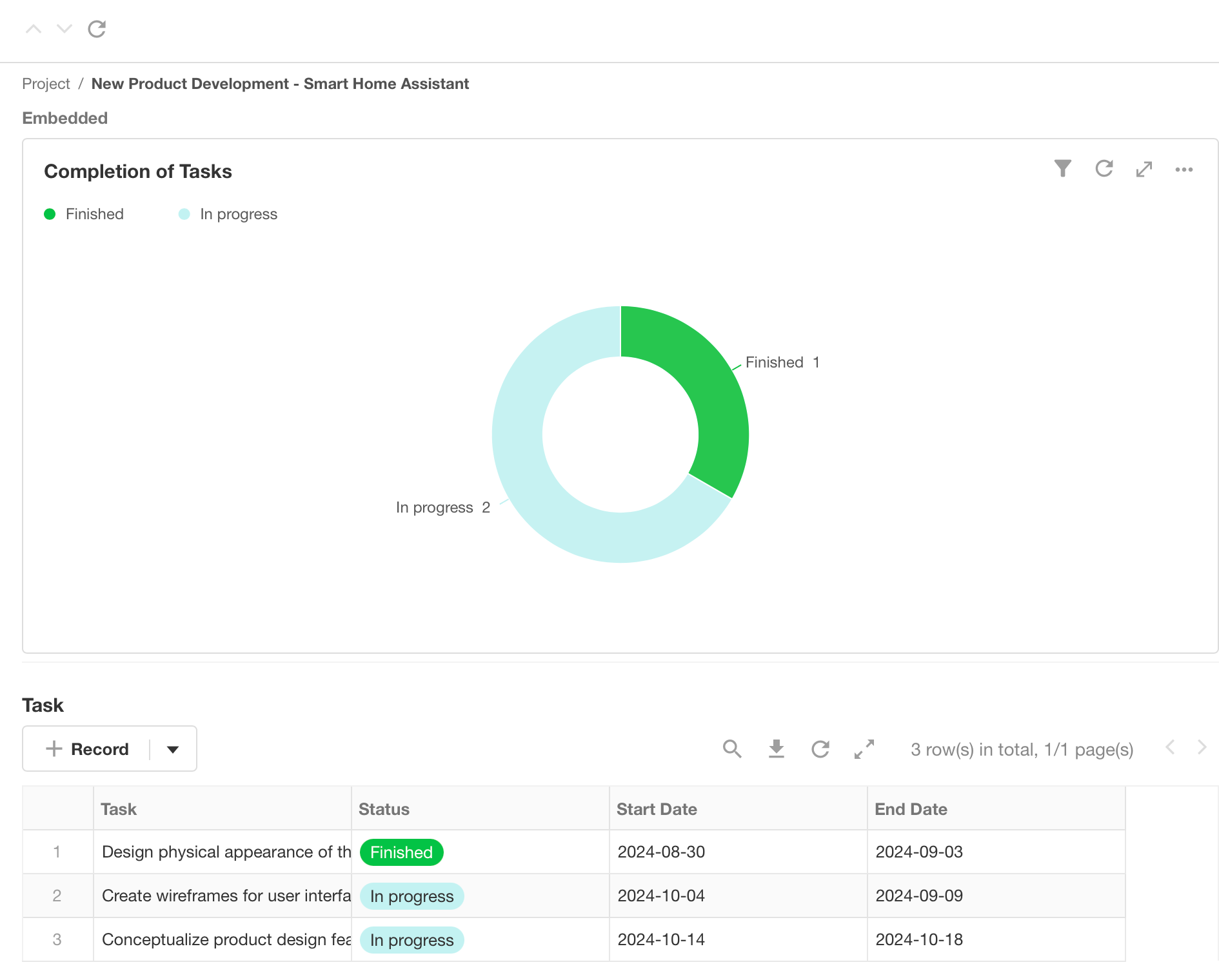
-
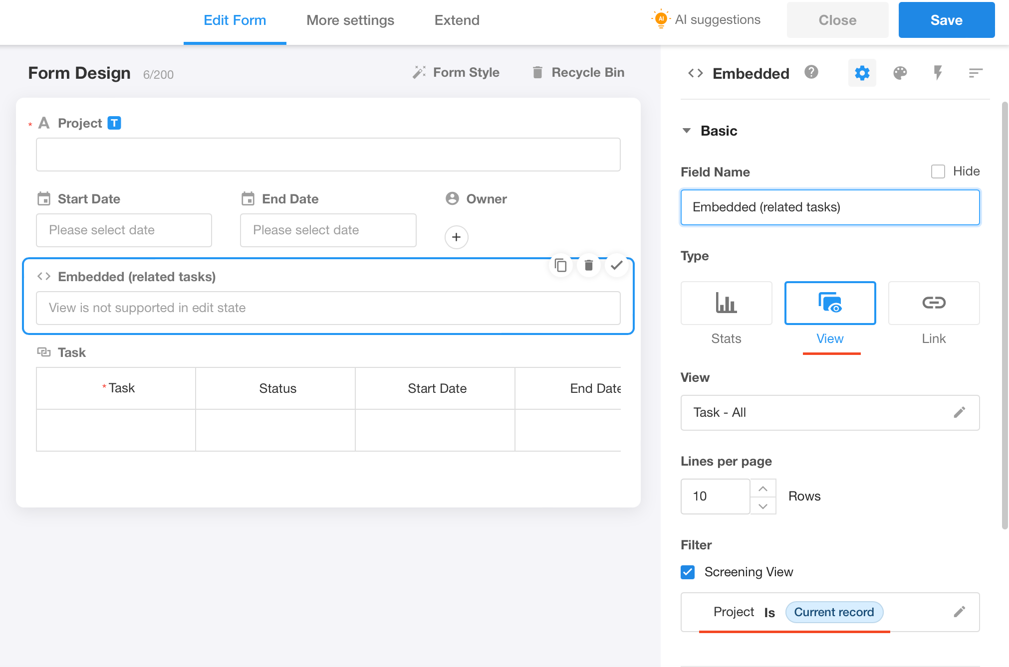
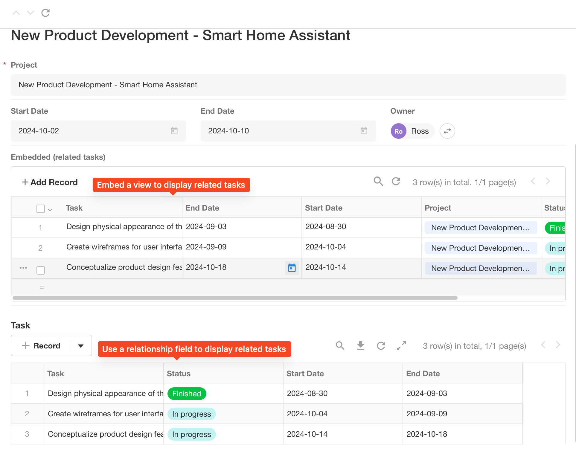
Embed View
Setting:
Effect:
Was this document helpful?